Discover Movies another Way | WTM
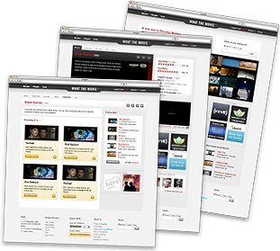
whatthemovie.com“The brand presents a functional, game-focused aesthetic with a clean, utilitarian interface. It balances a playful core concept with a straightforward, accessible design language that prioritizes clarity and ease of use over decorative flair.”
Color Palette
Colors
Typography
Fonts
Open Sans
Arial, sans-serif
Open Sans
Arial, sans-serif
The quick brown fox
12pxThe quick brown fox
12pxThe quick brown fox
13.2pxThe quick brown fox
14.4pxThe quick brown fox
13.2pxComponents
Design System
rgb(232, 232, 232) 0px 2px 3px 0px
Voice & Tone
Personality
Visual Energy
Design Era
flat-2.0
Emotional Tone
approachable-competitive
Target Audience
Casual movie enthusiasts and trivia players seeking quick, low-friction entertainment.
Comparable Brands
Brand Rules
Dos & Don'ts
Do
- Use Open Sans for all typography: weight 700 for headings (Title Case) and weight 400 for body text.
- Apply primary accent color #cc0000 exclusively for secondary actions, links, and key highlights; use #333333 for all primary text.
- Style primary CTA buttons as outlines with #9f9f9f borders, #000000 text, 4px border-radius, and a subtle shadow: rgb(232, 232, 232) 0px 2px 3px 0px.
- Style secondary buttons with #ffffff background, #cc0000 text, 3px border-radius, and #d5d5d5 borders.
- Maintain a flat design aesthetic by avoiding gradients entirely; rely on solid colors (#ffffff, #efefef, #cc0000) for backgrounds and elements.
- Use a base spacing unit of 2px for padding and margins to ensure consistent, compact layout density.
- Keep copy simple and direct, utilizing imperative verbs for CTAs (e.g., 'Start Guessing') and avoiding jargon.
- Apply 4px border-radius to standard interactive elements and buttons to maintain a soft but defined geometric feel.
Don't
- Do not use title case for body text; reserve Title Case strictly for headings.
- Avoid using emojis in any marketing copy or UI labels.
- Do not use serif fonts; the brand is strictly sans-serif (Open Sans).
- Avoid multi-layer or heavy drop shadows; keep shadows subtle and uniform (rgb(232, 232, 232) 0px 2px 3px 0px) only on primary buttons.
- Do not use gradients for buttons, backgrounds, or text highlights.
- Avoid excessive whitespace or large border radii (e.g., >5px); the brand prefers compact, tight spacing and small radii.
- Do not use bright or neon colors outside the defined palette (#cc0000, #ffffff, #efefef, #333333, #000000).
- Avoid complex animations or transitions; the interface should feel static and immediate.
Design Assets
Visual Elements

How to use this file
1. Save this file as DESIGN.md in your project root (sibling to README.md).
2. AI agents that read project files (Claude Code, Cursor, v0, Lovable, Bolt, Windsurf) will discover it automatically.
3. Validate or export tokens with the official CLI:
npx @google/design.md lint DESIGN.md
npx @google/design.md export --format tailwind DESIGN.md
Developer Access
# Fetch the full brand kit
curl https://extractvibe.com/api/brand/whatthemovie.com \
  -H "x-api-key: ev_your_key"

# Export as CSS variables
curl https://extractvibe.com/api/extract/JOB_ID/export/css \
  -H "x-api-key: ev_your_key"

# Export as Tailwind config
curl https://extractvibe.com/api/extract/JOB_ID/export/tailwind \
  -H "x-api-key: ev_your_key"
Extract your own brand kit
Get colors, fonts, voice, and personality from any website in seconds. Open source.