

Webflow
webflow.com“Webflow projects a professional, engineering-forward aesthetic that bridges the gap between design and development. The brand feels precise, modern, and authoritative, emphasizing control and technical capability without sacrificing visual elegance. It targets users who value clean code and custom solutions over generic templates.”
Color Palette
Colors
Light Mode
Dark Mode
Typography
Fonts
WF Visual Sans Variable
Arial, sans-serif
WF Visual Sans Variable
Arial, sans-serif
The quick brown fox
16pxThe quick brown fox
80pxThe quick brown fox
24pxThe quick brown fox
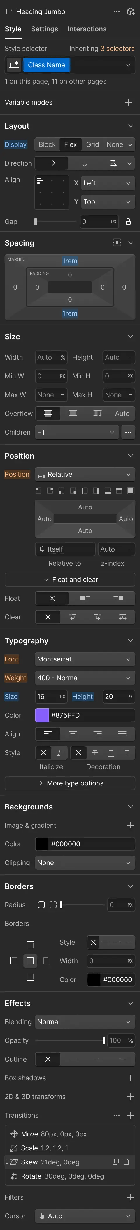
20pxComponents
Design System
rgba(0, 0, 0, 0) 0px 84px 24px 0px, rgba(0, 0, 0, 0.01) 0px 54px 22px 0px, rgba(0, 0, 0, 0.04) 0px 30px 18px 0px, rgba(0, 0, 0, 0.08) 0px 13px 13px 0px, rgba(0, 0, 0, 0.09) 0px 3px 7px 0px
rgba(0, 0, 0, 0) 0px 0px 0px 100px inset
linear-gradient(rgb(255, 255, 255) 0%, color(srgb 1 1 1 / 0.85) 30%, color(srgb ...
linear-gradient(rgba(255, 255, 255, 0.16), rgba(0, 0, 0, 0.25) 59%, rgba(0, 0, 0...
Voice & Tone
Personality
Visual Energy
Design Era
contemporary-minimal
Emotional Tone
competent-empowering
Target Audience
Professional designers, frontend developers, and marketing teams who want full control over their digital presence without writing raw code manually.
Comparable Brands
Brand Rules
Dos & Don'ts
Do
- Use WF Visual Sans Variable for all typography; apply weight 500-600 for headings and 400-500 for body text.
- Format all headings in sentence-case with no emoji or excessive punctuation; keep body line-height at 25.6px.
- Style primary CTA buttons with #146ef5 background, #ffffff text, 0px border-radius (sharp corners), and 12px vertical padding.
- Style outline buttons with #080808 text and border, 0px border-radius, and approximately 20px vertical padding for a tall, distinct look.
- Maintain a flat design aesthetic with 0px border-radius on interactive elements; avoid rounded corners on buttons and inputs.
- Use #080808 for primary text and #ffffff for backgrounds; reserve #7a3dff for secondary accents or gradients.
- Apply subtle, multi-layered shadows only to specific elements like cards or overlays (e.g., rgba(0,0,0,0.01) 0px 54px 22px 0px), never on primary buttons.
- Use action-oriented imperative verbs in copy (e.g., 'Build', 'Create', 'Drive') and avoid exclamations or emojis.
Don't
- Do not use title case or ALL CAPS for headings; strictly adhere to sentence-case.
- Do not use serif fonts; the brand is exclusively sans-serif using WF Visual Sans Variable.
- Do not use emoji in marketing copy or UI elements; the brand maintains a serious, professional tone.
- Do not use rounded corners (border-radius > 0px) on buttons or primary UI controls; keep them sharp.
- Do not use vibrant or saturated background colors for the main layout; stick to #ffffff or light grays.
- Do not use heavy drop shadows on buttons; the brand prefers flat, solid color fills for primary actions.
- Do not use playful or casual language; avoid slang, humor, or excessive enthusiasm in copy.
- Do not use gradients on primary buttons; reserve gradients for background sections or subtle visual effects.
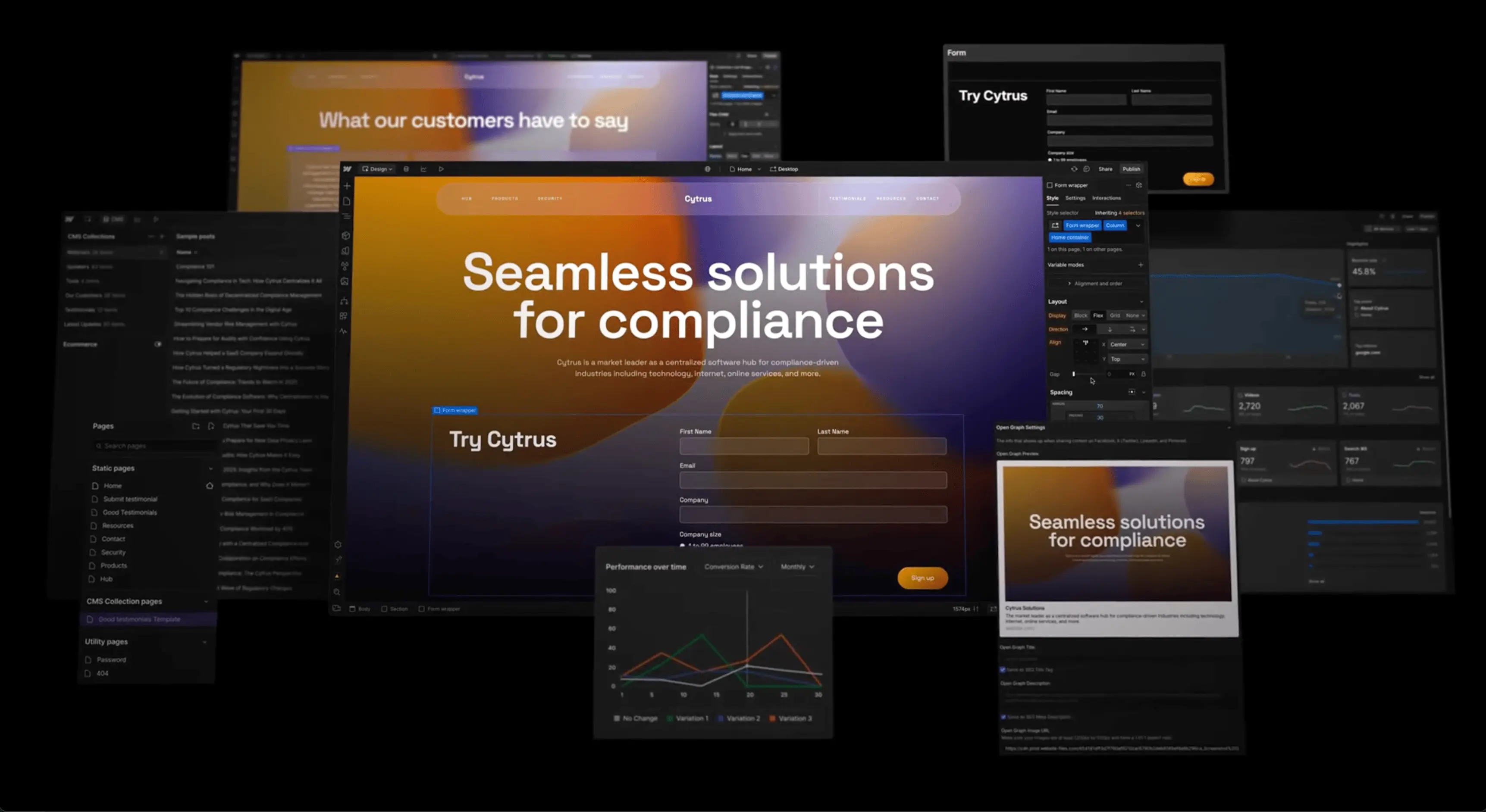
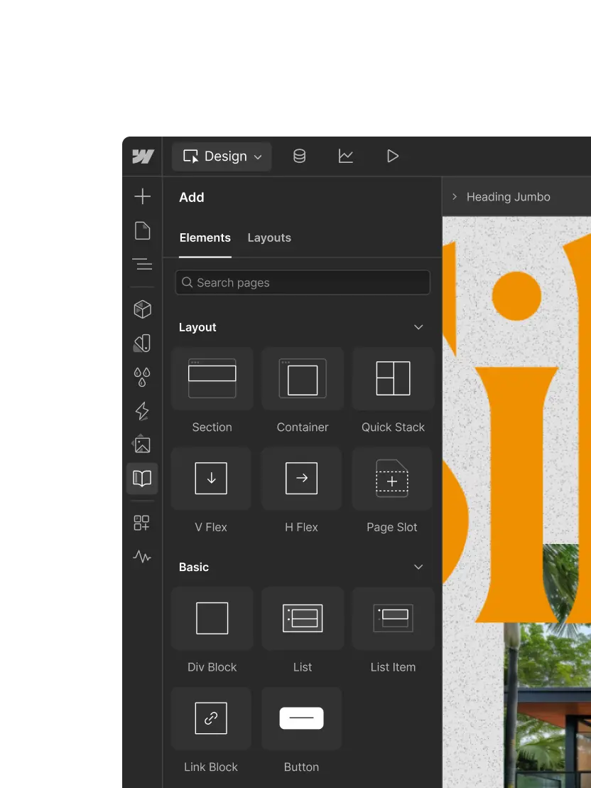
Design Assets
Visual Elements


How to use this file
1. Save this file as DESIGN.md in your project root (sibling to README.md).
2. AI agents that read project files (Claude Code, Cursor, v0, Lovable, Bolt, Windsurf) will discover it automatically.
3. Validate or export tokens with the official CLI:
npx @google/design.md lint DESIGN.md
npx @google/design.md export --format tailwind DESIGN.md
Developer Access
# Fetch the full brand kit
curl https://extractvibe.com/api/brand/webflow.com \
  -H "x-api-key: ev_your_key"

# Export as CSS variables
curl https://extractvibe.com/api/extract/JOB_ID/export/css \
  -H "x-api-key: ev_your_key"

# Export as Tailwind config
curl https://extractvibe.com/api/extract/JOB_ID/export/tailwind \
  -H "x-api-key: ev_your_key"
Extract your own brand kit
Get colors, fonts, voice, and personality from any website in seconds. Open source.