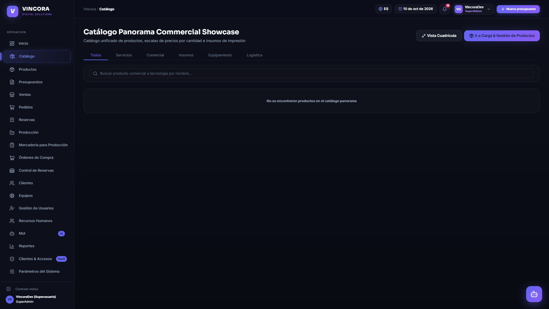
VINCORA
vincora.freedev.app“VINCORA projects a modern, high-tech, and efficient image, designed to empower businesses with a comprehensive operational system. Its aesthetic combines a dark, sophisticated background with vibrant, energetic purple accents, suggesting innovation and robust functionality.”
Color Palette
Colors
Light Mode
Dark Mode
Typography
Fonts
Inter
-apple-system, BlinkMacSystemFont, Segoe UI, sans-serif
Sora
Inter, -apple-system, BlinkMacSystemFont, Segoe UI, sans-serif
Sora
Inter, -apple-system, BlinkMacSystemFont, Segoe UI, sans-serif
The quick brown fox
16pxThe quick brown fox
62.4pxThe quick brown fox
33.6pxThe quick brown fox
17.28pxThe quick brown fox
13.12pxComponents
Design System
rgba(37, 99, 235, 0.28) 0px 0px 26px 0px
rgba(124, 58, 237, 0.16) 0px 0px 32px 0px
rgba(0, 0, 0, 0.5) 0px 12px 30px 0px
rgba(0, 0, 0, 0.7) 0px 16px 40px 0px, rgba(99, 102, 241, 0.16) 0px 0px 30px 0px
rgba(0, 0, 0, 0.65) 0px 16px 36px 0px, rgba(99, 102, 241, 0.15) 0px 0px 24px 0px
rgba(0, 0, 0, 0.7) 0px 24px 60px 0px, rgba(99, 102, 241, 0.18) 0px 0px 45px 0px
rgba(0, 0, 0, 0.65) 0px 24px 60px 0px, rgba(99, 102, 241, 0.15) 0px 0px 40px 0px
rgba(97, 71, 252, 0.3) 0px 4px 12px 0px
rgba(99, 102, 241, 0.25) 0px 0px 16px 0px
radial-gradient(800px 400px at 50% 0%, rgba(99, 102, 241, 0.08), rgba(0, 0, 0, 0...
radial-gradient(circle at 50% 15%, rgba(99, 102, 241, 0.1) 0%, rgba(0, 0, 0, 0) ...
radial-gradient(760px 480px at 12% 8%, rgba(99, 102, 241, 0.16), rgba(0, 0, 0, 0...
linear-gradient(rgba(148, 163, 184, 0.05) 1px, rgba(0, 0, 0, 0) 1px), linear-gra...
Voice & Tone
Personality
Visual Energy
Design Era
flat-2.0-with-depth
Emotional Tone
empowering-innovative
Target Audience
Small to medium-sized businesses (PyMEs) and industries in Argentina seeking a comprehensive, integrated, and modern operational management system.
Comparable Brands
Brand Rules
Dos & Don'ts
Do
- Use Sora for all headings in title-case, primarily at 500, 600, or 700 weights.
- Use Inter for body text at 400 or 500 weights, maintaining a line-height of 25.6px.
- Employ a dark background of #121212 for both light and dark modes, with primary text in #f8fafc.
- Utilize #6147fc as the primary accent color for interactive elements and key visual highlights, complemented by #a5b4fc for secondary accents.
- Primary CTA buttons should feature a #6147fc background, #ffffff text, 8px border-radius, and a shadow of rgba(97, 71, 252, 0.3) 0px 4px 12px 0px, with 9px 18px padding.
- Outline buttons should have #94a3b8 text, a #6147fc border, 999px border-radius, and 6px 10px padding.
- Secondary buttons should use a #10121c background, #94a3b8 text, 999px border-radius, and 8px 18px padding.
- Apply subtle, multi-layer shadows to cards, such as rgba(37, 99, 235, 0.28) 0px 0px 26px 0px or rgba(124, 58, 237, 0.16) 0px 0px 32px 0px.
- Incorporate radial gradients for background depth, specifically radial-gradient(800px 400px at 50% 0%, rgba(99, 102, 241, 0.08), rgba(0, 0, 0, 0)) or similar with subtle color variations.
- Maintain a consistent border-radius system: 8px for small elements, 9px for medium, and 999px for pill-shaped elements like buttons.
Don't
- Avoid using serif fonts; the brand exclusively uses sans-serif fonts (Inter and Sora).
- Do not use light backgrounds; the primary background color is consistently #121212.
- Refrain from using excessive exclamations; they are rare in the brand's copy.
- Do not use a monochrome color palette; always incorporate the vibrant primary purple (#6147fc) and its secondary (#a5b4fc) for visual interest.
- Avoid sharp, unrounded corners; all interactive elements and cards should have a minimum border-radius of 8px.
- Do not use flat buttons without shadows for primary calls to action; primary buttons require a distinct shadow (rgba(97, 71, 252, 0.3) 0px 4px 12px 0px).
- Do not use casual or overly playful language; the tone is serious and enthusiastic, with moderate vocabulary and heavy jargon.
- Avoid inconsistent padding on buttons; adhere to the established 6px 10px, 9px 18px, or 8px 18px patterns.
<!-- Generated by ExtractVibe — https://extractvibe.com/brand/vincora.freedev.app -->
<!-- Extracted: 2026-10-31T15:20:31.732Z | Schema: v1 | Quality: 90/100 -->
---
version: alpha
name: "VINCORA"
description: "VINCORA projects a modern, high-tech, and efficient image, designed to empower businesses with a comprehensive operational system. Its aesthetic combines a dark, sophisticated background with vibrant, energetic purple accents, suggesting innovation and robust functionality."
colors:
  primary: "#6147fc"
  secondary: "#a5b4fc"
  tertiary: "#6147fc"
  neutral: "#64748b"
  surface: "#161618"
  on-surface: "#f8fafc"
  on-surface-secondary: "#64748b"
  border: "#ffffff"
  error: "#ef4444"
  warning: "#f59e0b"
  success: "#10b981"
  info: "#06b6d4"
  surface-dark: "#121212"
  on-surface-dark: "#f8fafc"
typography:
  display-lg:
    fontFamily: "Sora"
    fontSize: "62.4px"
    fontWeight: "700"
    lineHeight: "67.392px"
    letterSpacing: "-1.872px"
  headline-lg:
    fontFamily: "Sora"
    fontSize: "33.6px"
    fontWeight: "600"
    lineHeight: "53.76px"
    letterSpacing: "-0.672px"
  headline-md:
    fontFamily: "Sora"
    fontSize: "17.28px"
    fontWeight: "500"
    lineHeight: "27.648px"
    letterSpacing: "-0.1728px"
  headline-sm:
    fontFamily: "Sora"
    fontSize: "13.12px"
    fontWeight: "500"
    lineHeight: "20.992px"
  body-md:
    fontFamily: "Inter"
    fontSize: "16px"
    fontWeight: "400"
    lineHeight: "25.6px"
rounded:
  sm: "8px"
  md: "9px"
  lg: "999px"
  full: "9999px"
spacing:
  base: "2px"
  xs: "1px"
  sm: "2px"
  md: "4px"
  lg: "6px"
  xl: "8px"
components:
  button-outline:
    textColor: "#94a3b8"
    rounded: "999px"
    padding: "6px 10px"
    fontSize: "13.12px"
    fontWeight: "500"
    borderColor: "#6147fc"
    borderWidth: "1px"
  button-primary:
    backgroundColor: "#6147fc"
    textColor: "#ffffff"
    rounded: "8px"
    padding: "9px 18px"
    fontSize: "13.6px"
    fontWeight: "600"
    borderColor: "#ffffff"
    boxShadow: "rgba(97, 71, 252, 0.3) 0px 4px 12px 0px"
  button-secondary:
    backgroundColor: "#10121c"
    textColor: "#94a3b8"
    rounded: "999px"
    padding: "8px 18px"
    fontSize: "13.12px"
    fontWeight: "600"
    borderWidth: "1px"
---

# VINCORA — Design System

## Overview

VINCORA's design system embodies the archetypes of The Magician and The Ruler, projecting an image of transformative power and authoritative control over complex operations. This is a system built for efficiency and high-level functionality, drawing inspiration from the integrated and dynamic interfaces of platforms like monday.com, ClickUp, Asana, and SAP. The aesthetic is unapologetically tech-forward and professional, designed to empower users with a sense of mastery and seamless integration.

The visual language is modern and sophisticated, leveraging a dark, expansive surface to create a sense of depth and focus, punctuated by energetic purple accents that signify innovation and robust capability. This design is not whimsical or overly decorative; it prioritizes clarity, functionality, and a streamlined user experience. It avoids gradients that dilute focus, overly playful iconography, or pastel palettes that would undermine its serious, high-performance intent. Every element is calibrated to reinforce VINCORA's commitment to integrated, dynamic, and efficient business operations.

**Key characteristics:**

- Vibe — tech-forward, efficient, integrated, dynamic, professional, modern
- Archetypes — The Magician, The Ruler
- Comparable to — monday.com, ClickUp, Asana, SAP
- Design era — flat-2.0-with-depth
- Emotional tone — empowering-innovative
- Target audience — Small to medium-sized businesses (PyMEs) and industries in Argentina seeking a comprehensive, integrated, and modern operational management system.
- Visual energy — 8/10 (high-energy/bold)

## Colors

The VINCORA color palette is anchored by a deep, sophisticated #121212 surface, providing a stable and professional backdrop that enhances content legibility. This dark foundation is dynamically energized by the primary accent color, #6147fc, a vibrant purple. This combination signals innovation, high-tech capability, and robust functionality, reflecting the brand's tech-forward and efficient character. The contrast is deliberate, ensuring critical information stands out while maintaining a sleek, modern aesthetic.

### Light mode

| Role | Hex | Name |
|------|-----|------|
| primary | `#6147fc` | Slate Blue |
| secondary | `#a5b4fc` | Light Sky Blue |
| accent / tertiary | `#6147fc` | Slate Blue |
| surface | `#161618` | Near-Black |
| background | `#121212` | Near-Black |
| text | `#f8fafc` | Off-White |
| secondary text | `#64748b` | Slate Gray |
| border | `#ffffff` | White |
| muted | `#64748b` | Slate Gray |

### Dark mode

| Role | Hex | Name |
|------|-----|------|
| surface | `#121212` | Near-Black |
| background | `#121212` | Near-Black |
| text | `#f8fafc` | Off-White |
| secondary text | `#94a3b8` | Dark Silver |
| muted | `#94a3b8` | Dark Silver |

### Semantic

| Role | Hex | Use |
|------|-----|-----|
| success | `#10b981` | Confirmations, positive states |
| warning | `#f59e0b` | Caution, intermediate states |
| error | `#ef4444` | Failures, destructive actions |
| info | `#06b6d4` | Neutral information, tips |

## Typography

VINCORA's typography system utilizes Inter for body text and Sora for headings, establishing a clear hierarchy and a modern, professional tone. Inter provides excellent readability and versatility for extensive content, aligning with the brand's emphasis on efficiency and clarity. Sora, with its clean and slightly futuristic aesthetic, reinforces the tech-forward and innovative aspects of VINCORA. This pairing ensures strong visual impact for key information while maintaining an integrated and professional overall typographic voice.

### Font families

| Family | Role | Source | Weights |
|--------|------|--------|---------|
| Inter | body | google-fonts | 400, 500, 600 |
| Sora | heading | google-fonts | 500, 600, 700 |
| Sora | body | google-fonts | 700 |

### Type scale

| Role | Family | Size | Weight | Line height | Letter spacing |
|------|--------|------|--------|-------------|----------------|
| Display | Sora | 62.4px | 700 | 67.392px | -1.872px |
| Heading 2 | Sora | 33.6px | 600 | 53.76px | -0.672px |
| Heading 3 | Sora | 17.28px | 500 | 27.648px | -0.1728px |
| Heading 4 | Sora | 13.12px | 500 | 20.992px | — |
| Body | Inter | 16px | 400 | 25.6px | — |

### Conventions

- Heading case — title-case
- Body line-height — 25.6px

## Layout

- Base spacing unit — `2px`

## Elevation & Depth

### Shadows

| Context | Value |
|---------|-------|
| card | `rgba(37, 99, 235, 0.28) 0px 0px 26px 0px` |
| card | `rgba(124, 58, 237, 0.16) 0px 0px 32px 0px` |
| card | `rgba(0, 0, 0, 0.5) 0px 12px 30px 0px` |
| dropdown | `rgba(0, 0, 0, 0.7) 0px 16px 40px 0px, rgba(99, 102, 241, 0.16) 0px 0px 30px 0px` |
| dropdown | `rgba(0, 0, 0, 0.65) 0px 16px 36px 0px, rgba(99, 102, 241, 0.15) 0px 0px 24px 0px` |
| modal | `rgba(0, 0, 0, 0.7) 0px 24px 60px 0px, rgba(99, 102, 241, 0.18) 0px 0px 45px 0px` |
| modal | `rgba(0, 0, 0, 0.65) 0px 24px 60px 0px, rgba(99, 102, 241, 0.15) 0px 0px 40px 0px` |
| button | `rgba(97, 71, 252, 0.3) 0px 4px 12px 0px` |
| button | `rgba(99, 102, 241, 0.25) 0px 0px 16px 0px` |

### Gradients

- `radial-gradient(800px 400px at 50% 0%, rgba(99, 102, 241, 0.08), rgba(0, 0, 0, 0) 70%)`
- `radial-gradient(circle at 50% 15%, rgba(99, 102, 241, 0.1) 0%, rgba(0, 0, 0, 0) 60%), radial-gradient(circle at 85% 85%, rgba(139, 92, 246, 0.07) 0%, rgba(0, 0, 0, 0) 50%), none`
- `radial-gradient(760px 480px at 12% 8%, rgba(99, 102, 241, 0.16), rgba(0, 0, 0, 0) 62%), radial-gradient(700px 460px at 88% 18%, rgba(139, 92, 246, 0.12), rgba(0, 0, 0, 0) 60%), radial-gradient(620px 420px at 55% 100%, rgba(99, 102, 241, 0.08), rgba(0, 0, 0, 0) 62%)`
- `linear-gradient(rgba(148, 163, 184, 0.05) 1px, rgba(0, 0, 0, 0) 1px), linear-gradient(90deg, rgba(148, 163, 184, 0.05) 1px, rgba(0, 0, 0, 0) 1px)`

## Shapes

Border-radius scale:

- `sm` — 8px
- `md` — 9px
- `lg` — 999px
- `full` — 9999px (pill / circular)

## Components

### Buttons

**Outline**

- Text — `#94a3b8`
- Radius — `999px`
- Padding — `6px 10px`
- Font size — `13.12px`
- Font weight — `500`
- Border — `1px solid #6147fc`
- Sample copy — "Ingresar al Sistema"

**Primary**

- Background — `#6147fc`
- Text — `#ffffff`
- Radius — `8px`
- Padding — `9px 18px`
- Font size — `13.6px`
- Font weight — `600`
- Border — ` solid #ffffff`
- Shadow — `rgba(97, 71, 252, 0.3) 0px 4px 12px 0px`
- Sample copy — "Solicitar demo"

**Secondary**

- Background — `#10121c`
- Text — `#94a3b8`
- Radius — `999px`
- Padding — `8px 18px`
- Font size — `13.12px`
- Font weight — `600`
- Sample copy — "Operaciones & Tablero"

## Do's and Don'ts

### Do

- Use Sora for all headings in title-case, primarily at 500, 600, or 700 weights.
- Use Inter for body text at 400 or 500 weights, maintaining a line-height of 25.6px.
- Employ a dark background of #121212 for both light and dark modes, with primary text in #f8fafc.
- Utilize #6147fc as the primary accent color for interactive elements and key visual highlights, complemented by #a5b4fc for secondary accents.
- Primary CTA buttons should feature a #6147fc background, #ffffff text, 8px border-radius, and a shadow of rgba(97, 71, 252, 0.3) 0px 4px 12px 0px, with 9px 18px padding.
- Outline buttons should have #94a3b8 text, a #6147fc border, 999px border-radius, and 6px 10px padding.
- Secondary buttons should use a #10121c background, #94a3b8 text, 999px border-radius, and 8px 18px padding.
- Apply subtle, multi-layer shadows to cards, such as rgba(37, 99, 235, 0.28) 0px 0px 26px 0px or rgba(124, 58, 237, 0.16) 0px 0px 32px 0px.
- Incorporate radial gradients for background depth, specifically radial-gradient(800px 400px at 50% 0%, rgba(99, 102, 241, 0.08), rgba(0, 0, 0, 0)) or similar with subtle color variations.
- Maintain a consistent border-radius system: 8px for small elements, 9px for medium, and 999px for pill-shaped elements like buttons.

### Don't

- Avoid using serif fonts; the brand exclusively uses sans-serif fonts (Inter and Sora).
- Do not use light backgrounds; the primary background color is consistently #121212.
- Refrain from using excessive exclamations; they are rare in the brand's copy.
- Do not use a monochrome color palette; always incorporate the vibrant primary purple (#6147fc) and its secondary (#a5b4fc) for visual interest.
- Avoid sharp, unrounded corners; all interactive elements and cards should have a minimum border-radius of 8px.
- Do not use flat buttons without shadows for primary calls to action; primary buttons require a distinct shadow (rgba(97, 71, 252, 0.3) 0px 4px 12px 0px).
- Do not use casual or overly playful language; the tone is serious and enthusiastic, with moderate vocabulary and heavy jargon.
- Avoid inconsistent padding on buttons; adhere to the established 6px 10px, 9px 18px, or 8px 18px patterns.

*Source — inferred*

## Voice

### Tone (1–10 scale)

| Axis | Score | Lean |
|------|-------|------|
| Formal ↔ Casual | 4/10 | formal |
| Playful ↔ Serious | 8/10 | serious |
| Enthusiastic ↔ Matter-of-fact | 6/10 | balanced |
| Respectful ↔ Irreverent | 2/10 | respectful |
| Technical ↔ Accessible | 5/10 | balanced |

### Copywriting style

- Avg. sentence length — 12 words
- Vocabulary — moderate
- Jargon — heavy
- CTA style — action-oriented imperative verbs with clear benefits or direct access
- Rhetorical devices — repetition, tricolon

### Sample copy

> Cotizá, facturá y producídesde un solo lugar.

> El sistema operativo diseñado para el ritmo real de las PyMEs argentinas.

> Todo conectado, sin planillas dispersas.

> ✓ Sin tarjeta de crédito · ✓ Homologado ARCA / AFIP · ✓ Listo en 5 minutos

> VINCORA es el sistema operativo integral para empresas, pymes e industrias: ventas B2B, cotizador inteligente con PDF, facturación electrónica ARCA con CAE, tablero Kanban de operaciones en 6 sectores en vivo, insumos y copiloto Mol IA.

## Logos

| Type | Variant | Format | URL | Confidence |
|------|---------|--------|-----|------------|
| primary | — | svg | [link](https://img.loadlogo.com/vincora.freedev.app) | 100% |
| favicon | — | — | [link](brands/vincora.freedev.app/logo-0.png) | 95% |
| logomark | — | svg | [link](brands/vincora.freedev.app/logo-svg-1.svg) | 90% |
| logomark | — | svg | [link](brands/vincora.freedev.app/logo-svg-2.svg) | 90% |
| logomark | — | svg | [link](brands/vincora.freedev.app/logo-svg-3.svg) | 90% |

## Sources

- Live brand page — https://extractvibe.com/brand/vincora.freedev.app
- Raw JSON — https://extractvibe.com/api/brand/vincora.freedev.app
- DESIGN.md (this file) — https://extractvibe.com/api/brand/vincora.freedev.app/design.md
- Extracted — 2026-10-31T15:20:31.732Z
- Generator — ExtractVibe vv1
- Quality score — 90/100
How to use this file
1. Save this file as DESIGN.md in your project root (sibling to README.md).
2. AI agents that read project files (Claude Code, Cursor, v0, Lovable, Bolt, Windsurf) will discover it automatically.
3. Validate or export tokens with the official CLI:
npx @google/design.md lint DESIGN.md
npx @google/design.md export --format tailwind DESIGN.md
Developer Access
# Fetch the full brand kit
curl https://extractvibe.com/api/brand/vincora.freedev.app \
  -H "x-api-key: ev_your_key"

# Export as CSS variables
curl https://extractvibe.com/api/extract/JOB_ID/export/css \
  -H "x-api-key: ev_your_key"

# Export as Tailwind config
curl https://extractvibe.com/api/extract/JOB_ID/export/tailwind \
  -H "x-api-key: ev_your_key"
Extract your own brand kit
Get colors, fonts, voice, and personality from any website in seconds. Open source.