

Synthesia
synthesia.io“Synthesia projects a highly professional, enterprise-grade presence that balances technical authority with accessible modernity. The aesthetic is clean and structured, utilizing a deep blue palette and soft shadows to convey trust, security, and corporate reliability without feeling overly rigid or cold.”
Color Palette
Colors
Typography
Fonts
Basiersquare Webfont
sans-serif
Basiersquare Webfont
sans-serif
The quick brown fox
16pxThe quick brown fox
88pxThe quick brown fox
56pxThe quick brown fox
28pxComponents
Design System
rgba(16, 24, 40, 0.08) 0px 2px 16px 0px
rgba(16, 24, 40, 0.08) 0px 4px 16px 0px
rgba(16, 24, 40, 0.08) 0px 6px 20px 0px
rgba(16, 24, 40, 0.08) 0px -6px 20px 0px
rgb(198, 215, 254) 0px 0px 0px 3px
rgba(16, 24, 40, 0.08) 0px 2px 10px 0px
rgba(16, 24, 40, 0.08) 0px 4px 20px 0px
rgb(209, 214, 229) 0px 0px 0px 1px, rgba(16, 24, 40, 0.08) 0px 2px 16px 0px
linear-gradient(90deg, rgb(128, 152, 249), rgb(62, 87, 218) 50%, rgb(44, 67, 184...
linear-gradient(rgb(242, 244, 253), rgb(255, 255, 255))...
linear-gradient(90deg, rgb(227, 235, 255), rgb(198, 215, 254) 50%, rgb(128, 152,...
linear-gradient(rgba(13, 15, 44, 0), rgb(13, 15, 44))...
Voice & Tone
Personality
Visual Energy
Design Era
contemporary-minimal
Emotional Tone
trustworthy-professional
Target Audience
Enterprise decision-makers, HR/L&D leaders, and marketing teams in large corporations seeking scalable, secure, and compliant AI solutions.
Comparable Brands
Brand Rules
Dos & Don'ts
Do
- Use Basiersquare Webfont for all typography; apply weight 500 for headings in sentence-case and weight 400 for body text with a fixed line-height of 24px.
- Style primary CTA buttons with background #3e57da, white text, 8px border-radius, 8px 16px padding, and a subtle shadow: rgba(16, 24, 40, 0.08) 0px 2px 10px 0px.
- Style secondary buttons with background #e3ebff, text #3e57da, 0px border-radius, 8px 12px padding, and a 1px border of #3e57da.
- Apply card shadows using rgba(16, 24, 40, 0.08) 0px 2px 16px 0px and dropdown shadows using rgba(16, 24, 40, 0.08) 0px 4px 16px 0px to create subtle depth.
- Utilize the primary brand color #3e57da for key interactive elements and accents, while keeping the background white (#ffffff) and text dark gray (#333b52) for high contrast and readability.
- Use subtle linear gradients for background sections or hero areas, specifically transitioning from light blue-gray (#f2f4fd) to white or using the blue spectrum (#8098f9 to #2c43b8).
- Maintain a clean, flat layout structure with a base spacing unit of 2px, ensuring consistent margins and padding across components.
- Use outline buttons with text #0d0f2c, border #e6eaf4, 12px border-radius, and 16px padding for tertiary actions or secondary information displays.
Don't
- Do not use title case for headings; strictly adhere to sentence-case formatting for all headline text.
- Avoid using emoji in marketing copy or UI elements; the brand maintains a serious, professional tone without playful symbols.
- Do not use serif fonts; the entire typographic system relies on the Basiersquare Webfont family.
- Avoid excessive shadows or heavy drop shadows; limit shadow opacity to 0.08 and keep blur radii tight (16px-20px) to maintain a clean aesthetic.
- Do not use bright, saturated colors outside the defined palette (#3e57da, #0d0f2c, #333b52, #ffffff); avoid neon or warm tones.
- Avoid sharp, square corners on primary interactive elements; use 8px radius for primary buttons and 12px for outline buttons.
- Do not use exclamations in copy; keep the tone matter-of-fact and professional, avoiding hyperbolic punctuation.
- Avoid using the large border-radius (15984px/pill shape) for standard buttons; reserve extreme rounding only for specific UI badges or tags if necessary.
Design Assets
Visual Elements





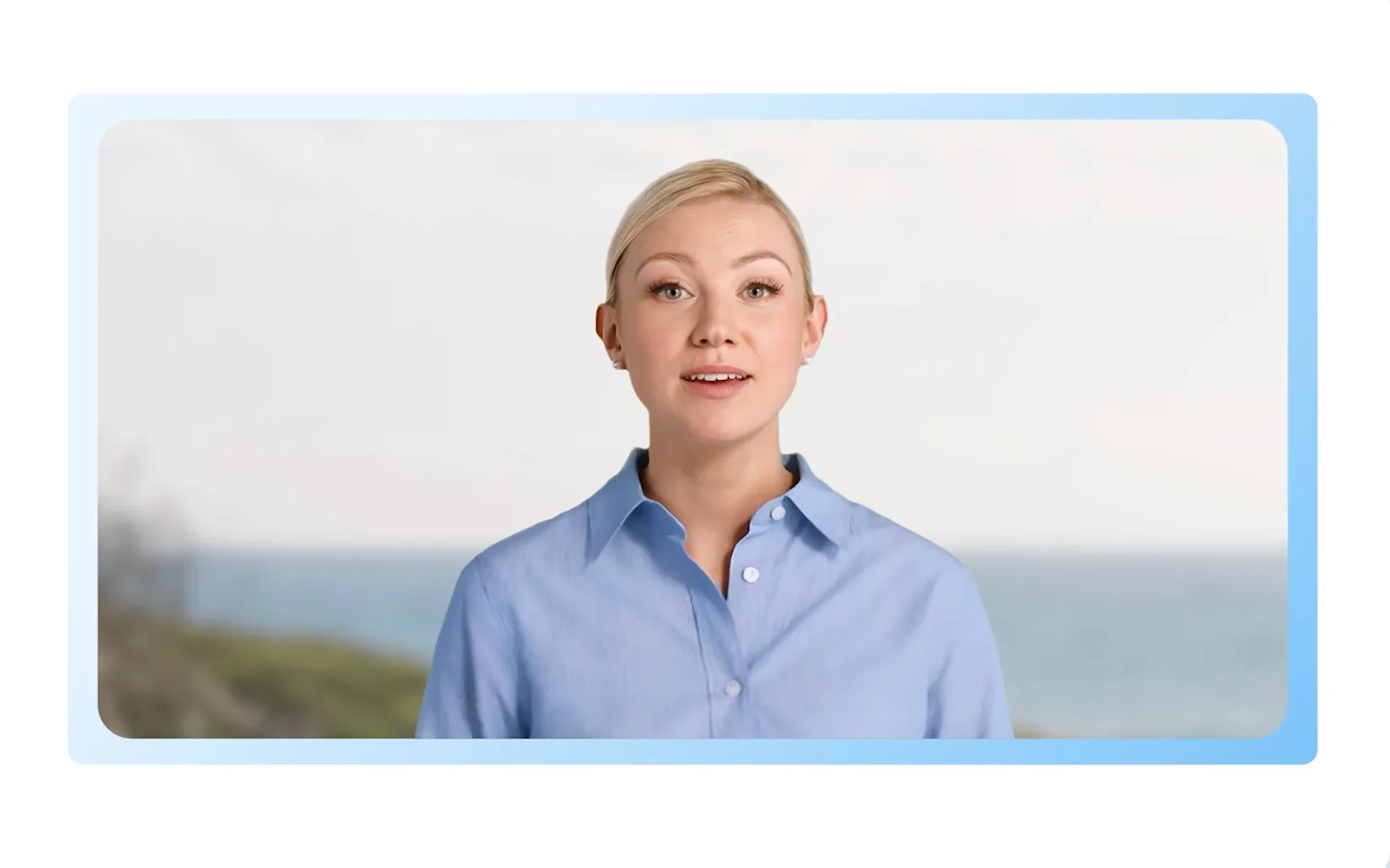
How to use this file
1. Save this file as DESIGN.md in your project root (sibling to README.md).
2. AI agents that read project files (Claude Code, Cursor, v0, Lovable, Bolt, Windsurf) will discover it automatically.
3. Validate or export tokens with the official CLI:
npx @google/design.md lint DESIGN.md
npx @google/design.md export --format tailwind DESIGN.md
Developer Access
# Fetch the full brand kit
curl https://extractvibe.com/api/brand/synthesia.io \
  -H "x-api-key: ev_your_key"

# Export as CSS variables
curl https://extractvibe.com/api/extract/JOB_ID/export/css \
  -H "x-api-key: ev_your_key"

# Export as Tailwind config
curl https://extractvibe.com/api/extract/JOB_ID/export/tailwind \
  -H "x-api-key: ev_your_key"
Extract your own brand kit
Get colors, fonts, voice, and personality from any website in seconds. Open source.