
SWAYZE
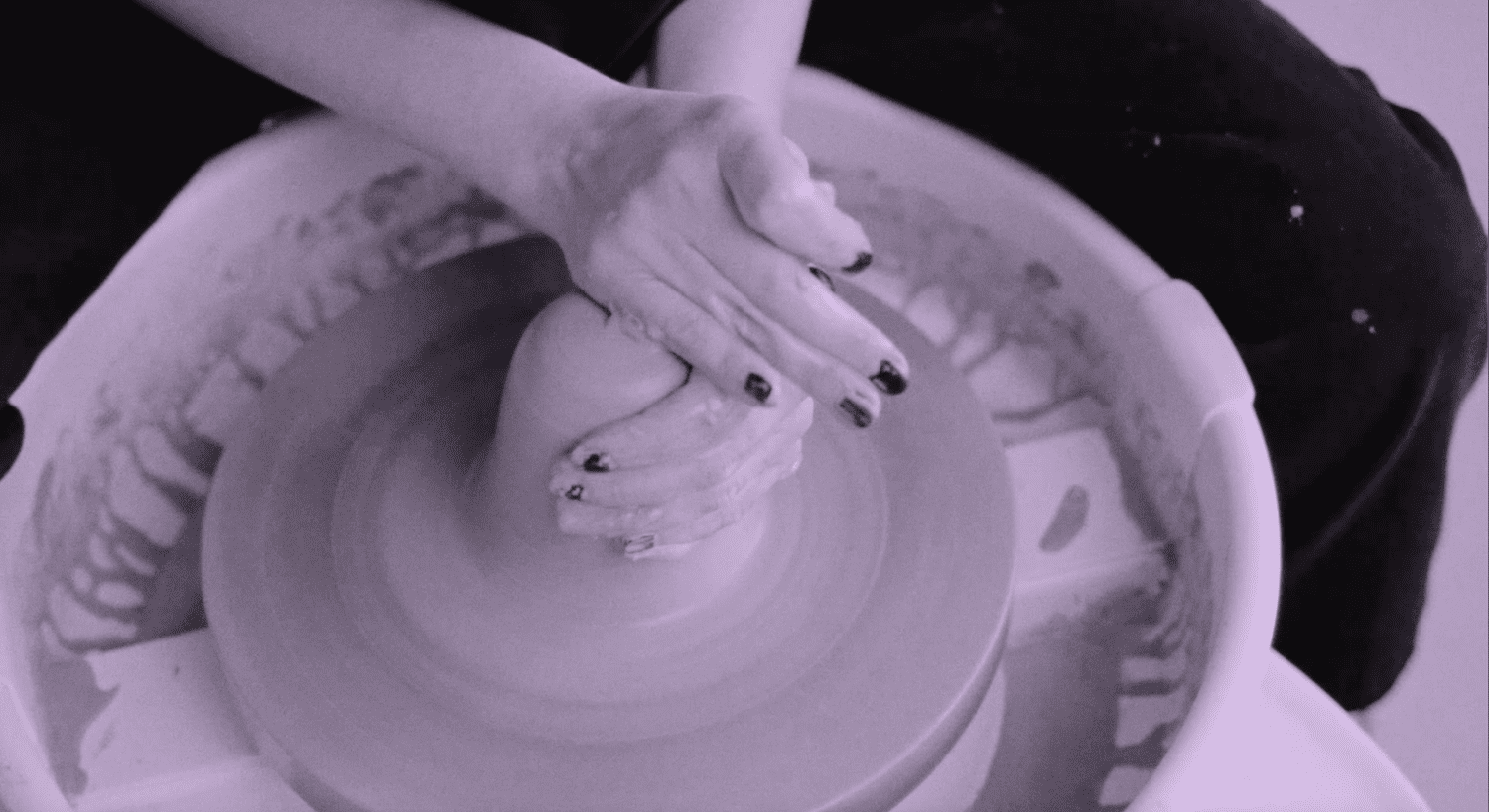
swayze.amsterdam“Swayze projects an inviting and accessible atmosphere, encouraging curiosity and creative exploration in ceramics. Its aesthetic blends a soft, natural palette with a clean, modern typography, suggesting a welcoming yet structured learning environment.”
Color Palette
Colors
Typography
Fonts
sans-serif
GeneralSans
Times New Roman
Times, serif
GeneralSans
graphie
The quick brown fox
15pxThe quick brown fox
66.84pxThe quick brown fox
18.456pxThe quick brown fox
20.184pxComponents
Design System
Voice & Tone
Personality
Visual Energy
Design Era
contemporary-minimal
Emotional Tone
friendly-approachable
Target Audience
Individuals new to ceramics or looking for a creative hobby, likely young adults to middle-aged, who appreciate a calm, inspiring, and easy-to-access learning experience.
Comparable Brands
Brand Rules
Dos & Don'ts
Do
- Utilize the primary color #e7cef2 for subtle accents and background elements, paired with #37201c for text and strong contrasts.
- Maintain a clean, minimal background using #fffff0 to ensure focus remains on content and ceramic creations.
- Employ GeneralSans at 700 weight in uppercase for all headings to convey a modern and clear tone.
- Use sans-serif (system font) or GeneralSans at 400 or 500 weight for body copy, ensuring high readability and a contemporary feel.
- Design secondary buttons with a #fffff0 background, #37201c text, a 300px border-radius for a pill shape, and 10px 20px padding, with no visible border.
- Implement action-oriented imperative verbs for all Calls to Action (CTAs), such as 'BOOK CLASSES NOW', often with repetition for emphasis.
- Adhere to a base spacing unit of 2px for all layout and component spacing, ensuring consistent visual rhythm.
- Apply a large border-radius of 300px to interactive elements like buttons, creating a soft, approachable, and pill-shaped aesthetic.
Don't
- Avoid using box-shadows or gradients anywhere in the design, maintaining a flat and clean visual style.
- Do not incorporate emojis or excessive exclamation marks in marketing copy; maintain a slightly enthusiastic yet grounded tone.
- Refrain from using technical jargon; all language should be simple and accessible to 'curious minds'.
- Do not use serif fonts for headings; GeneralSans in uppercase is the designated heading font.
- Avoid sharp corners; all interactive elements and containers should feature a generous border-radius, with 300px being the standard for buttons.
- Do not introduce vibrant or highly saturated colors; stick to the established muted and natural color palette.
- Do not use complex visual effects or overlays; the design should remain clean, straightforward, and focused on content.
Design Assets
Visual Elements


<!-- Generated by ExtractVibe — https://extractvibe.com/brand/swayze.amsterdam -->
<!-- Extracted: 2026-10-31T15:09:53.674Z | Schema: v1 | Quality: 90/100 -->
---
version: alpha
name: "SWAYZE"
description: "Swayze projects an inviting and accessible atmosphere, encouraging curiosity and creative exploration in ceramics. Its aesthetic blends a soft, natural palette with a clean, modern typography, suggesting a welcoming yet structured learning environment."
colors:
  primary: "#e7cef2"
  tertiary: "#37201c"
  surface: "#fffff0"
  on-surface: "#37201c"
  border: "#e7cef2"
typography:
  display-lg:
    fontFamily: "GeneralSans"
    fontSize: "66.84px"
    fontWeight: "700"
    lineHeight: "64.7011px"
  headline-lg:
    fontFamily: "GeneralSans"
    fontSize: "18.456px"
    fontWeight: "700"
    lineHeight: "18.6775px"
  headline-sm:
    fontFamily: "GeneralSans"
    fontSize: "20.184px"
    fontWeight: "700"
    lineHeight: "21.936px"
  body-md:
    fontFamily: "sans-serif"
    fontSize: "15px"
    fontWeight: "400"
rounded:
  md: "300px"
  full: "9999px"
spacing:
  base: "2px"
  xs: "1px"
  sm: "2px"
  md: "4px"
  lg: "6px"
  xl: "8px"
components:
  button-secondary:
    backgroundColor: "#fffff0"
    textColor: "#37201c"
    rounded: "300px"
    padding: "10px 20px"
    fontSize: "13.272px"
    fontWeight: "400"
    borderColor: "#fffff0"
    borderWidth: "1px"
---

# SWAYZE — Design System

## Overview

Swayze establishes an inviting and accessible atmosphere, fostering curiosity and creative exploration within ceramics. The design system embodies The Creator and The Innocent archetypes, translating into a visual language that is both welcoming and inspiring. It draws parallels with the approachable educational platforms of Skillshare and the curated craft community of Etsy workshops, while also reflecting the modern lifestyle sensibility of Madewell. The aesthetic blends a soft, natural color palette with clean, modern typography, suggesting a structured yet playful learning environment. This approach ensures users feel encouraged to experiment and learn without intimidation.

This design system explicitly avoids a corporate or overly academic tone. It is not rigid, exclusive, or overtly luxurious. Instead, Swayze prioritizes warmth, clarity, and ease of use, ensuring the design facilitates engagement rather than creating barriers. The visual identity communicates that ceramics is an accessible and enjoyable pursuit for everyone, from beginners to experienced practitioners. The design is grounded, authentic, and promotes a sense of discovery and personal growth, aligning with the brand's core values of creativity and accessibility.

**Key characteristics:**

- Vibe — welcoming, creative, accessible, modern, earthy, playful
- Archetypes — The Creator, The Innocent
- Comparable to — Skillshare, Etsy (craft workshops), ClassPass (creative classes), Madewell (lifestyle)
- Design era — contemporary-minimal
- Emotional tone — friendly-approachable
- Target audience — Individuals new to ceramics or looking for a creative hobby, likely young adults to middle-aged, who appreciate a calm, inspiring, and easy-to-access learning experience.
- Visual energy — 4/10 (moderate)

## Colors

The Swayze color palette centers on a primary hue of #e7cef2, a soft lavender that evokes creativity and calm, while the surface color #fffff0, a creamy off-white, provides a warm, earthy foundation. This combination signals an accessible and welcoming environment. The palette avoids harsh contrasts, instead opting for gentle transitions that reinforce the brand's inviting and natural character. It supports the 'welcoming, earthy, playful' vibe tags, ensuring a visually comfortable and inspiring experience.

### Light mode

| Role | Hex | Name |
|------|-----|------|
| primary | `#e7cef2` | Gainsboro |
| accent / tertiary | `#37201c` | Near-Black |
| background | `#fffff0` | Ivory |
| text | `#37201c` | Near-Black |
| border | `#e7cef2` | Gainsboro |

## Typography

Swayze's typography system utilizes GeneralSans for primary text and headings, paired with Times New Roman for specific accents or body copy where a touch of classic craftsmanship is desired. GeneralSans provides a clean, modern, and highly readable foundation, communicating clarity and accessibility. The subtle integration of Times New Roman adds a sophisticated yet grounded counterpoint, hinting at the heritage and artistry of ceramics. This hierarchy ensures information is digestible while maintaining an approachable and refined brand voice.

### Font families

| Family | Role | Source | Weights |
|--------|------|--------|---------|
| sans-serif | body | system | 400 |
| GeneralSans | heading | self-hosted | 700 |
| Times New Roman | body | system | 400 |
| GeneralSans | body | self-hosted | 400, 500 |
| graphie | body | self-hosted | 500 |

### Type scale

| Role | Family | Size | Weight | Line height | Letter spacing |
|------|--------|------|--------|-------------|----------------|
| Display | GeneralSans | 66.84px | 700 | 64.7011px | — |
| Heading 2 | GeneralSans | 18.456px | 700 | 18.6775px | — |
| Heading 4 | GeneralSans | 20.184px | 700 | 21.936px | — |
| Body | sans-serif | 15px | 400 | — | — |

### Conventions

- Heading case — uppercase

## Layout

- Base spacing unit — `2px`

## Shapes

Border-radius scale:

- `md` — 300px
- `full` — 9999px (pill / circular)

## Components

### Buttons

**Secondary**

- Background — `#fffff0`
- Text — `#37201c`
- Radius — `300px`
- Padding — `10px 20px`
- Font size — `13.272px`
- Font weight — `400`
- Border — `1px solid #fffff0`
- Sample copy — "Skip to Content"

## Do's and Don'ts

### Do

- Utilize the primary color #e7cef2 for subtle accents and background elements, paired with #37201c for text and strong contrasts.
- Maintain a clean, minimal background using #fffff0 to ensure focus remains on content and ceramic creations.
- Employ GeneralSans at 700 weight in uppercase for all headings to convey a modern and clear tone.
- Use sans-serif (system font) or GeneralSans at 400 or 500 weight for body copy, ensuring high readability and a contemporary feel.
- Design secondary buttons with a #fffff0 background, #37201c text, a 300px border-radius for a pill shape, and 10px 20px padding, with no visible border.
- Implement action-oriented imperative verbs for all Calls to Action (CTAs), such as 'BOOK CLASSES NOW', often with repetition for emphasis.
- Adhere to a base spacing unit of 2px for all layout and component spacing, ensuring consistent visual rhythm.
- Apply a large border-radius of 300px to interactive elements like buttons, creating a soft, approachable, and pill-shaped aesthetic.

### Don't

- Avoid using box-shadows or gradients anywhere in the design, maintaining a flat and clean visual style.
- Do not incorporate emojis or excessive exclamation marks in marketing copy; maintain a slightly enthusiastic yet grounded tone.
- Refrain from using technical jargon; all language should be simple and accessible to 'curious minds'.
- Do not use serif fonts for headings; GeneralSans in uppercase is the designated heading font.
- Avoid sharp corners; all interactive elements and containers should feature a generous border-radius, with 300px being the standard for buttons.
- Do not introduce vibrant or highly saturated colors; stick to the established muted and natural color palette.
- Do not use complex visual effects or overlays; the design should remain clean, straightforward, and focused on content.

*Source — inferred*

## Voice

### Tone (1–10 scale)

| Axis | Score | Lean |
|------|-------|------|
| Formal ↔ Casual | 8/10 | casual |
| Playful ↔ Serious | 4/10 | playful |
| Enthusiastic ↔ Matter-of-fact | 6/10 | balanced |
| Respectful ↔ Irreverent | 2/10 | respectful |
| Technical ↔ Accessible | 9/10 | accessible |

### Copywriting style

- Avg. sentence length — 10 words
- Vocabulary — simple
- Jargon — none
- CTA style — action-oriented imperative verbs
- Rhetorical devices — repetition

### Sample copy

> Welcoming all curious minds to explore the world of clay.

> Swayze is a new ceramic studio in Amsterdam, welcoming all curious minds to explore the world of clay.

> BOOK CLASSES NOWBOOK CLASSES NOWBOOK CLASSES NOWBOOK CLASSES NOWBOOK CLASSES NOWBOOK CLASSES NOWBOOK CLASSES NOWBOOK CLASSES NOWBOOK CLASSES NOWBOOK CLASSES NOWBOOK CLASSES NOW BOOK CLASSES NOW BOOK CLASSES NOW

> Unwrap Happiness: Gift Cards Available Now!

> A ceramic project for creatives

## Logos

| Type | Variant | Format | URL | Confidence |
|------|---------|--------|-----|------------|
| primary | — | svg | [link](https://img.loadlogo.com/swayze.amsterdam) | 100% |
| favicon | — | ico | [link](brands/swayze.amsterdam/logo-0.ico) | 95% |
| primary | — | png | [link](brands/swayze.amsterdam/logo-1.png) | 85% |
| secondary | — | png | [link](brands/swayze.amsterdam/logo-2.png) | 85% |

## Sources

- Live brand page — https://extractvibe.com/brand/swayze.amsterdam
- Raw JSON — https://extractvibe.com/api/brand/swayze.amsterdam
- DESIGN.md (this file) — https://extractvibe.com/api/brand/swayze.amsterdam/design.md
- Extracted — 2026-10-31T15:09:53.674Z
- Generator — ExtractVibe vv1
- Quality score — 90/100
How to use this file
1. Save this file as DESIGN.md in your project root (sibling to README.md).
2. AI agents that read project files (Claude Code, Cursor, v0, Lovable, Bolt, Windsurf) will discover it automatically.
3. Validate or export tokens with the official CLI:
npx @google/design.md lint DESIGN.md
npx @google/design.md export --format tailwind DESIGN.md
Developer Access
# Fetch the full brand kit
curl https://extractvibe.com/api/brand/swayze.amsterdam \
  -H "x-api-key: ev_your_key"

# Export as CSS variables
curl https://extractvibe.com/api/extract/JOB_ID/export/css \
  -H "x-api-key: ev_your_key"

# Export as Tailwind config
curl https://extractvibe.com/api/extract/JOB_ID/export/tailwind \
  -H "x-api-key: ev_your_key"
Extract your own brand kit
Get colors, fonts, voice, and personality from any website in seconds. Open source.