
Supabase
supabase.com“Supabase projects a vibe of robust, developer-centric efficiency, blending the reliability of traditional SQL with the speed of modern JavaScript frameworks. It feels technical yet accessible, prioritizing clarity and performance over decorative flair, creating an environment where building production-grade apps feels straightforward and powerful.”
Color Palette
Colors
Light Mode
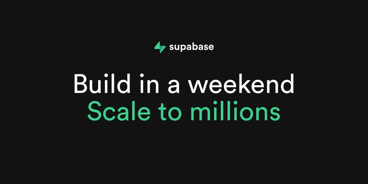
Dark Mode
Typography
Fonts
Circular
custom-font, Helvetica Neue, Helvetica, Arial, sans-serif
Circular
custom-font, Helvetica Neue, Helvetica, Arial, sans-serif
The quick brown fox
16pxThe quick brown fox
72pxThe quick brown fox
16pxThe quick brown fox
36pxThe quick brown fox
18pxThe quick brown fox
16pxComponents
Design System
rgba(0, 0, 0, 0) 0px 0px 0px 0px, rgba(0, 0, 0, 0) 0px 0px 0px 0px, rgba(0, 0, 0, 0) 0px 0px 0px 0px, rgba(0, 0, 0, 0) 0px 0px 0px 0px, rgba(0, 0, 0, 0) 0px 0px 0px 0px
rgba(0, 0, 0, 0) 0px 0px 0px 0px, rgba(0, 0, 0, 0) 0px 0px 0px 0px, rgba(0, 0, 0, 0) 0px 0px 0px 0px, rgba(0, 0, 0, 0) 0px 0px 0px 0px, rgba(0, 0, 0, 0.1) 0px 4px 6px -1px, rgba(0, 0, 0, 0.1) 0px 2px 4px -2px
rgba(0, 0, 0, 0) 0px 0px 0px 0px, rgba(0, 0, 0, 0) 0px 0px 0px 0px, rgba(0, 0, 0, 0) 0px 0px 0px 0px, rgba(0, 0, 0, 0) 0px 0px 0px 0px, rgba(0, 0, 0, 0.1) 0px 10px 15px -3px, rgba(0, 0, 0, 0.1) 0px 4px 6px -4px
linear-gradient(to top, rgba(0, 0, 0, 0) 0px, rgba(0, 0, 0, 0) 50%, rgb(23, 23, ...
radial-gradient(50% 100% at 50% 0px, rgba(0, 0, 0, 0) 0px, rgba(0, 0, 0, 0) 50%,...
linear-gradient(to right bottom in oklab, rgb(31, 31, 31) 0px, rgb(41, 41, 41) 1...
linear-gradient(in oklab, rgb(46, 46, 46) 0px, rgb(31, 31, 31) 100%)...
linear-gradient(to right in oklab, rgba(0, 0, 0, 0) 0px, rgb(46, 46, 46) 50%, rg...
Voice & Tone
Personality
Visual Energy
Design Era
contemporary-minimal
Emotional Tone
confident-technical
Target Audience
Software engineers, full-stack developers, and technical founders who value speed, scalability, and open-source transparency.
Comparable Brands
Brand Rules
Dos & Don'ts
Do
- Use Circular font for all text; apply weight 400 for body copy with a strict 24px line-height, and weight 400 for headings.
- Format all headings in sentence-case only; do not use title case or all-caps for primary headlines.
- Primary CTA buttons must use background #006239 with #fafafa text, 6px border-radius, and 4px 10px padding.
- Secondary buttons should use background #242424, border #363636, and #fafafa text with 6px border-radius.
- Outline buttons should have transparent background, #fafafa text, 6px border-radius, and 8px padding.
- Maintain a flat design aesthetic by avoiding drop shadows on interactive elements; use rgba(0,0,0,0) for all button shadows.
- Utilize subtle linear gradients (top-to-bottom fading to black) only for background overlays or section dividers, never on text or buttons.
- Keep copy concise and imperative; use action verbs like 'Build', 'Start', and 'Scale' without emojis or exclamations.
Don't
- Do not use serif fonts; the brand is strictly sans-serif (Circular).
- Do not use emojis or exclamation marks in any marketing copy or UI text.
- Do not apply drop shadows to buttons or cards; the design relies on flat contrast and borders.
- Do not use title case for headings; always use sentence case.
- Do not use bright or vibrant accent colors outside of the specified #3ecf8e green and #006239 dark green.
- Do not use pill-shaped buttons (100% radius); maintain a consistent 6px border-radius across all interactive elements.
- Do not use heavy or multi-layered shadows; the visual style is clean and flat.
- Do not use light mode backgrounds (#1c1c1c) for dark mode interfaces; strictly use #121212 for dark mode backgrounds.
Design Assets
Visual Elements


How to use this file
1. Save this file as DESIGN.md in your project root (sibling to README.md).
2. AI agents that read project files (Claude Code, Cursor, v0, Lovable, Bolt, Windsurf) will discover it automatically.
3. Validate or export tokens with the official CLI:
npx @google/design.md lint DESIGN.md
npx @google/design.md export --format tailwind DESIGN.md
Developer Access
# Fetch the full brand kit
curl https://extractvibe.com/api/brand/supabase.com \
  -H "x-api-key: ev_your_key"

# Export as CSS variables
curl https://extractvibe.com/api/extract/JOB_ID/export/css \
  -H "x-api-key: ev_your_key"

# Export as Tailwind config
curl https://extractvibe.com/api/extract/JOB_ID/export/tailwind \
  -H "x-api-key: ev_your_key"
Extract your own brand kit
Get colors, fonts, voice, and personality from any website in seconds. Open source.