
Spotify
spotify.com“Spotify projects an energetic and accessible vibe, positioning itself as a universal platform for music discovery and enjoyment. It combines a playful enthusiasm with a straightforward, user-friendly approach, making music readily available to everyone.”
Color Palette
Colors
Light Mode
Dark Mode
Typography
Fonts
SpotifyMixUI
CircularSp-Arab, CircularSp-Hebr, CircularSp-Cyrl, CircularSp-Grek, CircularSp-Deva, Helvetica Neue, helvetica, arial, Hiragino Sans, Hiragino Kaku Gothic ProN, Meiryo, MS Gothic
SpotifyMixUI
CircularSp-Arab, CircularSp-Hebr, CircularSp-Cyrl, CircularSp-Grek, CircularSp-Deva, Helvetica Neue, helvetica, arial, Hiragino Sans, Hiragino Kaku Gothic ProN, Meiryo, MS Gothic
SpotifyMixUITitle
CircularSp-Arab, CircularSp-Hebr, CircularSp-Cyrl, CircularSp-Grek, CircularSp-Deva, Helvetica Neue, helvetica, arial, Hiragino Sans, Hiragino Kaku Gothic ProN, Meiryo, MS Gothic
The quick brown fox
16pxThe quick brown fox
16pxThe quick brown fox
24pxThe quick brown fox
16pxThe quick brown fox
14.08pxThe quick brown fox
13.008pxComponents
Design System
Voice & Tone
Personality
Visual Energy
Design Era
flat-2.0
Emotional Tone
enthusiastic-accessible
Target Audience
Anyone seeking easy access to a vast music library, from casual listeners to avid music enthusiasts, across all demographics.
Comparable Brands
Brand Rules
Dos & Don'ts
Do
- Utilize SpotifyMixUI (weights 400, 700) for body text and general UI elements, and SpotifyMixUITitle (weight 700) for prominent headings, ensuring self-hosted font usage.
- Apply title-case for all headings, as exemplified by 'Your Library' and 'Trending songs'.
- Primary call-to-action buttons should use a background of #3860be with text color #555555, featuring a 17px border-radius and no padding or border.
- Secondary buttons should have a white background (#ffffff), text in #0000ee, a 0px border-radius, and a border of #0000ee, with no padding.
- Outline buttons should use white text (#ffffff), a 9999px border-radius, a #7c7c7c border, and 4px 16px 4px 36px padding.
- Maintain a dark mode background of #121212 with #b3b3b3 for text, ensuring high contrast and legibility.
- Adhere to a base spacing unit of 2px for all layout and component spacing.
- Implement border radii consistently using small (2px), medium (32px), and large (9999px) values for UI elements.
Don't
- Avoid using any box-shadows on UI elements; the brand maintains a flat aesthetic.
- Refrain from incorporating gradients in any visual elements; the brand uses solid color fills.
- Do not use emojis in any copy; the brand's content is direct and unadorned.
- Do not use exclamations in copy; the brand maintains an enthusiastic yet matter-of-fact tone.
- Do not deviate from the specified SpotifyMixUI and SpotifyMixUITitle font families; no other fonts are permitted.
- Avoid complex, multi-layered visual effects; the brand favors a clean, flat design approach.
- Do not introduce padding or borders to primary buttons; they are designed with a solid fill and specific radius.
Design Assets
Visual Elements
<!-- Generated by ExtractVibe — https://extractvibe.com/brand/spotify.com -->
<!-- Extracted: 2026-04-26T13:05:09.279Z | Schema: v1 | Quality: 100/100 -->
---
version: alpha
name: "Spotify"
description: "Spotify projects an energetic and accessible vibe, positioning itself as a universal platform for music discovery and enjoyment. It combines a playful enthusiasm with a straightforward, user-friendly approach, making music readily available to everyone."
colors:
primary: "#3860be"
tertiary: "#0000ee"
surface: "#121212"
border: "#b3b3b3"
link: "#0000ee"
surface-dark: "#121212"
on-surface-dark: "#b3b3b3"
typography:
display-lg:
fontFamily: "SpotifyMixUI"
fontSize: "16px"
fontWeight: "700"
headline-lg:
fontFamily: "SpotifyMixUITitle"
fontSize: "24px"
fontWeight: "700"
headline-md:
fontFamily: "SpotifyMixUI"
fontSize: "16px"
fontWeight: "700"
headline-sm:
fontFamily: "SpotifyMixUI"
fontSize: "14.08px"
fontWeight: "600"
lineHeight: "21.12px"
body-md:
fontFamily: "SpotifyMixUI"
fontSize: "16px"
fontWeight: "400"
rounded:
sm: "2px"
md: "32px"
lg: "9999px"
full: "9999px"
spacing:
base: "2px"
xs: "1px"
sm: "2px"
md: "4px"
lg: "6px"
xl: "8px"
components:
button-secondary:
backgroundColor: "#ffffff"
textColor: "#0000ee"
rounded: "0px"
padding: "0px"
fontSize: "16px"
fontWeight: "400"
borderColor: "#0000ee"
button-outline:
textColor: "#ffffff"
rounded: "9999px"
padding: "4px 16px 4px 36px"
fontSize: "14px"
fontWeight: "700"
borderColor: "#7c7c7c"
borderWidth: "1px"
button-primary:
backgroundColor: "#3860be"
textColor: "#555555"
rounded: "17px"
padding: "0px"
fontSize: "12px"
fontWeight: "700"
borderColor: "#bbbbbb"
borderWidth: "1px"
---
# Spotify — Design System
## Overview
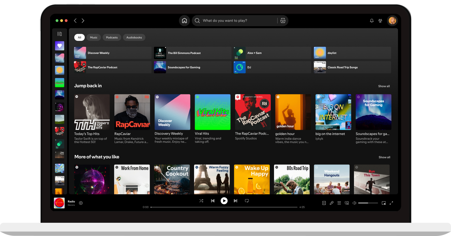
Spotify's design embodies the Everyman and Jester archetypes, creating an energetic, accessible, and user-friendly experience. The aesthetic aligns with modern digital platforms like Netflix, YouTube Music, and Apple Music, prioritizing directness and ease of use. This design language is not about exclusivity or high-brow sophistication; rather, it champions broad appeal and immediate engagement, making music discovery and enjoyment universally available. The visual identity avoids overly complex or ornate elements, opting instead for clean lines and intuitive layouts that facilitate seamless interaction. Playfulness is integrated through subtle cues and a vibrant energy, preventing the interface from feeling sterile or overly corporate. This approach ensures that the platform remains inviting and engaging for a diverse global audience, reflecting its core mission of connecting everyone with music.
The design ethos is grounded in a modern, direct approach, ensuring that users can effortlessly navigate and interact with content. It prioritizes functionality and clarity over stylistic excess. The design is not an exercise in minimalist austerity, nor does it lean into maximalist complexity. Instead, it strikes a balance that feels both contemporary and approachable, fostering a sense of familiarity and comfort. This strategic positioning allows Spotify to maintain its status as a leading music streaming service, consistently delivering an experience that is both engaging and effortlessly usable for millions of users worldwide.
**Key characteristics:**
- Vibe — energetic, accessible, modern, playful, user-friendly, direct
- Archetypes — The Everyman, The Jester
- Comparable to — Netflix, YouTube Music, Apple Music, TikTok
- Design era — flat-2.0
- Emotional tone — enthusiastic-accessible
- Target audience — Anyone seeking easy access to a vast music library, from casual listeners to avid music enthusiasts, across all demographics.
- Visual energy — 7/10 (high-energy/bold)
## Colors
The color philosophy centers on the primary brand color, `#3860be`, a vibrant and inviting blue that signals energy and accessibility. This is complemented by the deep surface color `#121212`, which provides a sophisticated backdrop, allowing content to pop and maintaining a modern, sleek aesthetic. The contrast ensures readability and visual hierarchy, reinforcing the brand's direct and user-friendly character while maintaining a playful, energetic undertone.
### Light mode
| Role | Hex | Name |
|------|-----|------|
| primary | `#3860be` | Royal Blue |
| accent / tertiary | `#0000ee` | Blue |
| background | `#121212` | Near-Black |
| border | `#b3b3b3` | Dark Silver |
| link | `#0000ee` | Blue |
### Dark mode
| Role | Hex | Name |
|------|-----|------|
| surface | `#121212` | Near-Black |
| background | `#121212` | Near-Black |
| text | `#b3b3b3` | Dark Silver |
## Typography
The type system utilizes SpotifyMixUI and SpotifyMixUITitle, a family designed for modern digital interfaces. SpotifyMixUITitle is reserved for prominent headings, establishing clear hierarchy and emphasizing key information. SpotifyMixUI handles body text and general UI elements, ensuring readability and consistency across the platform. This structured approach communicates clarity, efficiency, and a contemporary feel, aligning with Spotify's user-friendly and direct brand persona.
### Font families
| Family | Role | Source | Weights |
|--------|------|--------|---------|
| SpotifyMixUI | body | self-hosted | 400, 700 |
| SpotifyMixUI | heading | self-hosted | 600, 700 |
| SpotifyMixUITitle | heading | self-hosted | 700 |
### Type scale
| Role | Family | Size | Weight | Line height | Letter spacing |
|------|--------|------|--------|-------------|----------------|
| Display | SpotifyMixUI | 16px | 700 | — | — |
| Heading 2 | SpotifyMixUITitle | 24px | 700 | — | — |
| Heading 3 | SpotifyMixUI | 16px | 700 | — | — |
| Heading 4 | SpotifyMixUI | 14.08px | 600 | 21.12px | — |
| Body | SpotifyMixUI | 16px | 400 | — | — |
### Conventions
- Heading case — title-case
## Layout
- Base spacing unit — `2px`
## Shapes
Border-radius scale:
- `sm` — 2px
- `md` — 32px
- `lg` — 9999px
- `full` — 9999px (pill / circular)
## Components
### Buttons
**Secondary**
- Background — `#ffffff`
- Text — `#0000ee`
- Radius — `0px`
- Padding — `0px`
- Font size — `16px`
- Font weight — `400`
- Border — ` solid #0000ee`
- Sample copy — "Skip to main content"
**Outline**
- Text — `#ffffff`
- Radius — `9999px`
- Padding — `4px 16px 4px 36px`
- Font size — `14px`
- Font weight — `700`
- Border — `1px solid #7c7c7c`
- Sample copy — "English"
**Primary**
- Background — `#3860be`
- Text — `#555555`
- Radius — `17px`
- Padding — `0px`
- Font size — `12px`
- Font weight — `700`
- Border — `1px solid #bbbbbb`
- Sample copy — "Filter Icon"
## Do's and Don'ts
### Do
- Utilize SpotifyMixUI (weights 400, 700) for body text and general UI elements, and SpotifyMixUITitle (weight 700) for prominent headings, ensuring self-hosted font usage.
- Apply title-case for all headings, as exemplified by 'Your Library' and 'Trending songs'.
- Primary call-to-action buttons should use a background of #3860be with text color #555555, featuring a 17px border-radius and no padding or border.
- Secondary buttons should have a white background (#ffffff), text in #0000ee, a 0px border-radius, and a border of #0000ee, with no padding.
- Outline buttons should use white text (#ffffff), a 9999px border-radius, a #7c7c7c border, and 4px 16px 4px 36px padding.
- Maintain a dark mode background of #121212 with #b3b3b3 for text, ensuring high contrast and legibility.
- Adhere to a base spacing unit of 2px for all layout and component spacing.
- Implement border radii consistently using small (2px), medium (32px), and large (9999px) values for UI elements.
### Don't
- Avoid using any box-shadows on UI elements; the brand maintains a flat aesthetic.
- Refrain from incorporating gradients in any visual elements; the brand uses solid color fills.
- Do not use emojis in any copy; the brand's content is direct and unadorned.
- Do not use exclamations in copy; the brand maintains an enthusiastic yet matter-of-fact tone.
- Do not deviate from the specified SpotifyMixUI and SpotifyMixUITitle font families; no other fonts are permitted.
- Avoid complex, multi-layered visual effects; the brand favors a clean, flat design approach.
- Do not introduce padding or borders to primary buttons; they are designed with a solid fill and specific radius.
*Source — merged*
## Voice
### Tone (1–10 scale)
| Axis | Score | Lean |
|------|-------|------|
| Formal ↔ Casual | 7/10 | casual |
| Playful ↔ Serious | 8/10 | serious |
| Enthusiastic ↔ Matter-of-fact | 9/10 | matter-of-fact |
| Respectful ↔ Irreverent | 8/10 | irreverent |
| Technical ↔ Accessible | 7/10 | accessible |
### Copywriting style
- Avg. sentence length — 3 words
- Vocabulary — simple
- Jargon — some
- CTA style — action-oriented imperative verbs and benefit-focused phrases
### Sample copy
> Your Library
> Trending songs
> Sign up free
> Manage Consent Preferences
> Enable Tailored Advertising
## Logos
| Type | Variant | Format | URL | Confidence |
|------|---------|--------|-----|------------|
| primary | — | svg | [link](https://img.loadlogo.com/spotify.com) | 100% |
| favicon | — | png | [link](brands/spotify.com/logo-0.png) | 95% |
| favicon | — | png | [link](brands/spotify.com/logo-1.png) | 95% |
| favicon | — | ico | [link](brands/spotify.com/logo-2.ico) | 95% |
| favicon | — | png | [link](brands/spotify.com/logo-3.png) | 95% |
| favicon | — | png | [link](brands/spotify.com/logo-4.png) | 95% |
| favicon | — | png | [link](brands/spotify.com/logo-5.png) | 95% |
| favicon | — | png | [link](brands/spotify.com/logo-6.png) | 95% |
| favicon | — | png | [link](brands/spotify.com/logo-7.png) | 95% |
| favicon | — | png | [link](brands/spotify.com/logo-8.png) | 95% |
| primary | color | png | [link](brands/spotify.com/logo-9.png) | 85% |
| primary | color | svg | [link](brands/spotify.com/logo-10.svg) | 85% |
## Sources
- Official brand guidelines — https://spotify.com/brand
- Live brand page — https://extractvibe.com/brand/spotify.com
- Raw JSON — https://extractvibe.com/api/brand/spotify.com
- DESIGN.md (this file) — https://extractvibe.com/api/brand/spotify.com/design.md
- Extracted — 2026-04-26T13:05:09.279Z
- Generator — ExtractVibe vv1
- Quality score — 100/100
How to use this file
1. Save this file as DESIGN.md in your project root (sibling to README.md).
2. AI agents that read project files (Claude Code, Cursor, v0, Lovable, Bolt, Windsurf) will discover it automatically.
3. Validate or export tokens with the official CLI:
npx @google/design.md lint DESIGN.md
npx @google/design.md export --format tailwind DESIGN.md
Developer Access
# Fetch the full brand kit
curl https://extractvibe.com/api/brand/spotify.com \
  -H "x-api-key: ev_your_key"

# Export as CSS variables
curl https://extractvibe.com/api/extract/JOB_ID/export/css \
  -H "x-api-key: ev_your_key"

# Export as Tailwind config
curl https://extractvibe.com/api/extract/JOB_ID/export/tailwind \
  -H "x-api-key: ev_your_key"
Extract your own brand kit
Get colors, fonts, voice, and personality from any website in seconds. Open source.