
Render
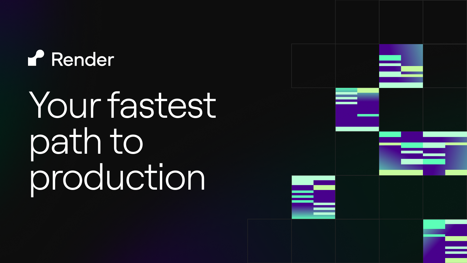
render.com“Render projects a sophisticated, builder-centric identity that balances technical precision with modern elegance. The brand feels like a premium tool for serious developers, utilizing a stark monochrome base punctuated by vibrant, abstract gradients to signal power and speed without sacrificing clarity.”
Color Palette
Colors
Typography
Fonts
ui-sans-serif
system-ui, sans-serif, Apple Color Emoji, Segoe UI Emoji, Segoe UI Symbol, Noto Color Emoji
Roobert
Roobert Fallback, sans-serif
Helvetica
Arial, Hiragino Sans GB, STXihei, Microsoft YaHei, WenQuanYi Micro Hei, Hind, MS Gothic, Apple SD Gothic Neo, NanumBarunGothic, sans-serif
PPNeueMontreal
PPNeueMontreal Fallback, sans-serif
The quick brown fox
16pxThe quick brown fox
80pxThe quick brown fox
64pxThe quick brown fox
32pxComponents
Design System
rgba(0, 0, 0, 0) 0px 0px 0px 0px, rgba(0, 0, 0, 0) 0px 0px 0px 0px, rgba(0, 0, 0, 0) 0px 0px 0px 0px
linear-gradient(to right, rgb(28, 0, 55), rgb(42, 0, 82), rgb(226, 166, 110))...
linear-gradient(to right, rgb(138, 5, 255), rgb(214, 127, 46))...
linear-gradient(to top, rgba(55, 49, 69, 0.16), rgba(55, 49, 69, 0.04))...
linear-gradient(120deg, rgb(255, 255, 255) 17.4%, rgb(231, 219, 255) 36.67%)...
linear-gradient(177deg, rgb(231, 219, 255) 56.49%, rgb(240, 240, 240) 12.68%)...
linear-gradient(rgba(0, 0, 0, 0), rgb(255, 255, 255))...
Voice & Tone
Personality
Visual Energy
Design Era
contemporary-minimal
Emotional Tone
confident-precise
Target Audience
Software engineers, CTOs, and technical founders who value infrastructure reliability, speed, and clean developer experience.
Comparable Brands
Brand Rules
Dos & Don'ts
Do
- Use Roobert (weights 300, 400) for all headings in sentence-case, and ui-sans-serif or Helvetica (weight 400) for body copy with a strict 24px line-height.
- Apply the primary accent color #7a3ff1 sparingly for key interactive states or highlights, while maintaining #0d0d0d as the dominant text and UI color.
- Style primary action buttons as outlined elements with 50% border-radius (pill shape), white text, and zero padding to create a sleek, low-profile interaction.
- Style secondary buttons as flat rectangles with 0px border-radius, #0d0d0d text, #ffffff background, and a 1px #0d0d0d border.
- Utilize linear gradients only for background accents or hero sections, specifically using the brand's signature purple-to-orange transitions (e.g., #8a05ff to #d67f2e) to add visual depth without clutter.
- Maintain a flat, minimal aesthetic by avoiding shadows on UI components; only use the specific modal shadow configuration if absolutely necessary for layering context.
- Adhere to a 2px base spacing unit for all margins, padding, and grid gaps to ensure precise, algorithmic layout consistency.
- Keep copy concise and imperative, avoiding emojis and excessive exclamations to maintain a professional, matter-of-fact tone.
Don't
- Do not use title case or ALL CAPS for headings; strictly enforce sentence-case capitalization.
- Do not use serif fonts anywhere in the interface; the brand is strictly sans-serif (Roobert, Helvetica, system-ui).
- Do not use rounded corners on secondary buttons or cards; maintain sharp 0px corners for structural elements.
- Do not apply drop shadows to buttons or primary content cards; reserve visual depth for subtle background gradients only.
- Do not use vibrant colors for body text or icons; reserve #0d0d0d for text and #7a3ff1 for accent interactions only.
- Do not use emoji in marketing copy or UI labels; the brand tone is serious and professional.
- Do not use bold weights (700+) for body text; stick to 400 for readability and a lighter, more airy feel.
- Do not use large padding on buttons; keep button padding at 0px to rely on the text size and border for definition.
Design Assets
Visual Elements


How to use this file
1. Save this file as DESIGN.md in your project root (sibling to README.md).
2. AI agents that read project files (Claude Code, Cursor, v0, Lovable, Bolt, Windsurf) will discover it automatically.
3. Validate or export tokens with the official CLI:
npx @google/design.md lint DESIGN.md
npx @google/design.md export --format tailwind DESIGN.md
Developer Access
# Fetch the full brand kit
curl https://extractvibe.com/api/brand/render.com \
  -H "x-api-key: ev_your_key"

# Export as CSS variables
curl https://extractvibe.com/api/extract/JOB_ID/export/css \
  -H "x-api-key: ev_your_key"

# Export as Tailwind config
curl https://extractvibe.com/api/extract/JOB_ID/export/tailwind \
  -H "x-api-key: ev_your_key"
Extract your own brand kit
Get colors, fonts, voice, and personality from any website in seconds. Open source.