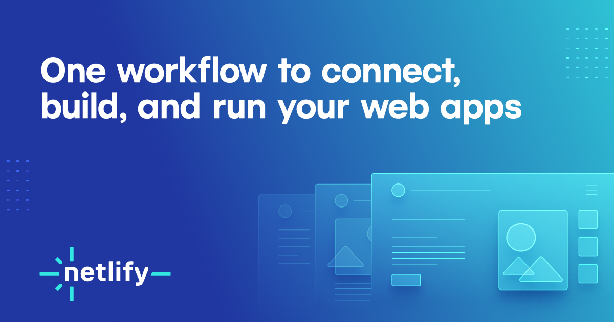

Netlify
netlify.com“Netlify projects a highly functional, developer-centric aesthetic that prioritizes clarity and speed over decorative flair. The brand feels like a precise engineering tool: clean, monochromatic, and grounded in technical reliability, using sharp geometric forms and dense typographic hierarchy to communicate efficiency.”
Color Palette
Colors
Typography
Fonts
Instrument Sans
system-ui, Helvetica, sans-serif
Figtree
system-ui, Helvetica, sans-serif
Martian Mono
ui-monospace, Cascadia Code, Source Code Pro, Menlo, Consolas, DejaVu Sans Mono, monospace
Figtree
system-ui, Helvetica, sans-serif
Martian Mono
ui-monospace, Cascadia Code, Source Code Pro, Menlo, Consolas, DejaVu Sans Mono, monospace
The quick brown fox
16pxThe quick brown fox
64pxThe quick brown fox
48.64pxThe quick brown fox
12pxThe quick brown fox
14pxThe quick brown fox
13.008pxComponents
Design System
color(srgb 0 0 0 / 0.07) 0px 16px 24px 0px, color(srgb 0 0 0 / 0.06) 0px 6px 30px 0px, color(srgb 0 0 0 / 0.1) 0px 8px 10px 0px
oklab(0 0 0 / 0) 0px 0px 0px 0px, oklab(0 0 0 / 0) 0px 0px 0px 0px
color(srgb 0 0 0 / 0.25) 0px 4px 12px 0px
Voice & Tone
Personality
Visual Energy
Design Era
contemporary-minimal
Emotional Tone
competent-reliable
Target Audience
Software engineers, developers, and technical founders who value speed, infrastructure reliability, and code-first workflows.
Comparable Brands
Brand Rules
Dos & Don'ts
Do
- Use Figtree (700/800 weight) for all primary headings in sentence-case, and Instrument Sans (400/600) for body copy with a strict 24px line-height.
- Apply Martian Mono (400 weight) exclusively for all code snippets, technical identifiers, and inline code elements.
- Style primary action buttons (e.g., 'Sign up') as outline variants with 360px border-radius (pill shape), 10px vertical/17px horizontal padding, and #181a1c text color.
- Style secondary buttons with a 4px border-radius, 8px/16px padding, #ffffff background, #181a1c text, and a specific shadow: color(srgb 0 0 0 / 0.25) 0px 4px 12px 0px.
- Maintain a strictly monochromatic palette using #ffffff for backgrounds and #181a1c for primary text; avoid introducing vibrant accent colors in UI elements.
- Use subtle, multi-layered shadows for floating elements like dropdowns (e.g., color(srgb 0 0 0 / 0.07) 0px 16px 24px 0px) to create depth without clutter.
- Keep navigation and header elements flat with no shadows (oklab(0 0 0 / 0)), ensuring a clean, unobstructed top-of-page experience.
- Use ghost buttons (360px radius, 10px/17px padding) for secondary actions like 'fetch https://netlify.ai' to maintain visual hierarchy without competing with primary CTAs.
Don't
- Do not use gradients anywhere in the interface; the design relies on flat surfaces and subtle shadows for depth.
- Do not use title case for headings; strictly adhere to sentence-case for all typographic hierarchy.
- Do not use emoji in marketing copy or UI labels; the brand maintains a serious, technical tone with rare or no emoji usage.
- Do not use serif fonts; the entire system is built on sans-serif (Instrument Sans, Figtree) and mono-spaced (Martian Mono) typefaces.
- Do not apply heavy or colored shadows to buttons; use only the specified neutral black shadow with 25% opacity for secondary buttons.
- Do not use sharp corners on interactive elements like 'Sign up' or ghost buttons; reserve 4px radius only for specific secondary UI components, using 360px for main actions.
- Do not use excessive whitespace for the sake of minimalism; the layout is dense and information-rich, reflecting a tool-like utility.
- Do not use bright or saturated colors for text or backgrounds; stick to the high-contrast black-and-white scheme to ensure readability and focus.
Design Assets
Visual Elements


How to use this file
1. Save this file as DESIGN.md in your project root (sibling to README.md).
2. AI agents that read project files (Claude Code, Cursor, v0, Lovable, Bolt, Windsurf) will discover it automatically.
3. Validate or export tokens with the official CLI:
npx @google/design.md lint DESIGN.md
npx @google/design.md export --format tailwind DESIGN.md
Developer Access
# Fetch the full brand kit
curl https://extractvibe.com/api/brand/netlify.com \
  -H "x-api-key: ev_your_key"

# Export as CSS variables
curl https://extractvibe.com/api/extract/JOB_ID/export/css \
  -H "x-api-key: ev_your_key"

# Export as Tailwind config
curl https://extractvibe.com/api/extract/JOB_ID/export/tailwind \
  -H "x-api-key: ev_your_key"
Extract your own brand kit
Get colors, fonts, voice, and personality from any website in seconds. Open source.