
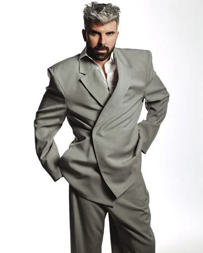
Звездный вокальный тренер Михаил Касымов приглашает к себе на обучение
mkasymov.ru“A sophisticated, high-end educational brand that blends classical authority with modern accessibility. The aesthetic is clean and editorial, utilizing stark contrasts and serif typography to convey prestige and expertise in vocal training.”
Color Palette
Colors
Light Mode
Dark Mode
Typography
Fonts
Times New Roman
Noto Sans
Arial, sans-serif
Arial
Noto Sans
Arial, sans-serif
The quick brown fox
16pxThe quick brown fox
34pxThe quick brown fox
18pxComponents
Design System
Voice & Tone
Personality
Visual Energy
Design Era
classic-editorial
Emotional Tone
trustworthy-premium
Target Audience
Adults and children seeking high-quality, professional vocal instruction in Moscow, likely valuing prestige, quality of space, and expert mentorship.
Comparable Brands
Brand Rules
Dos & Don'ts
Do
- Use Noto Sans (weights 400, 500) for all headings in sentence-case, and Times New Roman (weight 400) for body text to maintain an editorial, classic feel.
- Primary Call-to-Action buttons must be pill-shaped (border-radius: 60px), using an outline style with #000000 border and #ffffff text, labeled 'ЗАПИСЬ НА УРОК'.
- Maintain a high-contrast monochrome palette: use #222222 for primary text/elements and #ffffff for backgrounds in light mode; invert to #000000 background with white text in dark mode.
- Apply the accent color #e00000 sparingly, strictly for highlighting key value propositions or secondary interactive elements, never as a dominant background.
- Keep all UI elements flat with zero box-shadows and zero gradients to ensure a clean, modern, and distraction-free interface.
- Use Arial (weight 400) as a fallback for body text if Times New Roman is unavailable, ensuring consistent 400 weight across sans-serif fallbacks.
- Maintain ample whitespace around content blocks; avoid cluttered layouts to reflect the 'best space in Moscow' premium positioning.
- Use secondary buttons with #ffffff background and #ffffff text (likely for dark mode contexts or specific contrast needs) with a small 5px border-radius for subtle distinction from primary CTAs.
Don't
- Do not use title case for headings; strictly adhere to sentence-case conventions for all headings.
- Do not use emojis, exclamations, or playful language in copy; maintain a formal, matter-of-fact tone with moderate vocabulary.
- Do not apply any box-shadows, gradients, or depth effects to cards, buttons, or images; the design must remain strictly flat.
- Do not use serif fonts for headings; reserve Times New Roman exclusively for body copy to preserve the editorial hierarchy.
- Do not use bright or saturated colors other than #e00000 as an accent; avoid neon colors or multi-color palettes.
- Do not use rounded corners on secondary elements (like input fields or small tags); reserve the 60px pill shape only for primary CTAs.
- Do not mix font families within the same paragraph; stick to Noto Sans for headings and Times New Roman/Arial for body.
- Do not use all-caps for body text; reserve capitalization for specific UI labels or the primary CTA button text.
Design Assets
Visual Elements



<!-- Generated by ExtractVibe — https://extractvibe.com/brand/mkasymov.ru -->
<!-- Extracted: 2026-08-29T20:33:36.040Z | Schema: v1 | Quality: 100/100 -->
---
version: alpha
name: "Звездный вокальный тренер Михаил Касымов приглашает к себе на обучение"
description: "A sophisticated, high-end educational brand that blends classical authority with modern accessibility. The aesthetic is clean and editorial, utilizing stark contrasts and serif typography to convey prestige and expertise in vocal training."
colors:
  primary: "#222222"
  tertiary: "#e00000"
  neutral: "#7e7e7e"
  surface: "#ffffff"
  on-surface: "#000000"
  on-surface-secondary: "#7e7e7e"
  border: "#e8e8e8"
  surface-dark: "#000000"
typography:
  headline-lg:
    fontFamily: "Noto Sans"
    fontSize: "34px"
    fontWeight: "400"
    lineHeight: "34px"
  headline-md:
    fontFamily: "Noto Sans"
    fontSize: "18px"
    fontWeight: "500"
    lineHeight: "18px"
  body-md:
    fontFamily: "Times New Roman"
    fontSize: "16px"
    fontWeight: "400"
rounded:
  sm: "5px"
  md: "60px"
  lg: "100px"
  full: "9999px"
components:
  button-outline:
    textColor: "#ffffff"
    rounded: "60px"
    padding: "0px"
    fontSize: "14px"
    fontWeight: "400"
    borderColor: "#000000"
    borderWidth: "1px"
  button-secondary:
    backgroundColor: "#ffffff"
    textColor: "#ffffff"
    rounded: "5px"
    padding: "0px"
    fontSize: "16px"
    fontWeight: "400"
    borderWidth: "1px"
---

# Звездный вокальный тренер Михаил Касымов приглашает к себе на обучение — Design System

## Overview

The visual identity establishes a commanding presence through editorial minimalism, merging the gravitas of classical tradition with the clarity of modern digital interfaces. This aesthetic draws direct inspiration from the authoritative layouts of The New York Times and the refined luxury of Sotheby's, ensuring that every interaction feels curated and prestigious. The design atmosphere is not casual or playful; it is serious, focused, and intellectually stimulating, designed to elevate the perception of vocal training from a hobby to a masterclass in artistry. Stark contrasts define the user experience, utilizing deep, near-black tones against expansive white space to guide the eye with precision and reduce cognitive load. This approach aligns with the Sage and Ruler archetypes, projecting an image of unassailable expertise and high standards. The interface avoids decorative clutter, prioritizing content hierarchy and readability to foster trust and authority. By adopting a clean, systematic structure reminiscent of Apple Education, the design ensures that the sophisticated brand personality remains accessible, creating an environment where users feel they are engaging with elite instruction. The overall effect is one of quiet confidence, where the absence of noise amplifies the value of the expertise offered.

**Key characteristics:**

- Vibe — premium, editorial, classical, clean, authoritative, minimal
- Archetypes — The Sage, The Ruler
- Comparable to — MasterClass, The New York Times, Sotheby's, Apple Education
- Design era — classic-editorial
- Emotional tone — trustworthy-premium
- Target audience — Adults and children seeking high-quality, professional vocal instruction in Moscow, likely valuing prestige, quality of space, and expert mentorship.
- Visual energy — 4/10 (moderate)

## Colors

The palette relies on a strict binary of #222222 and #ffffff to convey absolute clarity and sophistication. The near-black primary color replaces standard black to reduce visual strain while maintaining high contrast, signaling premium quality and depth. The white surface provides a sterile, gallery-like backdrop that ensures content remains the focal point. This restrained approach eliminates ambiguity, reinforcing the brand's authoritative and timeless character through pure, unadulterated contrast.

### Light mode

| Role | Hex | Name |
|------|-----|------|
| primary | `#222222` | Near-Black |
| accent / tertiary | `#e00000` | Red |
| background | `#ffffff` | White |
| text | `#000000` | Black |
| secondary text | `#7e7e7e` | Gray |
| border | `#e8e8e8` | Lavender |
| muted | `#7e7e7e` | Gray |

### Dark mode

| Role | Hex | Name |
|------|-----|------|
| background | `#000000` | Black |

## Typography

The type system pairs Times New Roman with Noto Sans to bridge classical heritage and modern functionality. Serif headings invoke the editorial weight of The New York Times, establishing immediate credibility and tradition. Sans-serif body text ensures high legibility and contemporary accessibility, balancing the formality of the display type. This hierarchy communicates that while the art of singing is rooted in history, the training method is current, precise, and professionally structured.

### Font families

| Family | Role | Source | Weights |
|--------|------|--------|---------|
| Times New Roman | body | system | 400 |
| Noto Sans | heading | google-fonts | 400, 500 |
| Arial | body | system | 400 |
| Noto Sans | body | google-fonts | 400 |

### Type scale

| Role | Family | Size | Weight | Line height | Letter spacing |
|------|--------|------|--------|-------------|----------------|
| Heading 2 | Noto Sans | 34px | 400 | 34px | — |
| Heading 3 | Noto Sans | 18px | 500 | 18px | — |
| Body | Times New Roman | 16px | 400 | — | — |

### Conventions

- Heading case — sentence-case

## Shapes

Border-radius scale:

- `sm` — 5px
- `md` — 60px
- `lg` — 100px
- `full` — 9999px (pill / circular)

## Components

### Buttons

**Outline**

- Text — `#ffffff`
- Radius — `60px`
- Padding — `0px`
- Font size — `14px`
- Font weight — `400`
- Border — `1px solid #000000`
- Sample copy — "ЗАПИСЬ НА УРОК"

**Secondary**

- Background — `#ffffff`
- Text — `#ffffff`
- Radius — `5px`
- Padding — `0px`
- Font size — `16px`
- Font weight — `400`

## Do's and Don'ts

### Do

- Use Noto Sans (weights 400, 500) for all headings in sentence-case, and Times New Roman (weight 400) for body text to maintain an editorial, classic feel.
- Primary Call-to-Action buttons must be pill-shaped (border-radius: 60px), using an outline style with #000000 border and #ffffff text, labeled 'ЗАПИСЬ НА УРОК'.
- Maintain a high-contrast monochrome palette: use #222222 for primary text/elements and #ffffff for backgrounds in light mode; invert to #000000 background with white text in dark mode.
- Apply the accent color #e00000 sparingly, strictly for highlighting key value propositions or secondary interactive elements, never as a dominant background.
- Keep all UI elements flat with zero box-shadows and zero gradients to ensure a clean, modern, and distraction-free interface.
- Use Arial (weight 400) as a fallback for body text if Times New Roman is unavailable, ensuring consistent 400 weight across sans-serif fallbacks.
- Maintain ample whitespace around content blocks; avoid cluttered layouts to reflect the 'best space in Moscow' premium positioning.
- Use secondary buttons with #ffffff background and #ffffff text (likely for dark mode contexts or specific contrast needs) with a small 5px border-radius for subtle distinction from primary CTAs.

### Don't

- Do not use title case for headings; strictly adhere to sentence-case conventions for all headings.
- Do not use emojis, exclamations, or playful language in copy; maintain a formal, matter-of-fact tone with moderate vocabulary.
- Do not apply any box-shadows, gradients, or depth effects to cards, buttons, or images; the design must remain strictly flat.
- Do not use serif fonts for headings; reserve Times New Roman exclusively for body copy to preserve the editorial hierarchy.
- Do not use bright or saturated colors other than #e00000 as an accent; avoid neon colors or multi-color palettes.
- Do not use rounded corners on secondary elements (like input fields or small tags); reserve the 60px pill shape only for primary CTAs.
- Do not mix font families within the same paragraph; stick to Noto Sans for headings and Times New Roman/Arial for body.
- Do not use all-caps for body text; reserve capitalization for specific UI labels or the primary CTA button text.

*Source — inferred*

## Voice

### Tone (1–10 scale)

| Axis | Score | Lean |
|------|-------|------|
| Formal ↔ Casual | 6/10 | balanced |
| Playful ↔ Serious | 7/10 | serious |
| Enthusiastic ↔ Matter-of-fact | 5/10 | balanced |
| Respectful ↔ Irreverent | 2/10 | respectful |
| Technical ↔ Accessible | 4/10 | technical |

### Copywriting style

- Avg. sentence length — 6 words
- Vocabulary — moderate
- Jargon — some
- CTA style — benefit-focused phrases with open-ended indicators
- Rhetorical devices — repetition, ellipsis

### Sample copy

> Современное обучение в лучшем пространстве Москвы.

> Любой уровень вашей подготовки.

> Для взрослых и детей.

> Все включено +

> Консультация

## Logos

| Type | Variant | Format | URL | Confidence |
|------|---------|--------|-----|------------|
| favicon | — | jpg | [link](brands/mkasymov.ru/logo-0.jpg) | 95% |
| favicon | — | png | [link](brands/mkasymov.ru/logo-1.png) | 95% |
| favicon | — | png | [link](brands/mkasymov.ru/logo-2.png) | 95% |
| favicon | — | png | [link](brands/mkasymov.ru/logo-3.png) | 95% |

## Sources

- Official brand guidelines — https://www.simpler.so/media-kit
- Live brand page — https://extractvibe.com/brand/mkasymov.ru
- Raw JSON — https://extractvibe.com/api/brand/mkasymov.ru
- DESIGN.md (this file) — https://extractvibe.com/api/brand/mkasymov.ru/design.md
- Extracted — 2026-08-29T20:33:36.040Z
- Generator — ExtractVibe vv1
- Quality score — 100/100
How to use this file
1. Save this file as DESIGN.md in your project root (sibling to README.md).
2. AI agents that read project files (Claude Code, Cursor, v0, Lovable, Bolt, Windsurf) will discover it automatically.
3. Validate or export tokens with the official CLI:
npx @google/design.md lint DESIGN.md
npx @google/design.md export --format tailwind DESIGN.md
Developer Access
# Fetch the full brand kit
curl https://extractvibe.com/api/brand/mkasymov.ru \
  -H "x-api-key: ev_your_key"

# Export as CSS variables
curl https://extractvibe.com/api/extract/JOB_ID/export/css \
  -H "x-api-key: ev_your_key"

# Export as Tailwind config
curl https://extractvibe.com/api/extract/JOB_ID/export/tailwind \
  -H "x-api-key: ev_your_key"
Extract your own brand kit
Get colors, fonts, voice, and personality from any website in seconds. Open source.