
Agencia de Marketing Industrial B2B en México | Marketeros®
marketerosmx.com“A high-contrast, industrial-grade B2B brand that prioritizes raw performance and direct action over aesthetic flair. The design is stark and utilitarian, using a black-and-orange palette to convey urgency, precision, and technical authority in the manufacturing sector.”
Color Palette
Colors
Light Mode
Dark Mode
Typography
Fonts
Inter
ui-sans-serif, system-ui, sans-serif
Inter
ui-sans-serif, system-ui, sans-serif
JetBrains Mono
ui-monospace, SFMono-Regular, Menlo, monospace
JetBrains Mono
ui-monospace, SFMono-Regular, Menlo, monospace
The quick brown fox
16pxThe quick brown fox
46.08pxThe quick brown fox
43.2pxThe quick brown fox
37.44pxThe quick brown fox
11.52pxComponents
Design System
rgba(0, 0, 0, 0) 0px 0px 0px 0px, rgba(0, 0, 0, 0) 0px 0px 0px 0px, rgba(0, 0, 0, 0) 0px 0px 0px 0px, rgba(0, 0, 0, 0) 0px 0px 0px 0px, rgba(0, 0, 0, 0.1) 0px 20px 25px -5px, rgba(0, 0, 0, 0.1) 0px 8px 10px -6px
rgba(0, 0, 0, 0) 0px 0px 0px 0px, rgba(0, 0, 0, 0) 0px 0px 0px 0px, rgba(0, 0, 0, 0) 0px 0px 0px 0px, rgba(0, 0, 0, 0) 0px 0px 0px 0px, rgba(0, 0, 0, 0.25) 0px 25px 50px -12px
rgba(0, 0, 0, 0) 0px 0px 0px 0px, rgba(0, 0, 0, 0) 0px 0px 0px 0px, rgba(0, 0, 0, 0) 0px 0px 0px 0px, rgba(0, 0, 0, 0) 0px 0px 0px 0px, rgba(0, 0, 0, 0.1) 0px 10px 15px -3px, rgba(0, 0, 0, 0.1) 0px 4px 6px -4px
rgba(0, 0, 0, 0) 0px 0px 0px 0px, rgba(0, 0, 0, 0) 0px 0px 0px 0px, rgba(0, 0, 0, 0) 0px 0px 0px 0px, rgba(0, 0, 0, 0) 0px 0px 0px 0px, oklab(0.71585 0.127689 0.144915 / 0.1) 0px 25px 50px -12px
linear-gradient(to right in oklab, rgba(0, 0, 0, 0) 0%, rgb(255, 117, 0) 50%, rg...
linear-gradient(to right bottom, oklch(0.08 0 0) 0%, rgb(0, 0, 0) 100%)...
linear-gradient(to top, oklab(0.08 0 0 / 0.8) 0%, rgba(0, 0, 0, 0) 50%, rgba(0, ...
linear-gradient(to top, oklch(0.08 0 0) 0%, oklab(0.08 0 0 / 0.4) 50%, rgba(0, 0...
Voice & Tone
Personality
Visual Energy
Design Era
neo-brutalism
Emotional Tone
authoritative-urgent
Target Audience
Industrial manufacturing executives, plant managers, and B2B sales directors in Mexico seeking reliable, high-volume lead generation and digital transformation.
Comparable Brands
Brand Rules
Dos & Don'ts
Do
- Use Inter font family exclusively; apply weight 900 for main headings and weight 700 for subheadings, while using weight 500 for body text.
- Maintain a strict sentence-case convention for all headings and body copy; never use title case or all-caps for standard text.
- Set primary background to #000000 (black) and text to #000000 (black) for light mode content areas, creating a stark, high-contrast reading environment.
- Use #ff7500 (vibrant orange) as the sole primary accent color for CTAs, links, and key visual highlights against the black background.
- Style primary buttons with 0px border-radius (sharp square corners), #ff7500 background, black text, and padding of 8px 16px.
- Apply a linear gradient transition from transparent to #ff7500 (oklab format) for hover states or section dividers, specifically: linear-gradient(to right in oklab, rgba(0, 0, 0, 0) 0%, rgb(255, 117, 0) 50%, rgb(255, 117, 0) 100%).
- Use JetBrains Mono (weight 500 or 700) for technical data points, metrics, or code-like elements to reinforce the industrial/technical aesthetic.
- Keep body line-height at exactly 24px for optimal readability on black backgrounds.
- Avoid all box shadows; maintain a completely flat design aesthetic with no depth effects or drop shadows on elements.
- Use a base spacing unit of 2px for all margins and padding calculations to ensure precise, grid-aligned layouts.
Don't
- Do not use serif fonts; the brand is strictly sans-serif (Inter) and monospace (JetBrains Mono).
- Do not use rounded corners (border-radius > 0px) on any buttons or cards; maintain sharp, industrial edges.
- Do not use emojis in marketing copy; the tone is serious and professional.
- Do not use excessive exclamations; keep punctuation minimal and direct.
- Do not use light mode backgrounds with black text for the entire page; reserve black backgrounds for hero sections and dark mode interfaces to create contrast.
- Do not use multi-layer shadows or complex gradients; keep visual effects minimal and functional.
- Do not use playful or whimsical imagery; stick to industrial, mechanical, or abstract data-visualization visuals.
- Do not use title case for headings; this breaks the brand's consistent sentence-case convention.
Design Assets
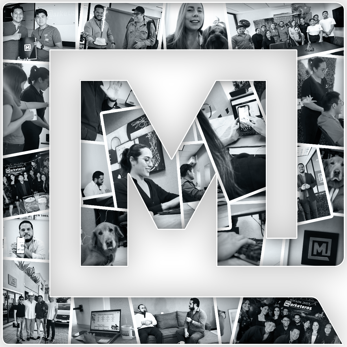
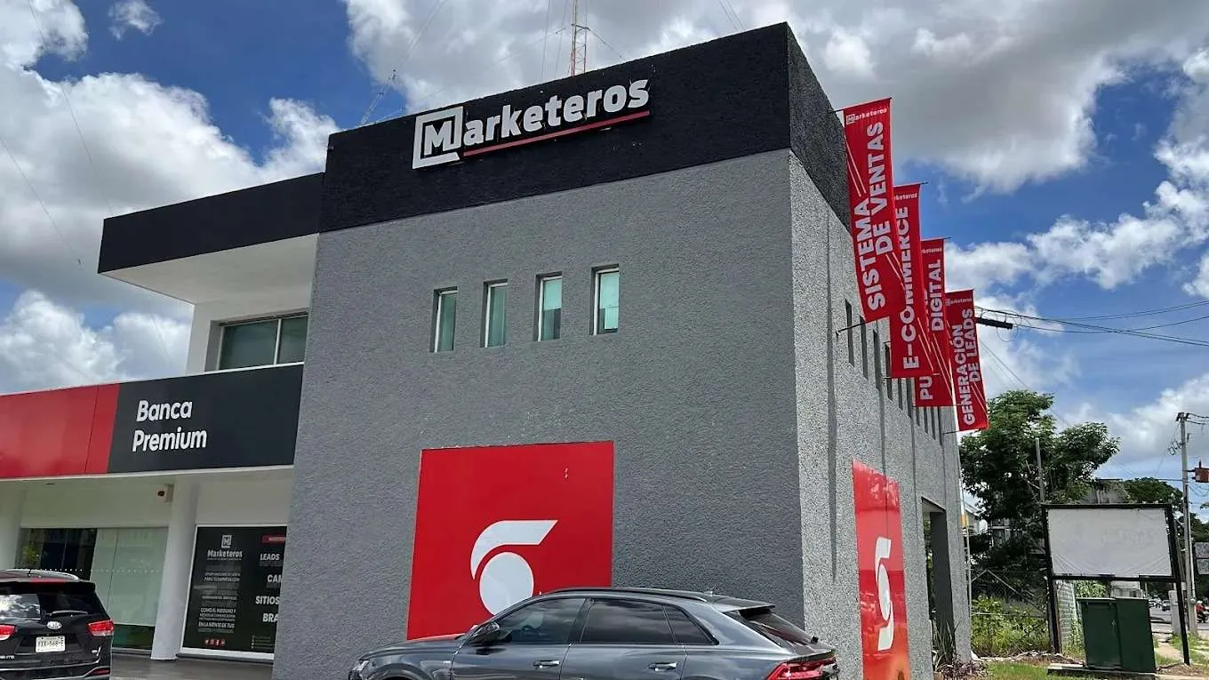
Visual Elements





How to use this file
1. Save this file as DESIGN.md in your project root (sibling to README.md).
2. AI agents that read project files (Claude Code, Cursor, v0, Lovable, Bolt, Windsurf) will discover it automatically.
3. Validate or export tokens with the official CLI:
npx @google/design.md lint DESIGN.md
npx @google/design.md export --format tailwind DESIGN.md
Developer Access
# Fetch the full brand kit
curl https://extractvibe.com/api/brand/marketerosmx.com \
  -H "x-api-key: ev_your_key"

# Export as CSS variables
curl https://extractvibe.com/api/extract/JOB_ID/export/css \
  -H "x-api-key: ev_your_key"

# Export as Tailwind config
curl https://extractvibe.com/api/extract/JOB_ID/export/tailwind \
  -H "x-api-key: ev_your_key"
Extract your own brand kit
Get colors, fonts, voice, and personality from any website in seconds. Open source.