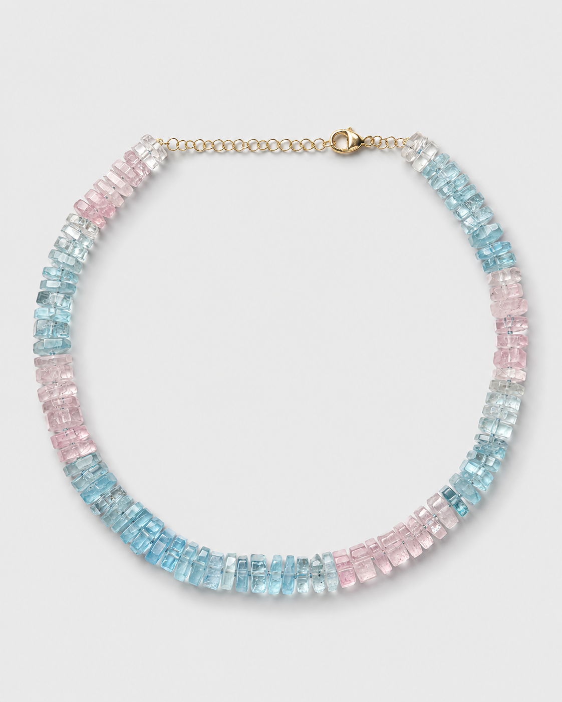
JIA JIA – JIAJIA
jiajiajewelry.com“JIA JIA embodies a serene, earth-rooted elegance that merges the raw authenticity of natural specimens with the refined precision of fine jewelry. The brand feels grounded, spiritual, and intellectually accessible, prioritizing truth and collective beauty over flashy luxury. It is a calm, minimalist sanctuary for those who value connection to the planet.”
Color Palette
Colors
Light Mode
Dark Mode
Typography
Fonts
AkzidenzGrotesk
serif
PPEditorialUltraLight
serif
AkzidenzGrotesk
serif
PPEditorialUltraLight
serif
The quick brown fox
14.5pxThe quick brown fox
60pxThe quick brown fox
15.95pxThe quick brown fox
15.95pxComponents
Design System
Voice & Tone
Personality
Visual Energy
Design Era
classic-editorial
Emotional Tone
serene-authentic
Target Audience
Conscious consumers, crystal enthusiasts, and jewelry lovers who value sustainability, spiritual connection, and understated luxury over overt status symbols.
Comparable Brands
Brand Rules
Dos & Don'ts
Do
- Use AkzidenzGrotesk (400/500 weight) for all body copy with a strict line-height of 22px.
- Use PPEditorialUltraLight (400/700 weight) for headings, applying title-case capitalization.
- Use AkzidenzGrotesk (700 weight) for secondary headings or emphasis, maintaining title-case.
- Apply primary brand color #00261d for main text and key UI elements in light mode.
- Use accent gold #c7ab52 or #c7ab58 sparingly for highlights, icons, or subtle decorative lines.
- Maintain sharp, 0px border-radius on all buttons and interactive elements to reinforce a structured, editorial feel.
- Keep all UI elements flat with no box-shadows or gradients to ensure a clean, modern aesthetic.
- Use action-oriented imperative verbs for CTAs (e.g., 'Explore', 'Discover') and avoid emoji usage entirely.
Don't
- Do not use gradients or box-shadows on any element; the design must remain strictly flat.
- Do not use rounded corners (border-radius > 0px) on buttons or cards; keep edges sharp.
- Do not use emoji in any marketing copy or UI text.
- Do not use exclamations in copy; maintain a matter-of-fact, calm tone.
- Do not use serif fonts; the brand is exclusively sans-serif (AkzidenzGrotesk) and ultra-light editorial (PPEditorialUltraLight).
- Do not use bright, saturated colors outside the defined palette (#00261d, #ab8c52, #c7ab58, #ffffff, #212121).
- Do not use sentence case for headings; strictly adhere to title-case.
- Do not use dark mode with white text; dark mode text is defined as #000000 (black) on a dark background, which is unusual and must be respected if implemented.
Design Assets
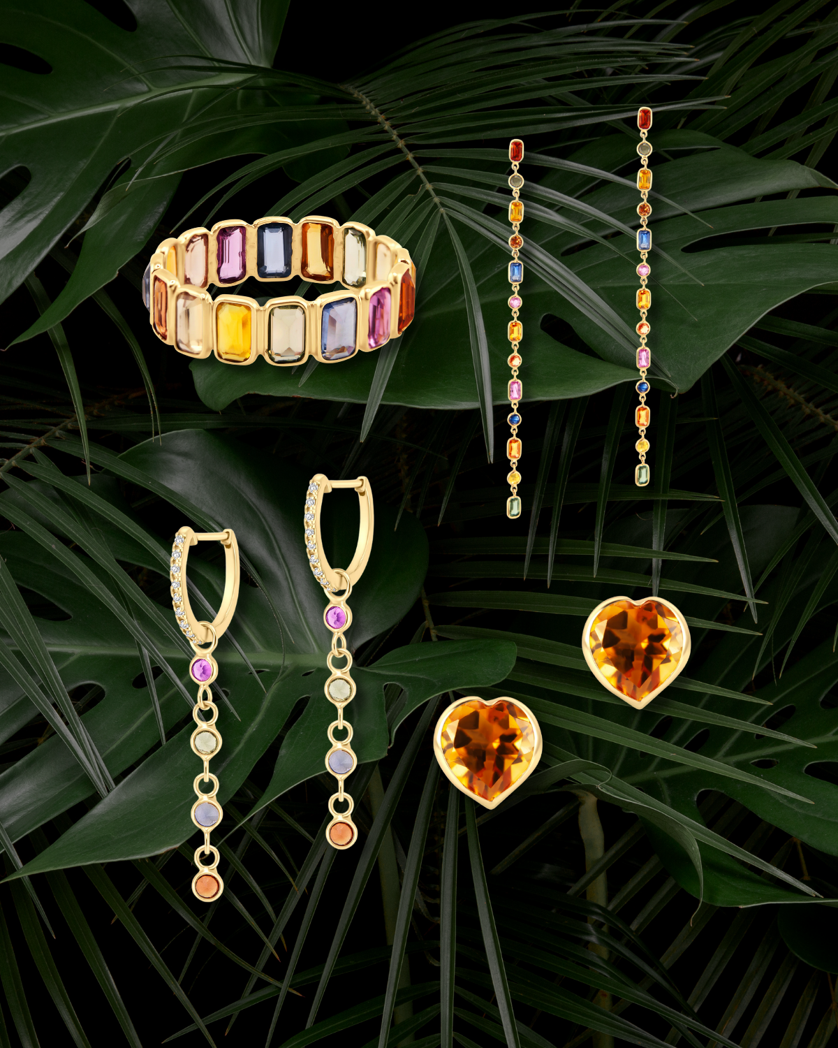
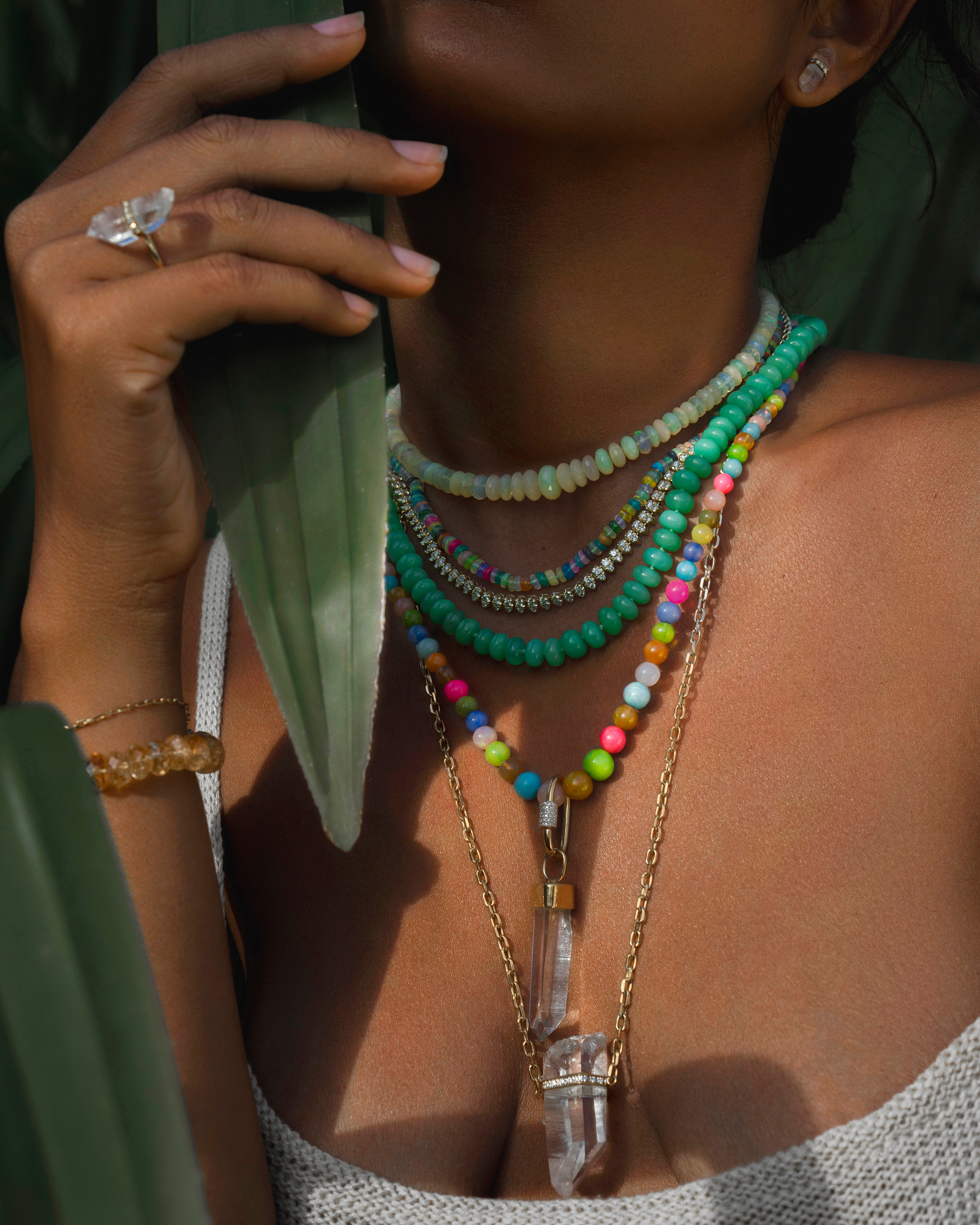
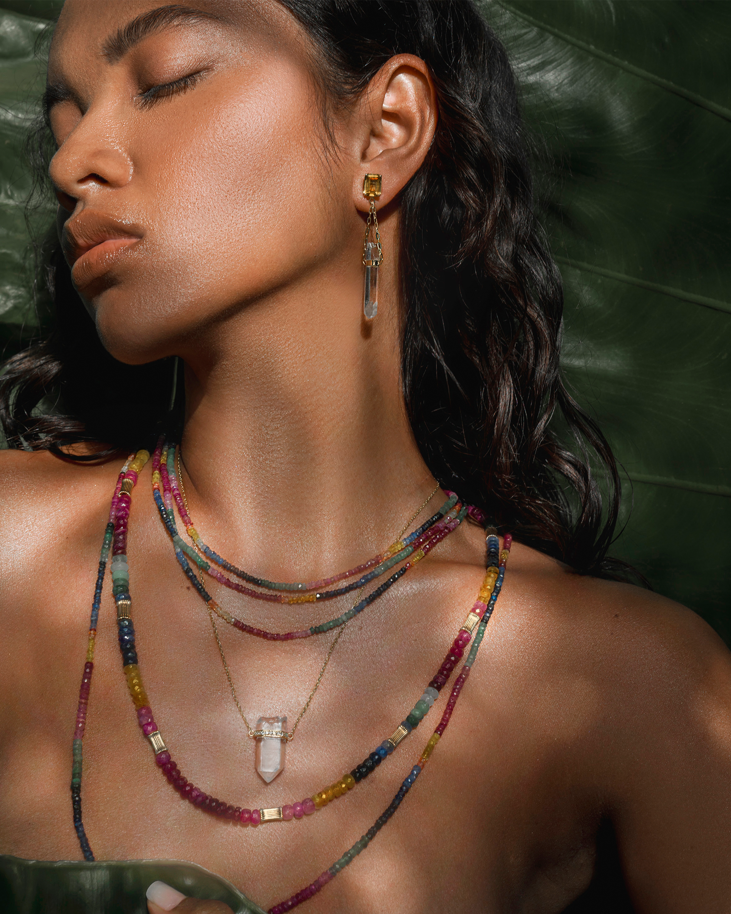
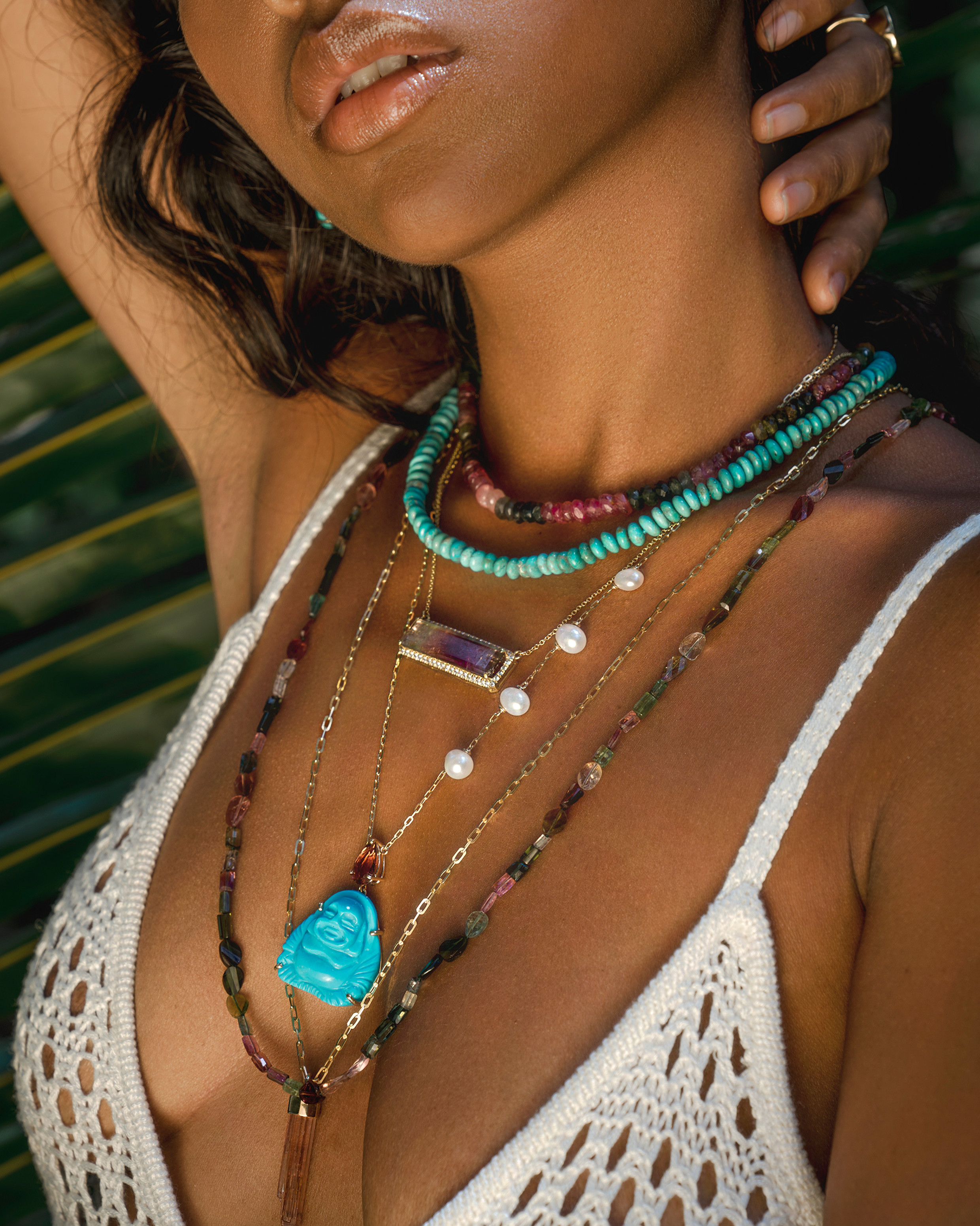
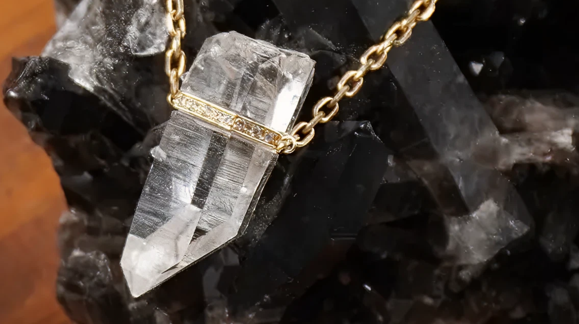
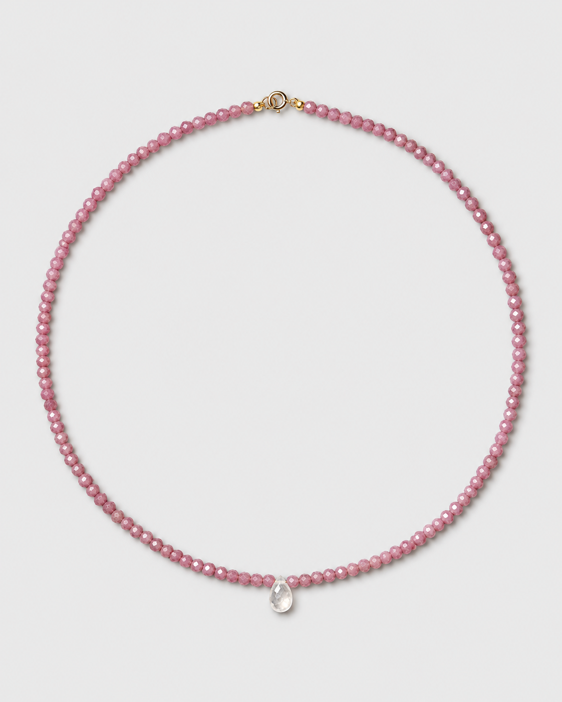
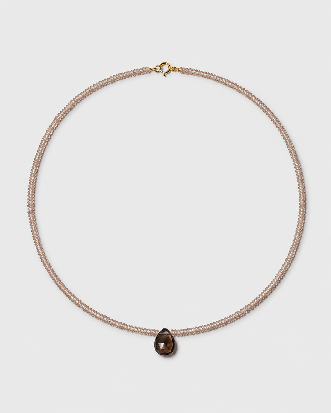
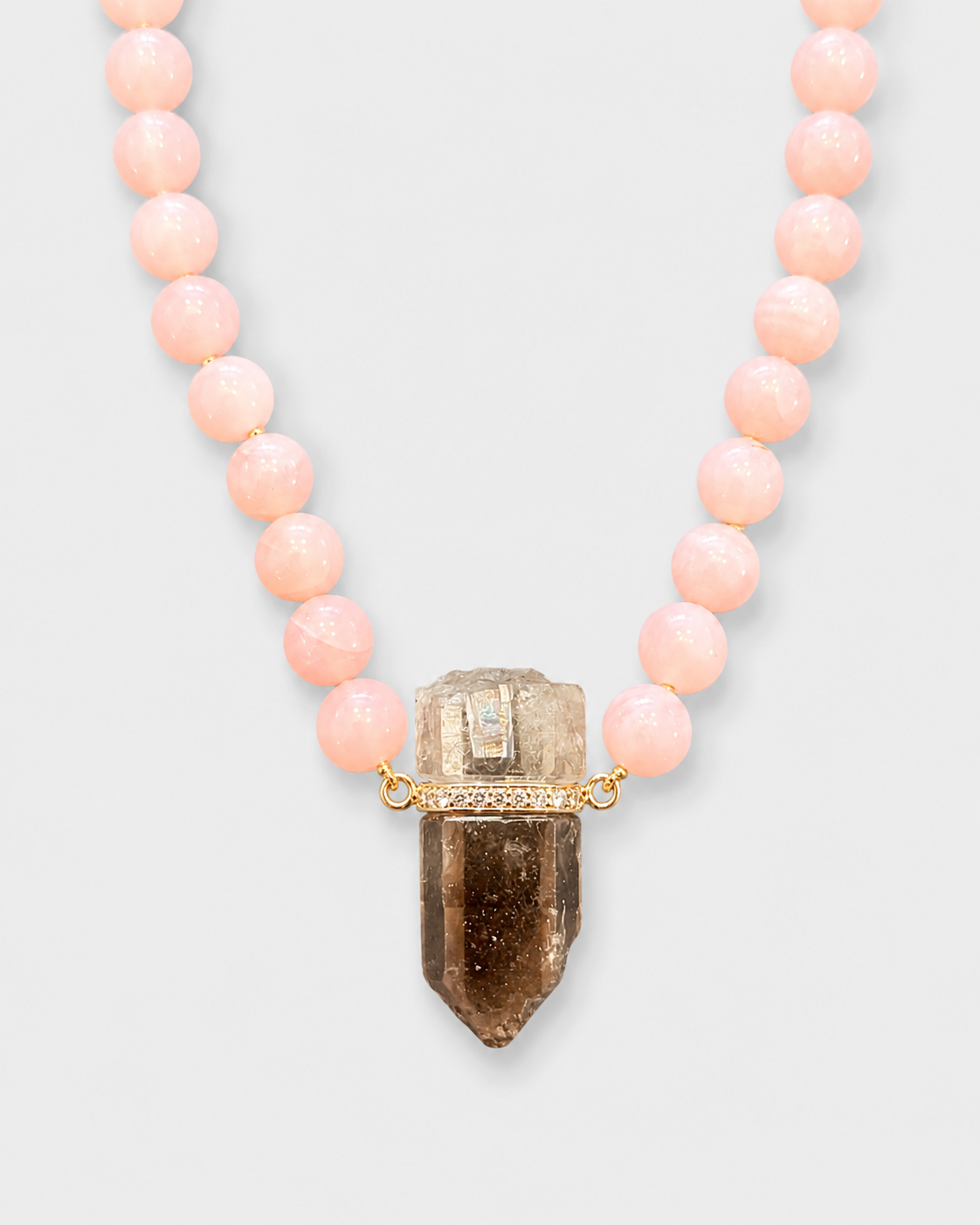
Visual Elements

How to use this file
1. Save this file as DESIGN.md in your project root (sibling to README.md).
2. AI agents that read project files (Claude Code, Cursor, v0, Lovable, Bolt, Windsurf) will discover it automatically.
3. Validate or export tokens with the official CLI:
npx @google/design.md lint DESIGN.md
npx @google/design.md export --format tailwind DESIGN.md
Developer Access
# Fetch the full brand kit
curl https://extractvibe.com/api/brand/jiajiajewelry.com \
  -H "x-api-key: ev_your_key"

# Export as CSS variables
curl https://extractvibe.com/api/extract/JOB_ID/export/css \
  -H "x-api-key: ev_your_key"

# Export as Tailwind config
curl https://extractvibe.com/api/extract/JOB_ID/export/tailwind \
  -H "x-api-key: ev_your_key"
Extract your own brand kit
Get colors, fonts, voice, and personality from any website in seconds. Open source.