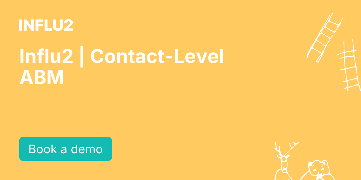

Influ2 | Contact-Level ABM
influ2.com“Influ2 presents a pragmatic, human-centric B2B brand that rejects corporate fluff in favor of direct, evidence-based communication. The aesthetic is clean and modern, utilizing a vibrant teal primary color against a stark white background to convey clarity and technical precision without unnecessary decoration.”
Color Palette
Colors
Light Mode
Dark Mode
Typography
Fonts
Graphik Web
ui-sans-serif, system-ui, sans-serif, Apple Color Emoji, Segoe UI Emoji, Segoe UI Symbol, Noto Color Emoji
Graphik Web
ui-sans-serif, system-ui, sans-serif, Apple Color Emoji, Segoe UI Emoji, Segoe UI Symbol, Noto Color Emoji
The quick brown fox
16pxThe quick brown fox
48pxThe quick brown fox
36pxThe quick brown fox
28pxThe quick brown fox
14pxComponents
Design System
rgba(0, 0, 0, 0) 0px 0px 0px 0px, rgba(0, 0, 0, 0) 0px 0px 0px 0px, rgba(0, 0, 0, 0.04) 0px 4px 15px 0px
Voice & Tone
Personality
Visual Energy
Design Era
contemporary-minimal
Emotional Tone
confident-clarity
Target Audience
B2B sales leaders, revenue operations managers, and marketing executives seeking realistic, human-focused ABM solutions.
Comparable Brands
Brand Rules
Dos & Don'ts
Do
- Use Graphik Web 600 for all headings in sentence-case, ensuring a professional yet accessible hierarchy.
- Set body copy to Graphik Web 400 with a strict line-height of 24px for optimal readability.
- Style primary CTAs with #13bbb2 background, #ffffff text, 10px border-radius, and 0px 20px padding.
- Apply no shadows to buttons or UI elements; maintain a strictly flat design aesthetic.
- Avoid gradients entirely; use solid colors (#13bbb2, #812aff, #ffffff) to maintain visual clarity.
- Use #812aff (purple) sparingly as an accent color, primarily in dark mode backgrounds or specific highlights.
- Keep copy tone matter-of-fact and direct, avoiding emojis and excessive exclamations.
- Use 10px border-radius for primary buttons and 6px-8px for secondary UI components.
Don't
- Do not use title case for headings; strictly adhere to sentence-case conventions.
- Do not use serif fonts; the brand is exclusively sans-serif (Graphik Web).
- Do not add drop shadows or multi-layer depth effects to cards, buttons, or modals.
- Do not use gradients in backgrounds or buttons; keep all fills solid.
- Do not use emojis in marketing copy or UI labels.
- Do not use high-contrast, playful, or overly casual language; maintain a professional, slightly formal tone.
- Do not use rounded-pill shapes (e.g., 50px radius); stick to the 6px-10px radius system.
- Do not use #000000 for body text on #ffffff backgrounds without sufficient contrast or spacing; ensure 24px line-height is respected.
Design Assets
Visual Elements



How to use this file
1. Save this file as DESIGN.md in your project root (sibling to README.md).
2. AI agents that read project files (Claude Code, Cursor, v0, Lovable, Bolt, Windsurf) will discover it automatically.
3. Validate or export tokens with the official CLI:
npx @google/design.md lint DESIGN.md
npx @google/design.md export --format tailwind DESIGN.md
Developer Access
# Fetch the full brand kit
curl https://extractvibe.com/api/brand/influ2.com \
  -H "x-api-key: ev_your_key"

# Export as CSS variables
curl https://extractvibe.com/api/extract/JOB_ID/export/css \
  -H "x-api-key: ev_your_key"

# Export as Tailwind config
curl https://extractvibe.com/api/extract/JOB_ID/export/tailwind \
  -H "x-api-key: ev_your_key"
Extract your own brand kit
Get colors, fonts, voice, and personality from any website in seconds. Open source.