
Headspace
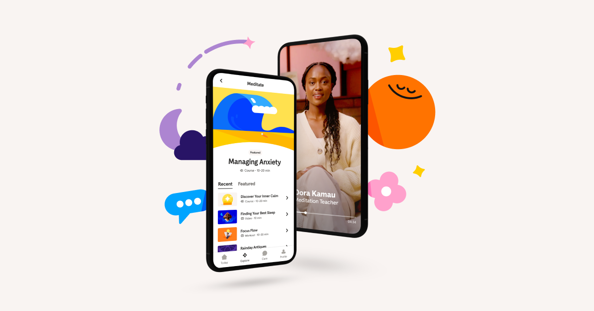
headspace.com“Headspace projects a calm, scientifically grounded, and accessible presence that demystifies meditation through simple, imperative language. The design is clean and uncluttered, utilizing a soft color palette and rounded geometry to create a sense of safety and ease without feeling clinical or overly corporate.”
Color Palette
Colors
Typography
Fonts
Headspace Apercu
sans-serif
Headspace Apercu
sans-serif
The quick brown fox
16pxThe quick brown fox
52pxThe quick brown fox
40pxThe quick brown fox
24pxThe quick brown fox
32pxThe quick brown fox
16pxComponents
Design System
rgba(65, 61, 69, 0.2) 0px 2px 0px 0px
Voice & Tone
Personality
Visual Energy
Design Era
contemporary-minimal
Emotional Tone
soothing-reassuring
Target Audience
Busy professionals and individuals seeking accessible, science-backed mental health tools who value simplicity and clarity over complex jargon.
Comparable Brands
Brand Rules
Dos & Don'ts
Do
- Use the custom 'Headspace Apercu' font family for all text; apply weight 700 for headings and 400/500 for body copy.
- Format all headings in sentence-case (e.g., 'Take a Global Deep Breath') and maintain body line-height at 18.4px for readability.
- Style primary CTA buttons with background #0061ef, white text (#ffffff), 32px border-radius, and a subtle bottom shadow: rgba(65, 61, 69, 0.2) 0px 2px 0px 0px.
- Style secondary buttons with background #f9f4f2, text #2d2c2b, 24px border-radius, and a solid border of #2d2c2b.
- Use the primary brand color #0061ef for key interactive elements and links, set against a pure white (#ffffff) background.
- Keep copy simple and jargon-light; use action-oriented imperative verbs (e.g., 'Try for free', 'Log in') and avoid exclamations or emojis.
- Apply a base spacing unit of 2px for consistent padding and margins, ensuring a clean, uncluttered layout.
- Use text color #4b4c4d for body copy and #2d2c2b for button text to ensure high contrast without using pure black.
Don't
- Do not use title case for headings; strictly adhere to sentence-case conventions.
- Avoid using gradients; the design relies on flat colors and subtle shadows for depth.
- Do not use serif fonts; the brand is strictly sans-serif using Headspace Apercu.
- Avoid sharp corners (0px or 4px radius); all interactive elements and cards should use significant rounding (24px-32px).
- Do not use emojis or excessive punctuation (exclamations) in marketing copy or UI labels.
- Avoid using pure black (#000000) for text; use #4b4c4d or #2d2c2b to maintain a softer, more approachable feel.
- Do not use multi-layered or complex shadows; keep shadows subtle and single-layered, specifically the 2px offset shadow on primary buttons.
Design Assets
Visual Elements


How to use this file
1. Save this file as DESIGN.md in your project root (sibling to README.md).
2. AI agents that read project files (Claude Code, Cursor, v0, Lovable, Bolt, Windsurf) will discover it automatically.
3. Validate or export tokens with the official CLI:
npx @google/design.md lint DESIGN.md
npx @google/design.md export --format tailwind DESIGN.md
Developer Access
# Fetch the full brand kit
curl https://extractvibe.com/api/brand/headspace.com \
  -H "x-api-key: ev_your_key"

# Export as CSS variables
curl https://extractvibe.com/api/extract/JOB_ID/export/css \
  -H "x-api-key: ev_your_key"

# Export as Tailwind config
curl https://extractvibe.com/api/extract/JOB_ID/export/tailwind \
  -H "x-api-key: ev_your_key"
Extract your own brand kit
Get colors, fonts, voice, and personality from any website in seconds. Open source.