

Good To-Go Dehydrated Meals and Backpacking Food
goodto-go.com“Good To-Go projects a practical and trustworthy vibe, catering to adventurers who value quality and accessibility. The brand balances a serious approach to outdoor sustenance with an approachable, chef-crafted promise, emphasizing real food for real experiences.”
Color Palette
Colors
Light Mode
Dark Mode
Typography
Fonts
Nunito
Nunito
Noto Sans
sans-serif
The quick brown fox
16pxThe quick brown fox
30pxThe quick brown fox
14pxThe quick brown fox
20pxThe quick brown fox
18pxComponents
Design System
rgba(25, 27, 30, 0.03) 0px 0px 5px 0px
Voice & Tone
Personality
Visual Energy
Design Era
flat-2.0
Emotional Tone
reliable-accessible
Target Audience
Outdoor enthusiasts, campers, backpackers, and travelers who prioritize healthy, convenient, and high-quality food options for their adventures.
Comparable Brands
Brand Rules
Dos & Don'ts
Do
- Use Nunito 700 for all headings, rendered in title-case.
- Utilize Nunito 400 or Noto Sans 400 for body text, maintaining a line-height of 24px.
- Employ the primary brand color #00a88e for key interactive elements and primary call-to-action backgrounds.
- Design primary buttons with a #00a88e background, #000000 text, a 100% border-radius (pill-shaped), and a #000000 border.
- Style secondary buttons with a #ffffff background, #343434 text, a 5px border-radius, a #f2f2f8 border, and a subtle shadow (rgba(25, 27, 30, 0.03) 0px 0px 5px 0px).
- Maintain a simple and accessible vocabulary, avoiding excessive jargon despite the 'technical' leaning.
- Use action-oriented imperative verbs for CTAs, often followed by product names or direct benefits.
- Adhere to a minimal visual effects approach, with only subtle shadows on secondary buttons and no gradients.
- Ensure all body copy is easily digestible and direct, reflecting the 'accessible' tone.
- Use a base unit of 2px for consistent spacing and sizing throughout the interface.
Don't
- Avoid using emoji in any marketing or interface copy; the brand uses none.
- Do not use exclamations frequently; they are rare in the brand's copy.
- Do not incorporate gradients into any visual elements; the brand utilizes a flat color approach.
- Refrain from using complex, multi-layer shadows; only a single, subtle shadow is present on secondary buttons.
- Do not use sharp-cornered elements; border radii are either 2px, 5px, or 100% (pill-shaped).
- Avoid overly playful or overly serious language; maintain a balanced, matter-of-fact yet accessible tone.
- Do not deviate from the specified font families (Nunito and Noto Sans); no other font styles should be introduced.
- Do not use a monochrome color palette; the brand uses a distinct primary, accent, and background color system.
- Avoid lengthy, complex sentences in body copy; prioritize simple and direct communication.
Design Assets
Visual Elements



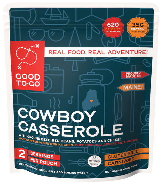
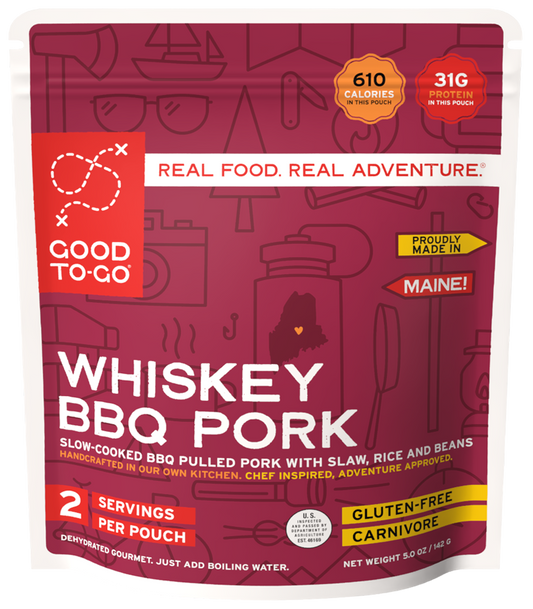


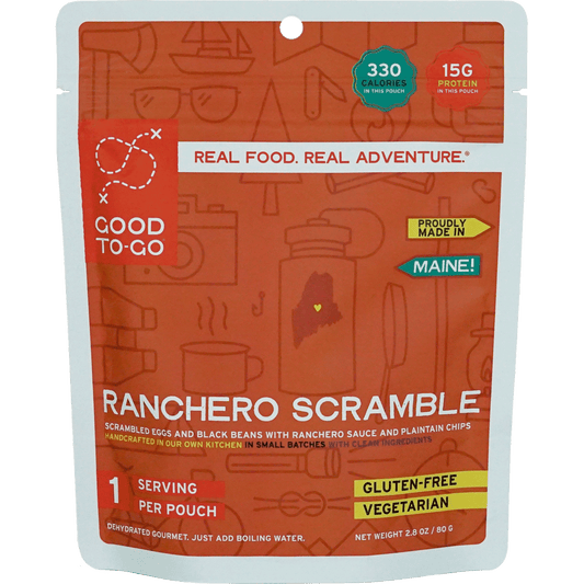
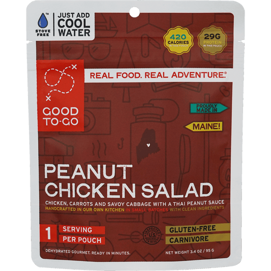

<!-- Generated by ExtractVibe — https://extractvibe.com/brand/goodto-go.com -->
<!-- Extracted: 2026-11-05T13:31:31.198Z | Schema: v1 | Quality: 90/100 -->
---
version: alpha
name: "Good To-Go Dehydrated Meals and Backpacking Food"
description: "Good To-Go projects a practical and trustworthy vibe, catering to adventurers who value quality and accessibility. The brand balances a serious approach to outdoor sustenance with an approachable, chef-crafted promise, emphasizing real food for real experiences."
colors:
  primary: "#00a88e"
  tertiary: "#343434"
  neutral: "#343434"
  surface: "#ffffff"
  on-surface: "#000000"
  on-surface-secondary: "#343434"
  primary-dark: "#4c5d64"
typography:
  display-lg:
    fontFamily: "Nunito"
    fontSize: "30px"
    fontWeight: "700"
    lineHeight: "0px"
    letterSpacing: "0.25px"
  headline-lg:
    fontFamily: "Nunito"
    fontSize: "14px"
    fontWeight: "700"
    lineHeight: "21px"
    letterSpacing: "0.25px"
  headline-md:
    fontFamily: "Nunito"
    fontSize: "20px"
    fontWeight: "700"
    lineHeight: "26px"
    letterSpacing: "0.25px"
  headline-sm:
    fontFamily: "Nunito"
    fontSize: "18px"
    fontWeight: "700"
    lineHeight: "23.4px"
    letterSpacing: "0.25px"
  body-md:
    fontFamily: "Nunito"
    fontSize: "16px"
    fontWeight: "400"
    lineHeight: "24px"
    letterSpacing: "1.2px"
rounded:
  sm: "2px"
  lg: "5px"
  full: "9999px"
spacing:
  base: "2px"
  xs: "1px"
  sm: "2px"
  md: "4px"
  lg: "6px"
  xl: "8px"
components:
  button-primary:
    backgroundColor: "#00a88e"
    textColor: "#000000"
    rounded: "100%"
    padding: "0px"
    fontSize: "25px"
    fontWeight: "400"
    borderColor: "#000000"
  button-secondary:
    backgroundColor: "#ffffff"
    textColor: "#343434"
    rounded: "5px"
    padding: "5px 10px"
    fontSize: "16px"
    fontWeight: "400"
    borderColor: "#f2f2f8"
    borderWidth: "1px"
    boxShadow: "rgba(25, 27, 30, 0.03) 0px 0px 5px 0px"
---

# Good To-Go Dehydrated Meals and Backpacking Food — Design System

## Overview

Good To-Go's design system embodies the spirit of The Explorer and The Everyman, mirroring the practical trustworthiness found in brands like REI and Patagonia. It prioritizes clarity and functionality, ensuring that users can effortlessly navigate and understand product information, much like a well-organized backpack on a long trek. The visual language is clean, direct, and free from superfluous ornamentation, reflecting a commitment to quality and accessibility without pretense. This design atmosphere is purpose-built for adventurers who demand reliable gear and sustenance, presenting information in a way that is both reassuring and straightforward.

The aesthetic is grounded in the outdoorsy and adventure-ready ethos, yet maintains a chef-crafted approachability. It is not overly rugged or extreme; instead, it projects a balanced sense of capability and wholesome nourishment. The design avoids trendy, ephemeral styles, opting instead for enduring visual principles that communicate stability and confidence. It does not employ overly saturated or artificial color palettes, nor does it rely on overly complex graphic elements. Every design decision reinforces the brand's promise of real food for real experiences, ensuring the interface feels as dependable and satisfying as a Good To-Go meal on the trail.

**Key characteristics:**

- Vibe — adventure-ready, chef-crafted, accessible, trustworthy, practical, outdoorsy
- Archetypes — The Explorer, The Everyman
- Comparable to — REI, Patagonia, Backcountry.com, Mountain House
- Design era — flat-2.0
- Emotional tone — reliable-accessible
- Target audience — Outdoor enthusiasts, campers, backpackers, and travelers who prioritize healthy, convenient, and high-quality food options for their adventures.
- Visual energy — 4/10 (moderate)

## Colors

The primary color, #00a88e, is a vibrant yet grounded teal, signaling freshness, nature, and reliability. This hue evokes the clear waters and lush landscapes of outdoor adventures, aligning with the brand's outdoorsy and adventure-ready vibe. Paired with a clean #ffffff surface color, the palette ensures high contrast and legibility, reinforcing the practical and accessible aspects of the brand. This combination communicates a trustworthy and wholesome character, reflecting the quality and natural ingredients of Good To-Go meals.

### Light mode

| Role | Hex | Name |
|------|-----|------|
| primary | `#00a88e` | Dark Cyan |
| accent / tertiary | `#343434` | Charcoal |
| surface | `#ffffff` | White |
| background | `#ffffff` | White |
| text | `#000000` | Black |
| secondary text | `#343434` | Charcoal |
| muted | `#343434` | Charcoal |

### Dark mode

| Role | Hex | Name |
|------|-----|------|
| primary | `#4c5d64` | Dark Gray |

## Typography

The type system leverages Nunito and Noto Sans, chosen for their legibility and friendly yet professional character. Nunito, as the primary typeface, offers a rounded, approachable feel that aligns with the chef-crafted and accessible brand promise, while maintaining a practical sensibility. Noto Sans provides robust support for diverse content, ensuring universal readability and trustworthiness. Hierarchy is established through clear size and weight variations, guiding the user's eye efficiently through information, much like a well-marked trail, reinforcing the brand's practical and adventure-ready nature.

### Font families

| Family | Role | Source | Weights |
|--------|------|--------|---------|
| Nunito | body | self-hosted | 400, 700 |
| Nunito | heading | self-hosted | 700 |
| Noto Sans | body | google-fonts | 400, 600 |

### Type scale

| Role | Family | Size | Weight | Line height | Letter spacing |
|------|--------|------|--------|-------------|----------------|
| Display | Nunito | 30px | 700 | 0px | 0.25px |
| Heading 2 | Nunito | 14px | 700 | 21px | 0.25px |
| Heading 3 | Nunito | 20px | 700 | 26px | 0.25px |
| Heading 4 | Nunito | 18px | 700 | 23.4px | 0.25px |
| Body | Nunito | 16px | 400 | 24px | 1.2px |

### Conventions

- Heading case — title-case
- Body line-height — 24px

## Layout

- Base spacing unit — `2px`

## Elevation & Depth

### Shadows

| Context | Value |
|---------|-------|
| button | `rgba(25, 27, 30, 0.03) 0px 0px 5px 0px` |

## Shapes

Border-radius scale:

- `sm` — 2px
- `lg` — 5px
- `full` — 9999px (pill / circular)

## Components

### Buttons

**Primary**

- Background — `#00a88e`
- Text — `#000000`
- Radius — `100%`
- Padding — `0px`
- Font size — `25px`
- Font weight — `400`
- Border — ` solid #000000`

**Secondary**

- Background — `#ffffff`
- Text — `#343434`
- Radius — `5px`
- Padding — `5px 10px`
- Font size — `16px`
- Font weight — `400`
- Border — `1px solid #f2f2f8`
- Shadow — `rgba(25, 27, 30, 0.03) 0px 0px 5px 0px`
- Sample copy — "Bigger TextBigger Text"

## Do's and Don'ts

### Do

- Use Nunito 700 for all headings, rendered in title-case.
- Utilize Nunito 400 or Noto Sans 400 for body text, maintaining a line-height of 24px.
- Employ the primary brand color #00a88e for key interactive elements and primary call-to-action backgrounds.
- Design primary buttons with a #00a88e background, #000000 text, a 100% border-radius (pill-shaped), and a #000000 border.
- Style secondary buttons with a #ffffff background, #343434 text, a 5px border-radius, a #f2f2f8 border, and a subtle shadow (rgba(25, 27, 30, 0.03) 0px 0px 5px 0px).
- Maintain a simple and accessible vocabulary, avoiding excessive jargon despite the 'technical' leaning.
- Use action-oriented imperative verbs for CTAs, often followed by product names or direct benefits.
- Adhere to a minimal visual effects approach, with only subtle shadows on secondary buttons and no gradients.
- Ensure all body copy is easily digestible and direct, reflecting the 'accessible' tone.
- Use a base unit of 2px for consistent spacing and sizing throughout the interface.

### Don't

- Avoid using emoji in any marketing or interface copy; the brand uses none.
- Do not use exclamations frequently; they are rare in the brand's copy.
- Do not incorporate gradients into any visual elements; the brand utilizes a flat color approach.
- Refrain from using complex, multi-layer shadows; only a single, subtle shadow is present on secondary buttons.
- Do not use sharp-cornered elements; border radii are either 2px, 5px, or 100% (pill-shaped).
- Avoid overly playful or overly serious language; maintain a balanced, matter-of-fact yet accessible tone.
- Do not deviate from the specified font families (Nunito and Noto Sans); no other font styles should be introduced.
- Do not use a monochrome color palette; the brand uses a distinct primary, accent, and background color system.
- Avoid lengthy, complex sentences in body copy; prioritize simple and direct communication.

*Source — inferred*

## Voice

### Tone (1–10 scale)

| Axis | Score | Lean |
|------|-------|------|
| Formal ↔ Casual | 8/10 | casual |
| Playful ↔ Serious | 4/10 | playful |
| Enthusiastic ↔ Matter-of-fact | 5/10 | balanced |
| Respectful ↔ Irreverent | 7/10 | irreverent |
| Technical ↔ Accessible | 9/10 | accessible |

### Copywriting style

- Avg. sentence length — 6 words
- Vocabulary — simple
- Jargon — some
- CTA style — action-oriented imperative verbs and product names
- Rhetorical devices — repetition

### Sample copy

> Real Food. Real Adventure.

> Shop healthy, chef-crafted dehydrated food made for adventure, camping, and travel.

> Get access to exclusive deals, recipes, stories, and new products.

> Camp Meals For Any Adventure

> From the backcountry to your

## Logos

| Type | Variant | Format | URL | Confidence |
|------|---------|--------|-----|------------|
| primary | — | svg | [link](https://img.loadlogo.com/goodto-go.com) | 100% |
| favicon | — | png | [link](brands/goodto-go.com/logo-0.png) | 95% |
| primary | color | png | [link](brands/goodto-go.com/logo-1.png) | 85% |
| primary | color | png | [link](brands/goodto-go.com/logo-2.png) | 85% |
| primary | color | png | [link](brands/goodto-go.com/logo-3.png) | 85% |
| secondary | — | png | [link](brands/goodto-go.com/logo-4.png) | 85% |

## Sources

- Live brand page — https://extractvibe.com/brand/goodto-go.com
- Raw JSON — https://extractvibe.com/api/brand/goodto-go.com
- DESIGN.md (this file) — https://extractvibe.com/api/brand/goodto-go.com/design.md
- Extracted — 2026-11-05T13:31:31.198Z
- Generator — ExtractVibe vv1
- Quality score — 90/100
How to use this file
1. Save this file as DESIGN.md in your project root (sibling to README.md).
2. AI agents that read project files (Claude Code, Cursor, v0, Lovable, Bolt, Windsurf) will discover it automatically.
3. Validate or export tokens with the official CLI:
npx @google/design.md lint DESIGN.md
npx @google/design.md export --format tailwind DESIGN.md
Developer Access
# Fetch the full brand kit
curl https://extractvibe.com/api/brand/goodto-go.com \
  -H "x-api-key: ev_your_key"

# Export as CSS variables
curl https://extractvibe.com/api/extract/JOB_ID/export/css \
  -H "x-api-key: ev_your_key"

# Export as Tailwind config
curl https://extractvibe.com/api/extract/JOB_ID/export/tailwind \
  -H "x-api-key: ev_your_key"
Extract your own brand kit
Get colors, fonts, voice, and personality from any website in seconds. Open source.