
GitHub · Change is constant. GitHub keeps you ahead. · GitHub
github.com“GitHub projects an image of serious innovation and collaborative advancement, empowering developers to build the future. It's a platform that values progress and community, offering powerful tools with a professional yet accessible feel.”
Color Palette
Colors
Light Mode
Dark Mode
Typography
Fonts
Mona Sans VF
-apple-system, BlinkMacSystemFont, Segoe UI, Noto Sans, Helvetica, Arial, sans-serif, Apple Color Emoji, Segoe UI Emoji
Mona Sans VF
-apple-system, BlinkMacSystemFont, Segoe UI, Noto Sans, Helvetica, Arial, sans-serif, Apple Color Emoji, Segoe UI Emoji
Mona Sans
MonaSansFallback, -apple-system, BlinkMacSystemFont, Segoe UI, Helvetica, Arial, sans-serif, Apple Color Emoji, Segoe UI Emoji
The quick brown fox
14pxThe quick brown fox
32pxThe quick brown fox
24pxThe quick brown fox
12pxComponents
Design System
rgba(209, 217, 224, 0.25) 0px 0px 0px 1px, rgba(37, 41, 46, 0.04) 0px 6px 12px -3px, rgba(37, 41, 46, 0.12) 0px 6px 18px 0px
rgba(209, 217, 224, 0) 0px 0px 0px 1px, rgba(37, 41, 46, 0.24) 0px 40px 80px 0px
linear-gradient(rgb(0, 2, 64), rgba(0, 0, 0, 0))...
linear-gradient(rgba(255, 255, 255, 0) -8.14%, rgba(255, 255, 255, 0.1) 62.09%)...
Voice & Tone
Personality
Visual Energy
Design Era
contemporary-functional
Emotional Tone
empowering-reliable
Target Audience
Software developers, engineering teams, businesses, and open-source communities seeking a robust, AI-powered platform for code development and collaboration.
Comparable Brands
Brand Rules
Dos & Don'ts
Do
- Use Mona Sans VF (self-hosted) for all typography, specifically weights 600 for headings and 400 or 500 for body text.
- Apply sentence-case for all headings, never title case or all caps.
- Ensure body text has a line-height of 21px for optimal readability.
- Primary call-to-action buttons must use a #08872b background with #ffffff text, a 6px border-radius, and padding of 6px 28px.
- Utilize a limited, high-contrast color palette, primarily #08872b (primary), #0d1117 (dark accent/background), and #f0f6fc (light text).
- Incorporate subtle, multi-layer shadows for depth on elements like dropdowns, using rgba(209, 217, 224, 0.25) 0px 0px 0px 1px and rgba(37, 41, 46, 0.04) 0px 6px 12px.
- Employ linear gradients for background elements to add subtle visual interest, such as linear-gradient(rgb(0, 2, 64), rgba(0, 0, 0, 0)).
- Maintain a consistent spacing system based on a 2px base unit, with border radii of 3px (small), 8px (medium), and 60px (large) for various elements.
Don't
- Do not use emojis or exclamations in any copy to maintain a serious and professional tone.
- Avoid using serif fonts; the brand is exclusively sans-serif with Mona Sans VF.
- Do not use overly playful or casual language; maintain a balance of technical and enthusiastic, leaning towards serious.
- Never use square corners for primary buttons; always apply a 6px border-radius.
- Do not introduce new colors outside the defined primary, accent, and text palette without strong justification.
- Avoid flat design; incorporate subtle depth through shadows and gradients as defined.
- Do not use excessive jargon where simpler, accessible terms could be used, despite the heavy technical vocabulary.
Design Assets
Visual Elements
<!-- Generated by ExtractVibe — https://extractvibe.com/brand/github.com -->
<!-- Extracted: 2026-04-26T13:10:45.060Z | Schema: v1 | Quality: 100/100 -->
---
version: alpha
name: "GitHub · Change is constant. GitHub keeps you ahead. · GitHub"
description: "GitHub projects an image of serious innovation and collaborative advancement, empowering developers to build the future. It's a platform that values progress and community, offering powerful tools with a professional yet accessible feel."
colors:
primary: "#08872b"
tertiary: "#0d1117"
neutral: "#58635b"
surface: "#ffffff"
border: "#d9d9d9"
surface-dark: "#0d1117"
on-surface-dark: "#f0f6fc"
typography:
display-lg:
fontFamily: "Mona Sans VF"
fontSize: "32px"
fontWeight: "600"
lineHeight: "48px"
headline-lg:
fontFamily: "Mona Sans VF"
fontSize: "24px"
fontWeight: "600"
lineHeight: "36px"
headline-md:
fontFamily: "Mona Sans VF"
fontSize: "12px"
fontWeight: "600"
lineHeight: "19.5px"
body-md:
fontFamily: "Mona Sans VF"
fontSize: "14px"
fontWeight: "400"
lineHeight: "21px"
rounded:
sm: "3px"
md: "8px"
lg: "60px"
full: "9999px"
spacing:
base: "2px"
xs: "1px"
sm: "2px"
md: "4px"
lg: "6px"
xl: "8px"
components:
button-primary:
backgroundColor: "#08872b"
textColor: "#ffffff"
rounded: "6px"
padding: "6px 28px"
fontSize: "16px"
fontWeight: "400"
borderWidth: "2px"
button-secondary:
backgroundColor: "#efefef"
textColor: "#000000"
rounded: "0px"
padding: "1px 6px"
fontSize: "16px"
fontWeight: "400"
borderColor: "#000000"
button-outline:
textColor: "#ffffff"
rounded: "6px"
padding: "4px 12px"
fontSize: "14px"
fontWeight: "400"
borderColor: "#d1d9e0"
borderWidth: "1px"
---
# GitHub · Change is constant. GitHub keeps you ahead. · GitHub — Design System
## Overview
GitHub's design system embodies the archetype of The Creator and The Sage, projecting an image of serious innovation and collaborative advancement. It is a developer-first, powerful, and professional platform, akin to industry leaders like Microsoft Azure, Google Cloud, AWS, and GitLab. The aesthetic is engineered to empower developers, fostering a sense of progress and community through its robust and accessible interface. This design language prioritizes clarity, functionality, and performance, ensuring that the visual experience directly supports complex technical workflows.
This system is not decorative. It avoids frivolous ornamentation, overly playful elements, or transient trends. The design does not aim for a 'cute' or 'approachable for everyone' aesthetic; its primary audience is the developer, and its visual vocabulary reflects that focus. Every design decision serves to enhance utility, streamline collaboration, and reinforce GitHub's position as the definitive platform for building the future. It is a system built for constant change, providing a stable yet adaptable foundation for continuous innovation.
**Key characteristics:**
- Vibe — developer-first, innovative, collaborative, powerful, professional, community-driven
- Archetypes — The Creator, The Sage
- Comparable to — Microsoft Azure, Google Cloud, AWS, GitLab
- Design era — contemporary-functional
- Emotional tone — empowering-reliable
- Target audience — Software developers, engineering teams, businesses, and open-source communities seeking a robust, AI-powered platform for code development and collaboration.
- Visual energy — 7/10 (high-energy/bold)
## Colors
The color palette is anchored by GitHub's primary green, #08872b, signaling growth, progress, and a vibrant ecosystem. This is contrasted with a dominant surface color of #000000, establishing a professional and high-contrast environment that minimizes eye strain during prolonged coding sessions. The deliberate choice of a deep, rich green against a stark black reinforces the brand's powerful and innovative character, providing a clear visual hierarchy that directs attention to critical information and actions.
### Light mode
| Role | Hex | Name |
|------|-----|------|
| primary | `#08872b` | Forest Green |
| accent / tertiary | `#0d1117` | Near-Black |
| surface | `#ffffff` | White |
| background | `#000000` | Black |
| border | `#d9d9d9` | Gainsboro |
| muted | `#58635b` | Dark Gray |
### Dark mode
| Role | Hex | Name |
|------|-----|------|
| surface | `#0d1117` | Near-Black |
| background | `#0d1117` | Near-Black |
| text | `#f0f6fc` | Alice Blue |
## Typography
The type system utilizes Mona Sans VF exclusively. This choice communicates modernity, clarity, and technical precision. The variable font capabilities of Mona Sans VF allow for fine-grained control over weight and width, enabling a highly adaptable and legible hierarchy across diverse content types and screen sizes. The typography is designed for optimal readability within code environments and technical documentation, ensuring that information is conveyed efficiently and without visual friction, reinforcing GitHub's professional and developer-first ethos.
### Font families
| Family | Role | Source | Weights |
|--------|------|--------|---------|
| Mona Sans VF | body | self-hosted | 400, 500, 700 |
| Mona Sans VF | heading | self-hosted | 600 |
| Mona Sans | body | self-hosted | 400 |
### Type scale
| Role | Family | Size | Weight | Line height | Letter spacing |
|------|--------|------|--------|-------------|----------------|
| Display | Mona Sans VF | 32px | 600 | 48px | — |
| Heading 2 | Mona Sans VF | 24px | 600 | 36px | — |
| Heading 3 | Mona Sans VF | 12px | 600 | 19.5px | — |
| Body | Mona Sans VF | 14px | 400 | 21px | — |
### Conventions
- Heading case — sentence-case
- Body line-height — 21px
## Layout
- Base spacing unit — `2px`
## Elevation & Depth
### Shadows
| Context | Value |
|---------|-------|
| dropdown | `rgba(209, 217, 224, 0.25) 0px 0px 0px 1px, rgba(37, 41, 46, 0.04) 0px 6px 12px -3px, rgba(37, 41, 46, 0.12) 0px 6px 18px 0px` |
| element | `rgba(209, 217, 224, 0) 0px 0px 0px 1px, rgba(37, 41, 46, 0.24) 0px 40px 80px 0px` |
### Gradients
- `linear-gradient(rgb(0, 2, 64), rgba(0, 0, 0, 0))`
- `linear-gradient(rgba(255, 255, 255, 0) -8.14%, rgba(255, 255, 255, 0.1) 62.09%)`
## Shapes
Border-radius scale:
- `sm` — 3px
- `md` — 8px
- `lg` — 60px
- `full` — 9999px (pill / circular)
## Components
### Buttons
**Primary**
- Background — `#08872b`
- Text — `#ffffff`
- Radius — `6px`
- Padding — `6px 28px`
- Font size — `16px`
- Font weight — `400`
- Sample copy — "Sign up for GitHub"
**Secondary**
- Background — `#efefef`
- Text — `#000000`
- Radius — `0px`
- Padding — `1px 6px`
- Font size — `16px`
- Font weight — `400`
- Border — ` solid #000000`
- Sample copy — "Toggle navigation"
**Outline**
- Text — `#ffffff`
- Radius — `6px`
- Padding — `4px 12px`
- Font size — `14px`
- Font weight — `400`
- Border — `1px solid #d1d9e0`
- Sample copy — "Sign in"
## Do's and Don'ts
### Do
- Use Mona Sans VF (self-hosted) for all typography, specifically weights 600 for headings and 400 or 500 for body text.
- Apply sentence-case for all headings, never title case or all caps.
- Ensure body text has a line-height of 21px for optimal readability.
- Primary call-to-action buttons must use a #08872b background with #ffffff text, a 6px border-radius, and padding of 6px 28px.
- Utilize a limited, high-contrast color palette, primarily #08872b (primary), #0d1117 (dark accent/background), and #f0f6fc (light text).
- Incorporate subtle, multi-layer shadows for depth on elements like dropdowns, using rgba(209, 217, 224, 0.25) 0px 0px 0px 1px and rgba(37, 41, 46, 0.04) 0px 6px 12px.
- Employ linear gradients for background elements to add subtle visual interest, such as linear-gradient(rgb(0, 2, 64), rgba(0, 0, 0, 0)).
- Maintain a consistent spacing system based on a 2px base unit, with border radii of 3px (small), 8px (medium), and 60px (large) for various elements.
### Don't
- Do not use emojis or exclamations in any copy to maintain a serious and professional tone.
- Avoid using serif fonts; the brand is exclusively sans-serif with Mona Sans VF.
- Do not use overly playful or casual language; maintain a balance of technical and enthusiastic, leaning towards serious.
- Never use square corners for primary buttons; always apply a 6px border-radius.
- Do not introduce new colors outside the defined primary, accent, and text palette without strong justification.
- Avoid flat design; incorporate subtle depth through shadows and gradients as defined.
- Do not use excessive jargon where simpler, accessible terms could be used, despite the heavy technical vocabulary.
*Source — merged*
## Voice
### Tone (1–10 scale)
| Axis | Score | Lean |
|------|-------|------|
| Formal ↔ Casual | 4/10 | formal |
| Playful ↔ Serious | 8/10 | serious |
| Enthusiastic ↔ Matter-of-fact | 6/10 | balanced |
| Respectful ↔ Irreverent | 2/10 | respectful |
| Technical ↔ Accessible | 3/10 | technical |
### Copywriting style
- Avg. sentence length — 12 words
- Vocabulary — moderate
- Jargon — heavy
- CTA style — action-oriented imperative verbs and benefit-focused phrases
- Rhetorical devices — repetition
### Sample copy
> Join the world's most widely adopted, AI-powered developer platform where millions of developers, businesses, and the largest open source community build software that advances humanity.
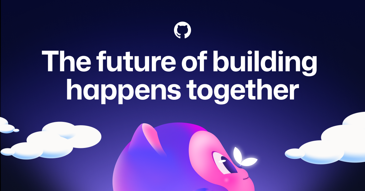
> The future of building happens together
> Write, test, and fix code quickly with GitHub Copilot, from simple boilerplate to complex features.
> Your AI partner everywhere. Copilot is ready to work with you at each step of the software development lifecycle.
> Automate your path to production
## Logos
| Type | Variant | Format | URL | Confidence |
|------|---------|--------|-----|------------|
| primary | — | svg | [link](https://img.loadlogo.com/github.com) | 100% |
| favicon | — | svg | [link](brands/github.com/logo-0.svg) | 95% |
| favicon | — | png | [link](brands/github.com/logo-1.png) | 95% |
| favicon | — | png | [link](brands/github.com/logo-2.png) | 95% |
| favicon | — | png | [link](brands/github.com/logo-3.png) | 95% |
| favicon | — | png | [link](brands/github.com/logo-4.png) | 95% |
| favicon | — | png | [link](brands/github.com/logo-5.png) | 95% |
| favicon | — | png | [link](brands/github.com/logo-6.png) | 95% |
| favicon | — | png | [link](brands/github.com/logo-7.png) | 95% |
| favicon | — | png | [link](brands/github.com/logo-8.png) | 95% |
| favicon | — | png | [link](brands/github.com/logo-9.png) | 95% |
| favicon | — | png | [link](brands/github.com/logo-10.png) | 95% |
## Sources
- Official brand guidelines — https://github.com/base-org/brand-kit/blob/main/guides/editorial-style-guide.md
- Live brand page — https://extractvibe.com/brand/github.com
- Raw JSON — https://extractvibe.com/api/brand/github.com
- DESIGN.md (this file) — https://extractvibe.com/api/brand/github.com/design.md
- Extracted — 2026-04-26T13:10:45.060Z
- Generator — ExtractVibe vv1
- Quality score — 100/100
How to use this file
1. Save this file as DESIGN.md in your project root (sibling to README.md).
2. AI agents that read project files (Claude Code, Cursor, v0, Lovable, Bolt, Windsurf) will discover it automatically.
3. Validate or export tokens with the official CLI:
npx @google/design.md lint DESIGN.md
npx @google/design.md export --format tailwind DESIGN.md
Developer Access
# Fetch the full brand kit
curl https://extractvibe.com/api/brand/github.com \
  -H "x-api-key: ev_your_key"

# Export as CSS variables
curl https://extractvibe.com/api/extract/JOB_ID/export/css \
  -H "x-api-key: ev_your_key"

# Export as Tailwind config
curl https://extractvibe.com/api/extract/JOB_ID/export/tailwind \
  -H "x-api-key: ev_your_key"
Extract your own brand kit
Get colors, fonts, voice, and personality from any website in seconds. Open source.