
Duolingo
duolingo.com“Duolingo projects a playful, accessible, and highly energetic personality that demystifies education through simplicity and humor. The brand feels like a friendly, slightly mischievous companion rather than a strict academic institution, prioritizing engagement and low-friction interaction over formal prestige.”
Color Palette
Colors
Light Mode
Dark Mode
Typography
Fonts
sans-serif
din-round
sans-serif
feather
sans-serif
din-round
sans-serif
The quick brown fox
17pxThe quick brown fox
32pxThe quick brown fox
48pxComponents
Design System
Voice & Tone
Personality
Visual Energy
Design Era
contemporary-minimal
Emotional Tone
playful-approachable
Target Audience
Casual learners, students, and self-improvers seeking low-pressure, gamified education; likely younger demographics or those intimidated by traditional academic structures.
Comparable Brands
Brand Rules
Dos & Don'ts
Do
- Use 'Din-Round' at 700 weight for all headings, strictly in lowercase, to maintain the brand's informal and modern voice.
- Use 'Feather' at 700 weight for secondary headings or specific UI elements where a distinct typographic hierarchy is needed, also in lowercase.
- Apply 'Din-Round' at 500 weight for body copy to ensure readability while maintaining the rounded, friendly aesthetic.
- Set body copy line-height to exactly 20px to create a compact, dense, and efficient reading experience.
- Use #ffffff background with #3c3c3c text for light mode to ensure high contrast and clean readability.
- Style primary CTA buttons with a 12px border-radius, 0px vertical padding, and 16px horizontal padding for a pill-like, clickable appearance.
- Avoid all box-shadows and gradients to maintain a flat, clean, and lightweight visual profile.
- Use direct action verbs in CTAs (e.g., 'Get started') to reduce friction and encourage immediate engagement.
- Employ repetition, tricolon, and parallelism in copy to create a rhythmic, memorable, and enthusiastic tone.
Don't
- Do not use title case or uppercase for headings; the brand strictly uses lowercase to appear less formal and more approachable.
- Do not use emojis in marketing copy or UI text, as the brand relies on wordplay and tone rather than iconography for expression.
- Do not use serif fonts; the brand is entirely sans-serif to convey modernity and accessibility.
- Do not apply box-shadows to any element, including cards or buttons, to adhere to the flat design aesthetic.
- Do not use gradients or complex visual effects; keep the design minimal and distraction-free.
- Do not use jargon or technical language; keep vocabulary simple and accessible to a general audience.
- Do not use high-friction CTAs like 'Register' or 'Sign Up'; use low-barrier verbs like 'Start' or 'Get started'.
- Do not use sharp corners (0px radius) on interactive elements; maintain the 12px radius for a friendly, soft interface.
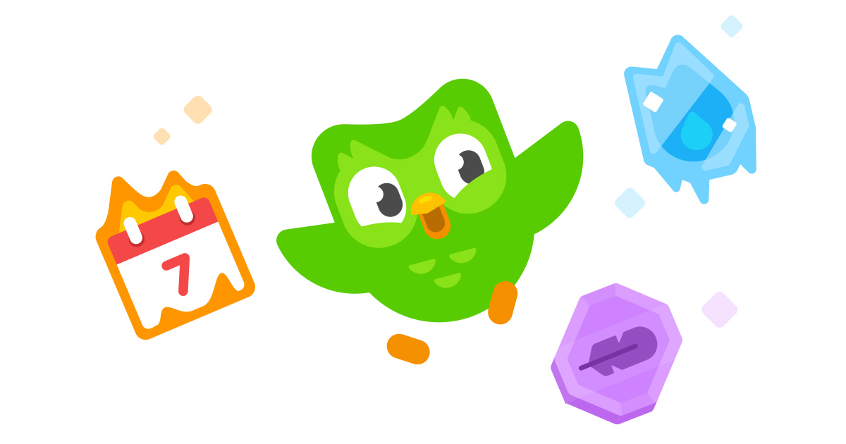
Design Assets
Visual Elements


How to use this file
1. Save this file as DESIGN.md in your project root (sibling to README.md).
2. AI agents that read project files (Claude Code, Cursor, v0, Lovable, Bolt, Windsurf) will discover it automatically.
3. Validate or export tokens with the official CLI:
npx @google/design.md lint DESIGN.md
npx @google/design.md export --format tailwind DESIGN.md
Developer Access
# Fetch the full brand kit
curl https://extractvibe.com/api/brand/duolingo.com \
  -H "x-api-key: ev_your_key"

# Export as CSS variables
curl https://extractvibe.com/api/extract/JOB_ID/export/css \
  -H "x-api-key: ev_your_key"

# Export as Tailwind config
curl https://extractvibe.com/api/extract/JOB_ID/export/tailwind \
  -H "x-api-key: ev_your_key"
Extract your own brand kit
Get colors, fonts, voice, and personality from any website in seconds. Open source.