
Coca-Cola
coca-cola.com“This Coca-Cola brand presence exudes a warm, accessible, and community-focused vibe, emphasizing shared experiences and simple pleasures. It aims to connect with consumers on an emotional level through relatable content and an inviting, yet classic, aesthetic.”
Color Palette
Colors
Typography
Fonts
Noto-regional
Noto-latin, TCCC-UnityText, sans-serif
Noto-regional
Noto-latin, TCCC-UnityText, sans-serif
The quick brown fox
16pxThe quick brown fox
32pxThe quick brown fox
38pxThe quick brown fox
10pxComponents
Design System
rgba(0, 0, 0, 0.06) 0px 14px 24px 0px
Voice & Tone
Personality
Visual Energy
Design Era
classic-contemporary
Emotional Tone
friendly-approachable
Target Audience
Families and individuals who value connection, shared moments, and a sense of tradition, seeking simple joys and familiar comforts.
Comparable Brands
Brand Rules
Dos & Don'ts
Do
- Utilize Noto-regional 700 for all headings, rendered in title-case.
- Employ Noto-regional 400 for all body text, maintaining a line-height of 24px.
- Ensure all primary text elements are #000000 (black) against a #eeeeee (light gray) background in light mode.
- Design secondary buttons with a #ffffff background, #000000 text, a #000000 border, 8000px border-radius, and 4px 16px padding.
- Design outline buttons with #000000 text, a #000000 border, 8000px border-radius, and 4px 16px padding.
- Incorporate a single, subtle shadow style: rgba(0, 0, 0, 0.06) 0px 14px 24px 0px, specifically for dropdowns or similar layered elements.
- Maintain a consistent base unit of 2px for all spacing and sizing calculations.
- Use action-oriented imperative verbs and benefit-focused phrases for all calls to action (CTAs).
Don't
- Avoid using any gradients; the brand's visual language is flat with subtle shadows.
- Do not use any emoji in marketing copy or UI elements.
- Refrain from using exclamations frequently; they should be rare and impactful.
- Do not apply shadows to buttons or other interactive elements, reserving the single shadow style for dropdowns.
- Avoid any jargon; all copy should be simple and accessible.
- Do not use any font families other than Noto-regional for both body and heading text.
- Do not use sharp or moderately rounded corners; all significant border radii should be pill-shaped (8000px).
- Do not introduce a rich or vibrant color palette beyond the established black, white, and light gray; maintain a limited, classic color scheme.
Design Assets
Visual Elements
<!-- Generated by ExtractVibe — https://extractvibe.com/brand/coca-cola.com -->
<!-- Extracted: 2026-05-03T14:49:04.030Z | Schema: v1 | Quality: 100/100 -->
---
version: alpha
name: "Coca-Cola"
description: "This Coca-Cola brand presence projects an accessible, community-focused vibe, emphasizing shared experiences and simple joys. It aims to connect with consumers on an emotional level through themes of togetherness and celebration, while maintaining a clear, straightforward digital interface."
colors:
primary: "#000000"
neutral: "#6c6c6c"
surface: "#eeeeee"
on-surface: "#000000"
border: "#bdbdbd"
typography:
headline-lg:
fontFamily: "Noto-regional"
fontSize: "32px"
fontWeight: "700"
lineHeight: "40px"
letterSpacing: "-1.5px"
headline-md:
fontFamily: "Noto-regional"
fontSize: "38px"
fontWeight: "700"
lineHeight: "48px"
letterSpacing: "-1.5px"
headline-sm:
fontFamily: "Noto-regional"
fontSize: "10px"
fontWeight: "700"
lineHeight: "18px"
body-md:
fontFamily: "Noto-regional"
fontSize: "16px"
fontWeight: "400"
lineHeight: "24px"
rounded:
md: "8000px"
full: "9999px"
spacing:
base: "2px"
xs: "1px"
sm: "2px"
md: "4px"
lg: "6px"
xl: "8px"
components:
button-secondary:
backgroundColor: "#ffffff"
textColor: "#000000"
rounded: "8000px"
padding: "4px 16px"
fontSize: "16px"
fontWeight: "700"
borderColor: "#000000"
button-outline:
textColor: "#000000"
rounded: "8000px"
padding: "4px 16px"
fontSize: "16px"
fontWeight: "700"
borderColor: "#000000"
borderWidth: "2px"
---
# Coca-Cola — Design System
## Overview
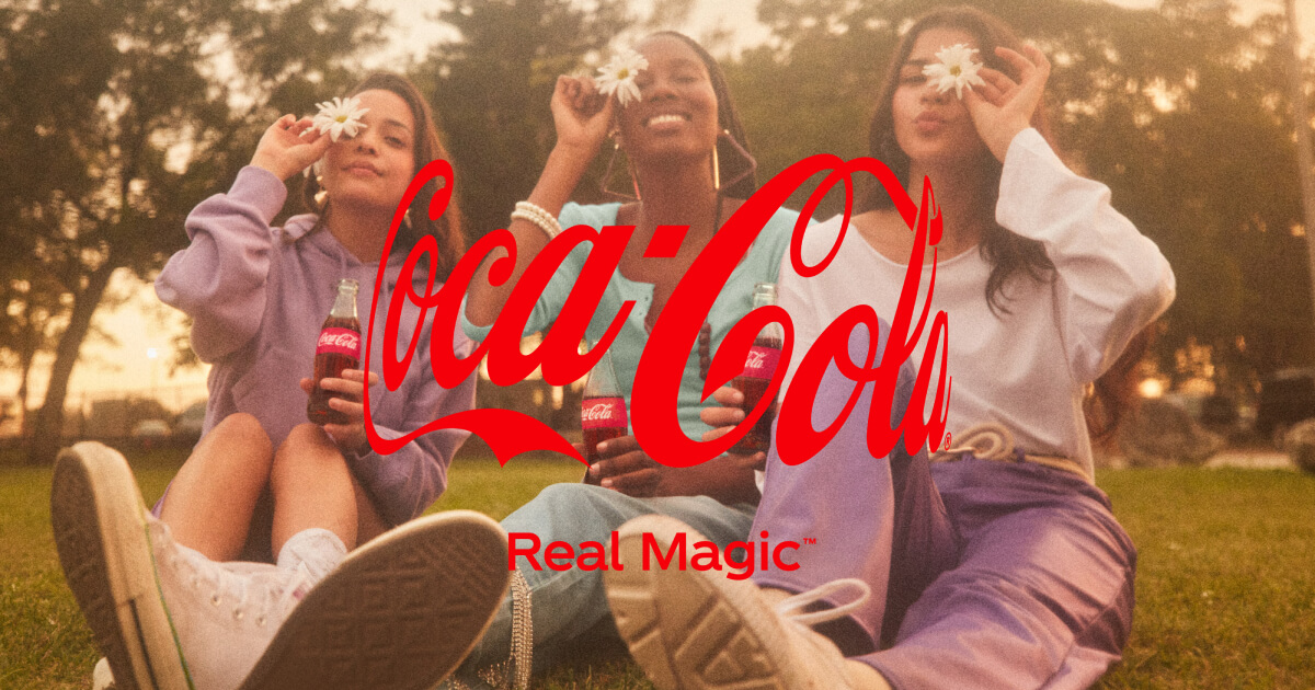
This design system embodies the Everyman and Innocent archetypes, delivering an accessible, community-focused, and celebratory digital experience. It draws inspiration from the straightforward, universally appealing interfaces of brands like McDonald's, Disney, and Starbucks, ensuring immediate recognition and ease of use. The aesthetic prioritizes shared experiences and simple joys, fostering emotional connection through themes of togetherness and celebration. It is designed to be approachable and clean, reflecting a classic sensibility without resorting to overt nostalgia or complex visual metaphors.
This system explicitly avoids exclusivity, avant-garde aesthetics, or highly specialized visual language. It does not aim for a premium, luxury, or niche appeal. Instead, it champions clarity, broad appeal, and a welcoming atmosphere. The design is not experimental or abstract; it is grounded in familiar visual cues that promote comfort and trust, aligning with the brand's core values of universal accessibility and simple, unadulterated pleasure. It is a digital handshake, not a digital art installation.
**Key characteristics:**
- Vibe — accessible, community, celebratory, approachable, classic, clean
- Archetypes — The Everyman, The Innocent
- Comparable to — McDonald's, Disney, Starbucks
- Design era — flat-2.0
- Emotional tone — friendly-approachable
- Target audience — Families and individuals who value shared experiences, community, and simple, joyful moments, particularly during holidays and social gatherings.
- Visual energy — 4/10 (moderate)
## Colors
The color palette is intentionally minimalist and direct. The primary use of #000000 (black) grounds the interface with authority and classic simplicity, while #eeeeee (light gray) serves as the predominant surface color, providing a clean, unobtrusive backdrop. This stark contrast ensures high readability and a clear visual hierarchy, signaling an approachable and straightforward brand character. The absence of a complex color scheme underscores the brand's focus on content and user interaction rather than decorative elements, reinforcing its accessible and clean vibe.
### Light mode
| Role | Hex | Name |
|------|-----|------|
| primary | `#000000` | Black |
| background | `#eeeeee` | White Smoke |
| text | `#000000` | Black |
| border | `#bdbdbd` | Silver |
| muted | `#6c6c6c` | Dim Gray |
## Typography
The typographic system utilizes Noto-regional fonts exclusively. This choice ensures broad language support and a consistent, universally legible aesthetic across all regions, aligning with the Everyman archetype. Hierarchy is established through size and weight variations, maintaining a clean and uncluttered presentation. The type system communicates clarity, approachability, and a sense of global inclusivity, reinforcing the brand's commitment to accessibility and straightforward communication without visual distractions. It is designed for immediate comprehension and comfortable reading across all digital touchpoints.
### Font families
| Family | Role | Source | Weights |
|--------|------|--------|---------|
| Noto-regional | body | self-hosted | 400, 700 |
| Noto-regional | heading | self-hosted | 700 |
### Type scale
| Role | Family | Size | Weight | Line height | Letter spacing |
|------|--------|------|--------|-------------|----------------|
| Heading 2 | Noto-regional | 32px | 700 | 40px | -1.5px |
| Heading 3 | Noto-regional | 38px | 700 | 48px | -1.5px |
| Heading 4 | Noto-regional | 10px | 700 | 18px | — |
| Body | Noto-regional | 16px | 400 | 24px | — |
### Conventions
- Heading case — title-case
- Body line-height — 24px
## Layout
- Base spacing unit — `2px`
## Elevation & Depth
### Shadows
| Context | Value |
|---------|-------|
| dropdown | `rgba(0, 0, 0, 0.06) 0px 14px 24px 0px` |
## Shapes
Border-radius scale:
- `md` — 8000px
- `full` — 9999px (pill / circular)
## Components
### Buttons
**Secondary**
- Background — `#ffffff`
- Text — `#000000`
- Radius — `8000px`
- Padding — `4px 16px`
- Font size — `16px`
- Font weight — `700`
- Border — ` solid #000000`
- Sample copy — "Enter Now"
**Outline**
- Text — `#000000`
- Radius — `8000px`
- Padding — `4px 16px`
- Font size — `16px`
- Font weight — `700`
- Border — `2px solid #000000`
- Sample copy — "Log In"
## Do's and Don'ts
### Do
- Utilize Noto-regional 700 for all headings, presented in title-case.
- Employ Noto-regional 400 for body text, ensuring a line-height of 24px for readability.
- Maintain a high-contrast color scheme with primary text and elements in #000000 against a #eeeeee background in light mode.
- Design secondary buttons with a #ffffff background, #000000 text, a #000000 border, 8000px border-radius (pill-shaped), and 4px 16px padding.
- Design outline buttons with #000000 text, a #000000 border, 8000px border-radius (pill-shaped), and 4px 16px padding.
- Apply a subtle single-layer shadow of rgba(0, 0, 0, 0.06) 0px 14px 24px 0px exclusively to dropdowns or similar overlay elements.
- Craft calls to action using action-oriented imperative verbs and benefit-focused phrases, avoiding jargon.
- Ensure all spacing adheres to a base unit of 2px for consistent layout and element separation.
### Don't
- Do not use gradients in any visual elements; the brand's aesthetic is flat.
- Avoid the use of emojis in all marketing and interface copy.
- Do not use exclamations frequently; they should be rare and reserved for high-impact statements.
- Do not apply shadows to buttons or other interactive elements; shadows are reserved for specific overlay components like dropdowns.
- Do not use any font families other than Noto-regional for both headings and body text.
- Avoid complex vocabulary or jargon; maintain an accessible and simple language style.
- Do not use sharp or moderately rounded corners; all interactive elements and containers should feature an 8000px (pill-shaped) border-radius.
*Source — merged*
## Voice
### Tone (1–10 scale)
| Axis | Score | Lean |
|------|-------|------|
| Formal ↔ Casual | 8/10 | casual |
| Playful ↔ Serious | 3/10 | playful |
| Enthusiastic ↔ Matter-of-fact | 3/10 | enthusiastic |
| Respectful ↔ Irreverent | 2/10 | respectful |
| Technical ↔ Accessible | 9/10 | accessible |
### Copywriting style
- Avg. sentence length — 12 words
- Vocabulary — simple
- Jargon — none
- CTA style — action-oriented imperative verbs and benefit-focused phrases
- Rhetorical devices — repetition
### Sample copy
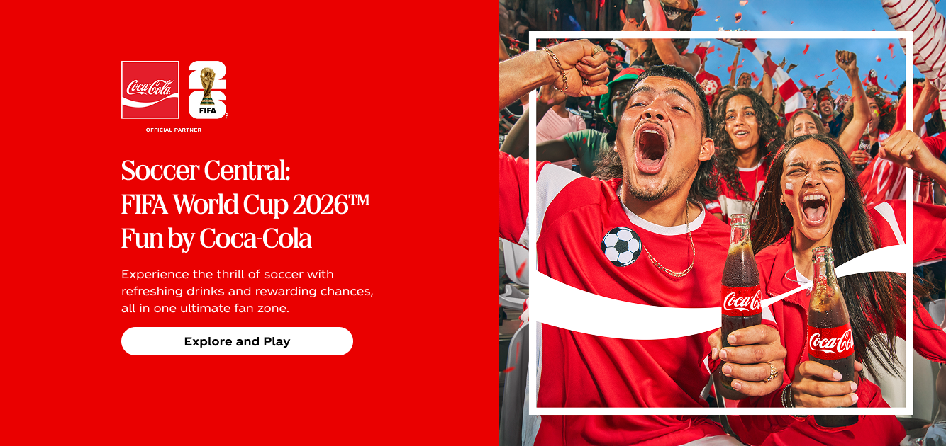
> Explore ways you can be closer to the ones you love with meals worth sharing, festive playlists, and more holiday magic from Coke®.
> You could score the ultimate watch party kit!
> Enter for a chance to win your choice of an indoor or outdoor watch party kit. Make your place the go-to spot for every match.
## Logos
| Type | Variant | Format | URL | Confidence |
|------|---------|--------|-----|------------|
| primary | — | svg | [link](https://img.loadlogo.com/coca-cola.com) | 100% |
| primary | color | png | [link](https://extractvibe.com/api/assets/brands/coca-cola.com/logo-7.png) | 92% |
| wordmark | — | svg | [link](https://extractvibe.com/api/assets/brands/coca-cola.com/logo-3.svg) | 97% |
| wordmark | color | png | [link](https://extractvibe.com/api/assets/brands/coca-cola.com/logo-5.png) | 92% |
| wordmark | color | png | [link](https://extractvibe.com/api/assets/brands/coca-cola.com/logo-6.png) | 92% |
| wordmark | color | png | [link](https://extractvibe.com/api/assets/brands/coca-cola.com/logo-4.png) | 92% |
| logomark | color | png | [link](https://extractvibe.com/api/assets/brands/coca-cola.com/logo-8.png) | 90% |
| secondary | — | svg | [link](https://extractvibe.com/api/assets/brands/coca-cola.com/logo-9.svg) | 92% |
| favicon | — | png | [link](https://extractvibe.com/api/assets/brands/coca-cola.com/logo-0.png) | 78% |
| favicon | — | png | [link](https://extractvibe.com/api/assets/brands/coca-cola.com/logo-1.png) | 62% |
| favicon | — | png | [link](https://extractvibe.com/api/assets/brands/coca-cola.com/logo-2.png) | 62% |
## Sources
- Official brand guidelines — https://brandingstyleguides.com/guide/coca-cola-2020/
- Live brand page — https://extractvibe.com/brand/coca-cola.com
- Raw JSON — https://extractvibe.com/api/brand/coca-cola.com
- DESIGN.md (this file) — https://extractvibe.com/api/brand/coca-cola.com/design.md
- Extracted — 2026-05-03T14:49:04.030Z
- Generator — ExtractVibe vv1
- Quality score — 100/100
How to use this file
1. Save this file as DESIGN.md in your project root (sibling to README.md).
2. AI agents that read project files (Claude Code, Cursor, v0, Lovable, Bolt, Windsurf) will discover it automatically.
3. Validate or export tokens with the official CLI:
npx @google/design.md lint DESIGN.md
npx @google/design.md export --format tailwind DESIGN.md
Developer Access
# Fetch the full brand kit
curl https://extractvibe.com/api/brand/coca-cola.com \
  -H "x-api-key: ev_your_key"

# Export as CSS variables
curl https://extractvibe.com/api/extract/JOB_ID/export/css \
  -H "x-api-key: ev_your_key"

# Export as Tailwind config
curl https://extractvibe.com/api/extract/JOB_ID/export/tailwind \
  -H "x-api-key: ev_your_key"
Extract your own brand kit
Get colors, fonts, voice, and personality from any website in seconds. Open source.