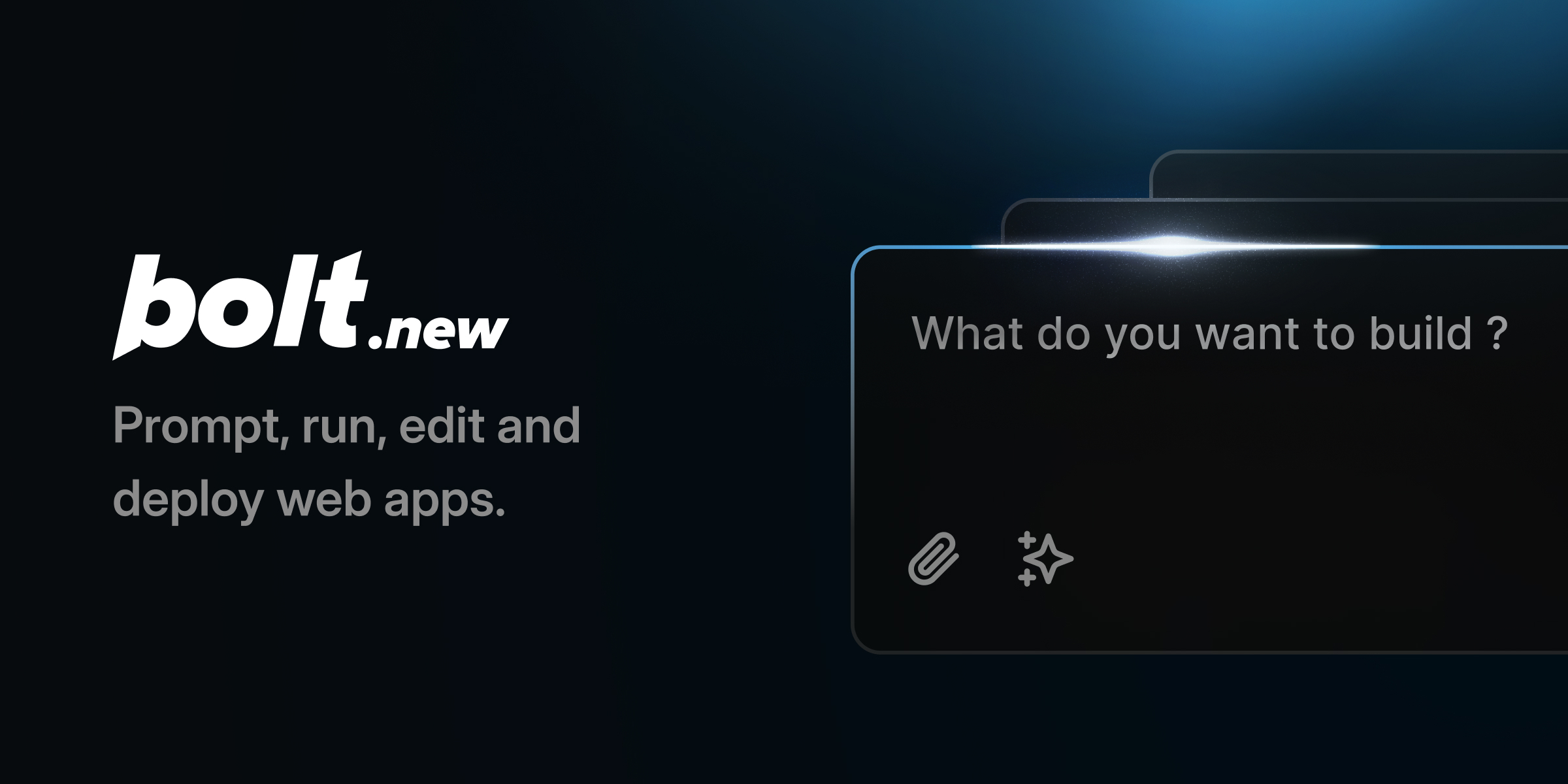

Bolt
bolt.new“Bolt AI projects a sleek, developer-centric aesthetic that balances technical precision with modern minimalism. The brand feels efficient and direct, utilizing a clean monochrome base punctuated by vibrant blue accents to signal action and innovation. It avoids clutter, focusing on clarity and speed to empower users to build without friction.”
Color Palette
Colors
Light Mode
Dark Mode
Typography
Fonts
Inter
Inter Display
sans-serif
Inter
ui-monospace
SFMono-Regular, Menlo, Monaco, Consolas, Liberation Mono, Courier New, monospace
The quick brown fox
16pxThe quick brown fox
48pxThe quick brown fox
30pxThe quick brown fox
18pxComponents
Design System
rgba(0, 0, 0, 0) 0px 0px 0px 0px, rgba(0, 0, 0, 0) 0px 0px 0px 0px, rgba(0, 0, 0, 0.05) 0px 1px 2px 0px
linear-gradient(to right bottom in oklch, rgba(255, 255, 255, 0.15) 0%, rgba(0, ...
Voice & Tone
Personality
Visual Energy
Design Era
contemporary-minimal
Emotional Tone
efficient-confident
Target Audience
Developers, designers, and founders who value speed, technical capability, and clean interfaces over decorative elements.
Comparable Brands
Brand Rules
Dos & Don'ts
Do
- Use Inter 700 (self-hosted) for main headings in sentence-case, and Inter 400/500/600 for body text with a strict 24px line-height.
- Apply primary action buttons with background #1488fc, text #f3f0f5, 6px border-radius, and 10px horizontal padding; ensure no shadow is applied.
- Use ui-monospace (system font) for all code snippets and technical data to maintain a native, lightweight feel.
- Maintain a flat design aesthetic: avoid all box-shadows (rgba(0,0,0,0) 0px 0px 0px 0px) and rely on high-contrast borders or subtle gradients for separation.
- Utilize the accent color #2ba6ff for secondary highlights or hover states, keeping the primary palette limited to #1488fc, #2ba6ff, #ffffff, and #171719.
- Implement subtle linear gradients (oklch space, white at 15% opacity) only on dark mode backgrounds to add depth without clutter.
- Keep button borders sharp at 6px radius; avoid pill-shaped (9999px) buttons except for specific tag or badge elements.
- Write copy using direct imperative verbs (e.g., 'Build', 'Create') and avoid exclamations or emojis to maintain a professional, matter-of-fact tone.
Don't
- Do not use Title Case for headings; strictly adhere to sentence-case to align with the brand's modern, understated voice.
- Do not apply drop shadows or blurs to interactive elements like buttons or cards; the brand is flat and lightweight.
- Do not use serif fonts or decorative typefaces; the entire system relies on Inter and ui-monospace.
- Do not use emoji in any marketing copy or UI labels; the brand maintains a clean, text-only aesthetic for communication.
- Do not use bright reds, greens, or yellows; restrict the color palette to blues, whites, and dark grays (#171719).
- Do not use 0px border-radius on primary buttons; maintain the consistent 6px rounding for all interactive controls.
- Do not use heavy, multi-layered shadows; if depth is needed, use subtle opacity gradients or border colors instead.
- Do not use formal, verbose language; keep vocabulary moderate and jargon heavy only where technically necessary for the developer audience.
Design Assets
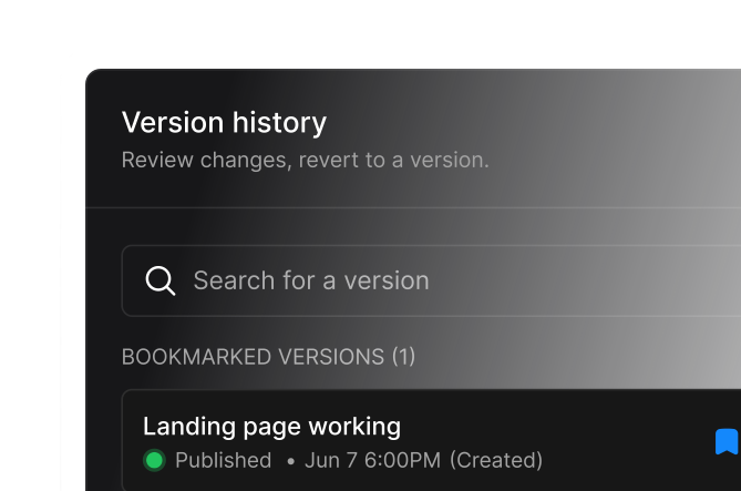
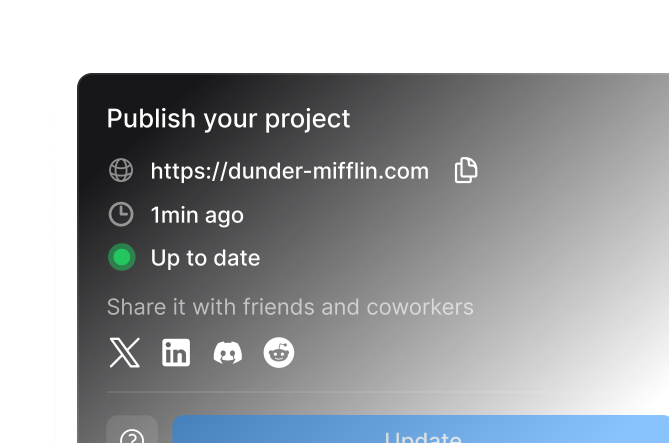
Visual Elements






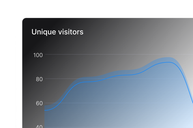
How to use this file
1. Save this file as DESIGN.md in your project root (sibling to README.md).
2. AI agents that read project files (Claude Code, Cursor, v0, Lovable, Bolt, Windsurf) will discover it automatically.
3. Validate or export tokens with the official CLI:
npx @google/design.md lint DESIGN.md
npx @google/design.md export --format tailwind DESIGN.md
Developer Access
# Fetch the full brand kit
curl https://extractvibe.com/api/brand/bolt.new \
  -H "x-api-key: ev_your_key"

# Export as CSS variables
curl https://extractvibe.com/api/extract/JOB_ID/export/css \
  -H "x-api-key: ev_your_key"

# Export as Tailwind config
curl https://extractvibe.com/api/extract/JOB_ID/export/tailwind \
  -H "x-api-key: ev_your_key"
Extract your own brand kit
Get colors, fonts, voice, and personality from any website in seconds. Open source.