Basecamp
basecamp.com“Basecamp projects a calm, organized, and highly accessible professional image. It emphasizes reliability and straightforward efficiency, positioning itself as a no-nonsense solution for project management.”
Color Palette
Colors
Typography
Fonts
Graphik
sans-serif
Graphik
sans-serif
The quick brown fox
32.04pxThe quick brown fox
64.08pxThe quick brown fox
64.08pxThe quick brown fox
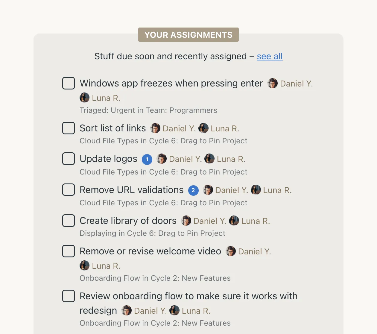
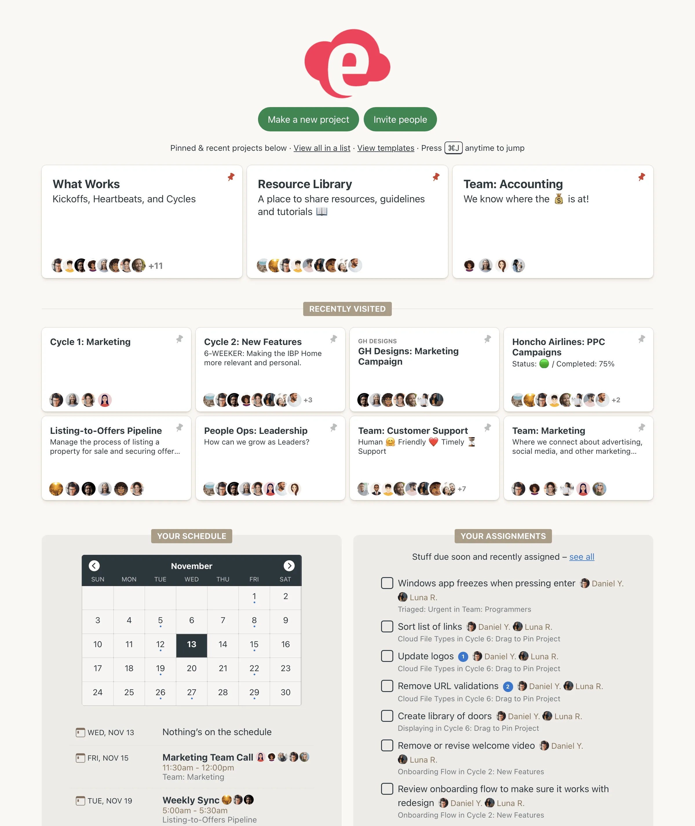
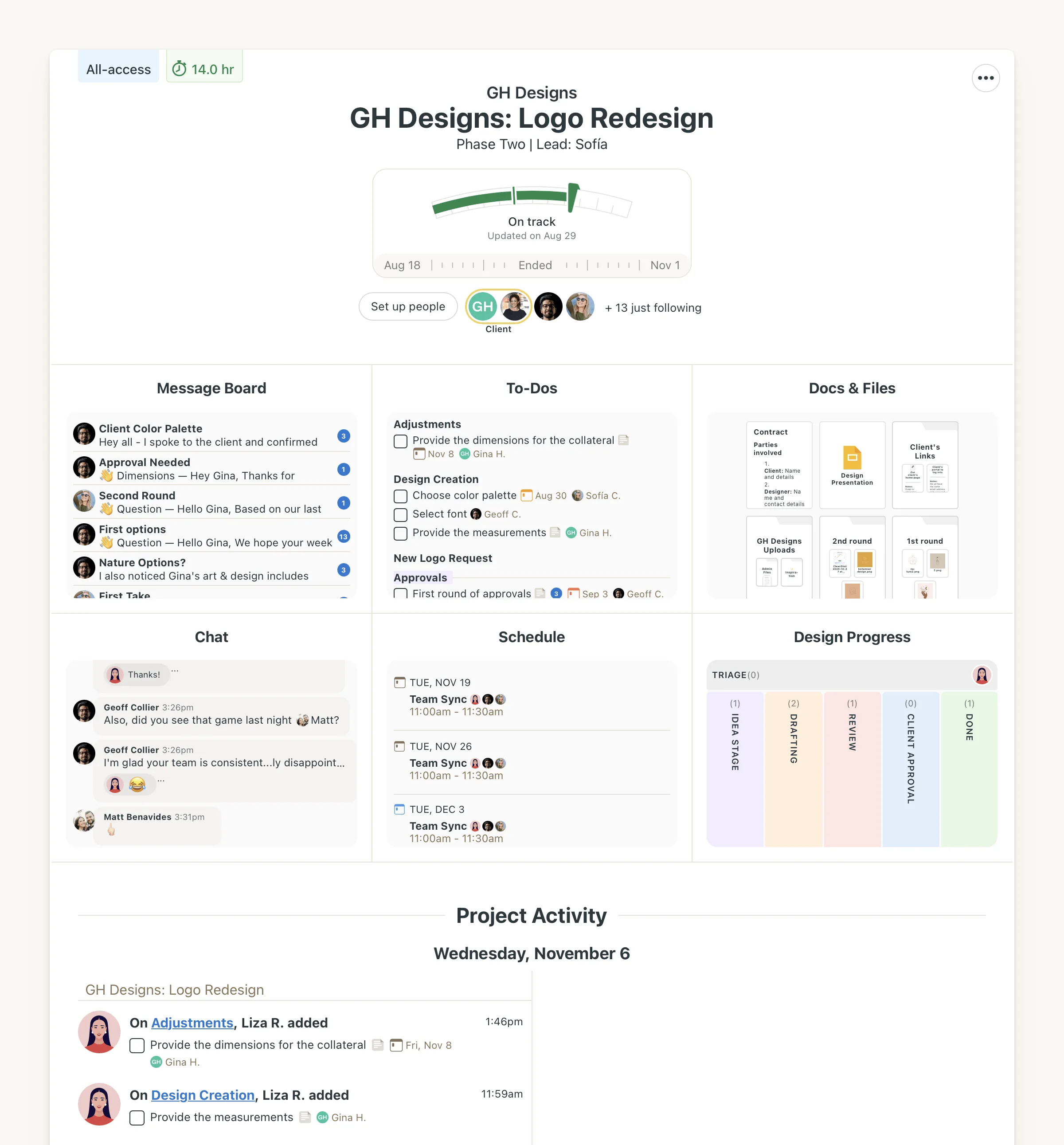
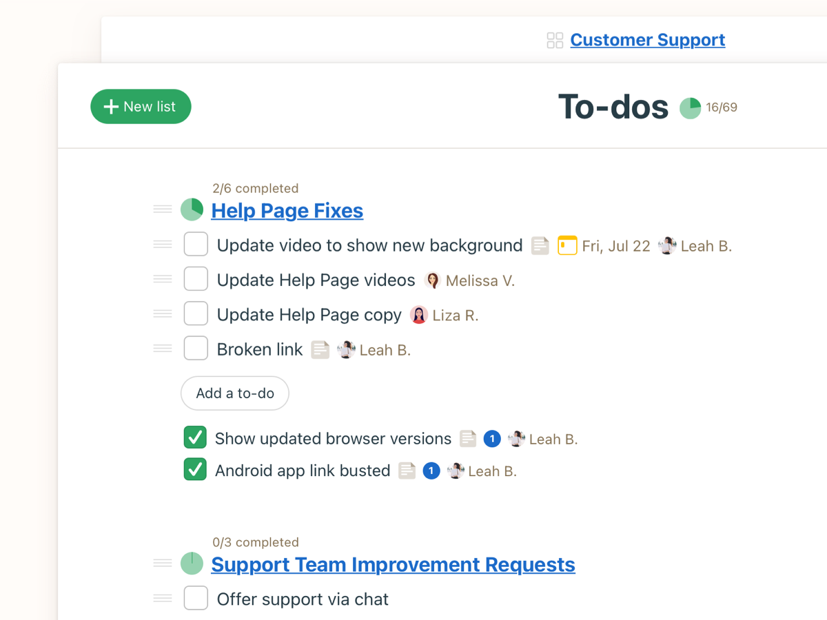
40.05pxComponents
Design System
rgba(11, 18, 21, 0.1) 0px 0px 0px 1px, rgba(11, 18, 21, 0.05) 0px 0px 1.9224px 0.38448px
rgba(85, 34, 250, 0.1) 0px 0px 0px 1px, rgba(85, 34, 250, 0.05) 0px 0px 1.9224px 0.38448px
Voice & Tone
Personality
Visual Energy
Design Era
contemporary-minimal
Emotional Tone
trustworthy-efficient
Target Audience
Businesses and teams seeking a straightforward, reliable, and non-overwhelming project management solution, valuing clarity and effectiveness over complex features.
Comparable Brands
Brand Rules
Dos & Don'ts
Do
- Utilize Graphik font family exclusively; Graphik 700 for headings (sentence-case) and Graphik 400, 500, or 600 for body text.
- Maintain a body line-height of 44.856px for optimal readability.
- Primary buttons must use a #0b8a0f background with #ffffff text, 4.005px border-radius, and no visible border.
- Secondary buttons should have a #ffffff background, #0b1215 text, 4.005px border-radius, and a #0b1215 border.
- Ghost buttons are defined by #0b1215 text, 4.806px border-radius, a #0b1215 border, and a subtle shadow (rgba(85, 34, 250, 0.1) 0px 0px 0px 1px, rgba(85, 34, 250, 0.05) 0px 0px 1.9224px).
- Apply subtle, single-layer shadows for interactive elements like buttons: rgba(11, 18, 21, 0.1) 0px 0px 0px 1px, rgba(11, 18, 21, 0.05) 0px 0px 1.9224px 0.
- Adhere to a limited color palette: #0b8a0f (primary), #0b1215 (accent/text), and #ffffff (background).
- Employ direct, benefit-oriented, and action-focused CTAs, often using rhetorical questions or alliteration.
Don't
- Do not use any font families other than Graphik for any text element.
- Avoid title-case or all-caps for headings; all headings must be in sentence-case.
- Do not incorporate emojis in any marketing or interface copy.
- Refrain from using gradients anywhere in the design; the brand is flat with subtle shadows.
- Do not use highly rounded or pill-shaped border radii; stick to small radii (4.005px or 4.806px).
- Avoid overly playful or highly enthusiastic language; maintain a matter-of-fact and accessible tone.
- Do not introduce complex jargon; keep vocabulary simple and universally understandable.
- Avoid using more than two distinct shadow styles; stick to the defined subtle button shadows.
Design Assets
Visual Elements
<!-- Generated by ExtractVibe — https://extractvibe.com/brand/basecamp.com -->
<!-- Extracted: 2026-05-03T14:48:31.968Z | Schema: v1 | Quality: 90/100 -->
---
version: alpha
name: "Basecamp — Project management software, online collaboration"
description: "Basecamp projects an image of calm, organized efficiency, offering a straightforward and reliable solution to project management chaos. It combines a no-nonsense approach with an accessible, slightly informal tone to convey competence and ease of use."
colors:
primary: "#0b8a0f"
tertiary: "#0b1215"
surface: "#ffffff"
on-surface: "#0b1215"
link: "#0b1215"
typography:
display-lg:
fontFamily: "Graphik"
fontSize: "64.08px"
fontWeight: "700"
lineHeight: "73.692px"
letterSpacing: "-2.6433px"
headline-lg:
fontFamily: "Graphik"
fontSize: "64.08px"
fontWeight: "700"
lineHeight: "73.692px"
letterSpacing: "-2.6433px"
headline-md:
fontFamily: "Graphik"
fontSize: "40.05px"
fontWeight: "700"
lineHeight: "46.0575px"
letterSpacing: "-1.35169px"
body-md:
fontFamily: "Graphik"
fontSize: "32.04px"
fontWeight: "400"
lineHeight: "44.856px"
letterSpacing: "-0.801px"
rounded:
sm: "4.005px"
lg: "4.806px"
full: "9999px"
spacing:
base: "2px"
xs: "1px"
sm: "2px"
md: "4px"
lg: "6px"
xl: "8px"
components:
button-secondary:
backgroundColor: "#ffffff"
textColor: "#0b1215"
rounded: "4.005px"
padding: "0px 12.2153px"
fontSize: "16.02px"
fontWeight: "500"
borderColor: "#0b1215"
button-primary:
backgroundColor: "#0b8a0f"
textColor: "#ffffff"
rounded: "4.005px"
padding: "0px 12.2153px"
fontSize: "16.02px"
fontWeight: "500"
borderColor: "#ffffff"
button-ghost:
textColor: "#0b1215"
rounded: "4.806px"
padding: "11.0538px 19.224px 12.2553px"
fontSize: "19.224px"
fontWeight: "500"
borderColor: "#0b1215"
boxShadow: "rgba(85, 34, 250, 0.1) 0px 0px 0px 1px, rgba(85, 34, 250, 0.05) 0px 0px 1.9224px 0.38448px"
---
# Basecamp — Project management software, online collaboration — Design System
## Overview
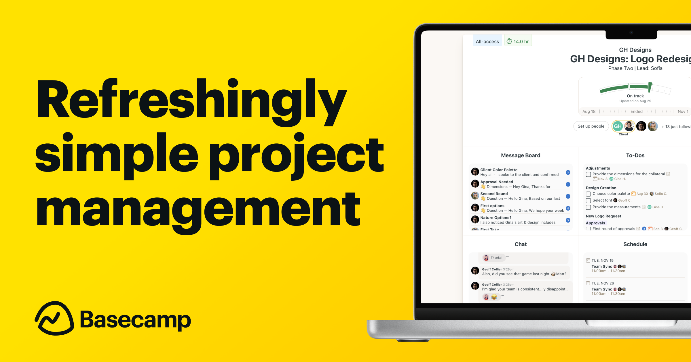
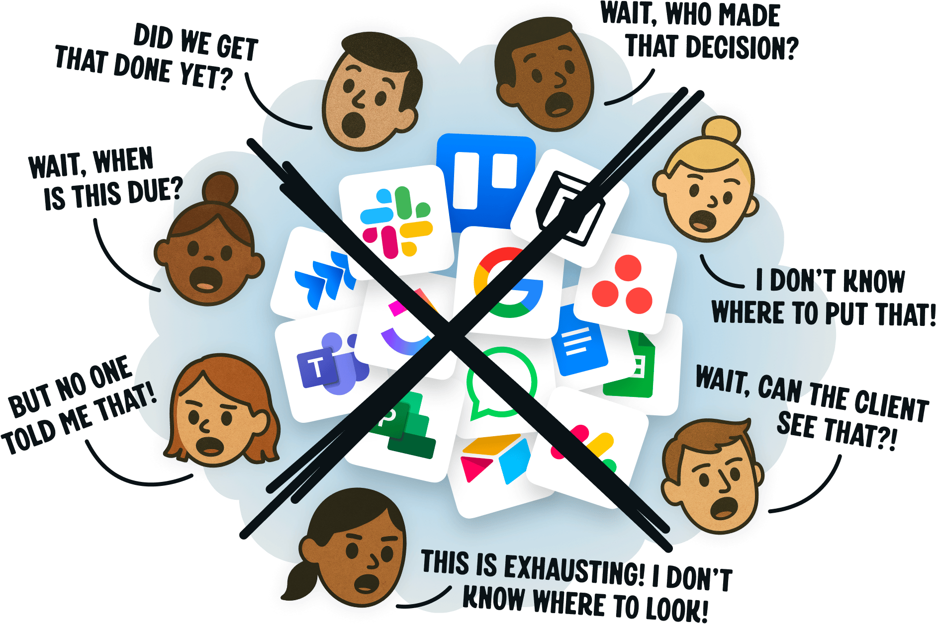
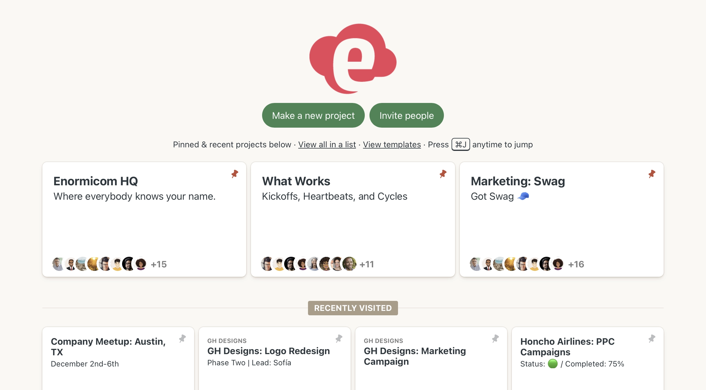
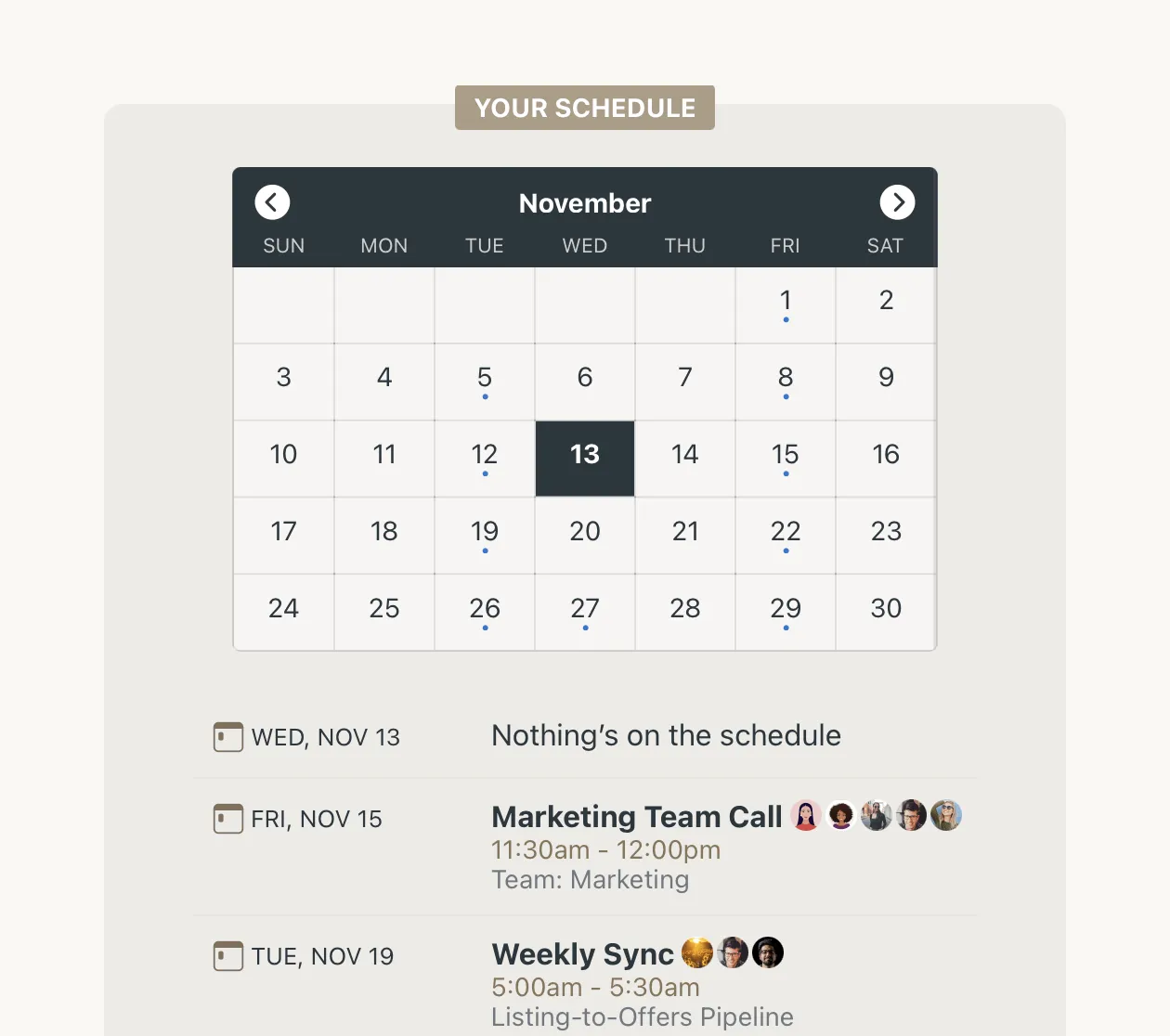
Basecamp's design embodies the Sage and Everyman archetypes, delivering a user experience that is inherently organized, efficient, and reliable. We provide a calm, no-nonsense environment for project management, directly contrasting the often chaotic and overwhelming interfaces prevalent in the industry. Our aesthetic prioritizes clarity and functionality, ensuring users perceive a straightforward and dependable solution.
This design system is a direct response to the complexities often found in comparable brands like Asana, Trello, Monday.com, and ClickUp. We eschew visual clutter and gratuitous animations, focusing instead on a clean, accessible presentation. The emotional register is one of quiet competence and ease, fostering trust and reducing cognitive load. This is not a platform designed for flashy engagement; it is a tool built for focused productivity.
**Key characteristics:**
- Vibe — organized, efficient, reliable, accessible, calm, no-nonsense
- Archetypes — The Sage, The Everyman
- Comparable to — Asana, Trello, Monday.com, ClickUp
- Design era — flat-2.0
- Emotional tone — trustworthy-efficient
- Target audience — Teams and businesses overwhelmed by complex project management tools, seeking a simpler, more organized, and reliable way to collaborate and manage work.
- Visual energy — 3/10 (calm/understated)
## Colors
The color palette is deliberately restrained, centered on the primary Basecamp Green (#0b8a0f) and a clean white surface (#ffffff). This choice immediately signals growth, stability, and clarity. The green evokes a sense of calm and progress, reinforcing the brand's commitment to organized efficiency. The abundant use of white space ensures readability and a perception of openness, directly supporting the accessible and no-nonsense brand character.
### Light mode
| Role | Hex | Name |
|------|-----|------|
| primary | `#0b8a0f` | Green |
| accent / tertiary | `#0b1215` | Near-Black |
| surface | `#ffffff` | White |
| background | `#ffffff` | White |
| text | `#0b1215` | Near-Black |
| link | `#0b1215` | Near-Black |
## Typography
Graphik is the singular typeface for all textual elements. Its clean, geometric forms convey modern professionalism and legibility, aligning perfectly with our organized and efficient brand. Hierarchy is established through size and weight variations of Graphik, not through a proliferation of different typefaces. This consistent typographic voice reinforces the calm and reliable nature of Basecamp, ensuring information is always presented clearly and without visual distraction.
### Font families
| Family | Role | Source | Weights |
|--------|------|--------|---------|
| Graphik | body | self-hosted | 400, 500, 600 |
| Graphik | heading | self-hosted | 700 |
### Type scale
| Role | Family | Size | Weight | Line height | Letter spacing |
|------|--------|------|--------|-------------|----------------|
| Display | Graphik | 64.08px | 700 | 73.692px | -2.6433px |
| Heading 2 | Graphik | 64.08px | 700 | 73.692px | -2.6433px |
| Heading 3 | Graphik | 40.05px | 700 | 46.0575px | -1.35169px |
| Body | Graphik | 32.04px | 400 | 44.856px | -0.801px |
### Conventions
- Heading case — sentence-case
- Body line-height — 44.856px
## Layout
- Base spacing unit — `2px`
## Elevation & Depth
### Shadows
| Context | Value |
|---------|-------|
| button | `rgba(11, 18, 21, 0.1) 0px 0px 0px 1px, rgba(11, 18, 21, 0.05) 0px 0px 1.9224px 0.38448px` |
| button | `rgba(85, 34, 250, 0.1) 0px 0px 0px 1px, rgba(85, 34, 250, 0.05) 0px 0px 1.9224px 0.38448px` |
## Shapes
Border-radius scale:
- `sm` — 4.005px
- `lg` — 4.806px
- `full` — 9999px (pill / circular)
## Components
### Buttons
**Secondary**
- Background — `#ffffff`
- Text — `#0b1215`
- Radius — `4.005px`
- Padding — `0px 12.2153px`
- Font size — `16.02px`
- Font weight — `500`
- Border — ` solid #0b1215`
- Sample copy — "Yes, that’s fine"
**Primary**
- Background — `#0b8a0f`
- Text — `#ffffff`
- Radius — `4.005px`
- Padding — `0px 12.2153px`
- Font size — `16.02px`
- Font weight — `500`
- Border — ` solid #ffffff`
- Sample copy — "Sign up free"
**Ghost**
- Text — `#0b1215`
- Radius — `4.806px`
- Padding — `11.0538px 19.224px 12.2553px`
- Font size — `19.224px`
- Font weight — `500`
- Border — ` solid #0b1215`
- Shadow — `rgba(85, 34, 250, 0.1) 0px 0px 0px 1px, rgba(85, 34, 250, 0.05) 0px 0px 1.9224px 0.38448px`
- Sample copy — "If you love Basecamp, you’ll love HEY — our delightfully fresh take on email + c"
## Do's and Don'ts
### Do
- Utilize Graphik font exclusively; use Graphik 700 for headings in sentence-case, and Graphik 400, 500, or 600 for body text with a line-height of 44.856px.
- Employ a primary brand color palette of #0b8a0f (primary green), #0b1215 (accent/text black), and #ffffff (background white).
- Design primary call-to-action buttons with a #0b8a0f background, #ffffff text, a 4.005px border-radius, and a #ffffff border.
- Design secondary buttons with a #ffffff background, #0b1215 text, a 4.005px border-radius, and a #0b1215 border.
- Incorporate subtle, single-layer shadows on interactive elements like ghost buttons, specifically rgba(85, 34, 250, 0.1) 0px 0px 0px 1px and rgba(85, 34, 250, 0.05) 0px 0px 1.9224px.
- Maintain a consistent border-radius of either 4.005px (small) or 4.806px (large) for all rounded corners.
- Craft copy using action-oriented and benefit-focused phrases, employing rhetorical questions, repetition, alliteration, and tricolons to engage the reader.
- Ensure all headings are in sentence-case, not title case.
### Don't
- Avoid using any gradients; the brand's visual style is strictly flat with solid colors.
- Do not use emojis in any marketing or product copy; the brand maintains a professional yet accessible tone.
- Refrain from using exclamations frequently; they should be rare to maintain a calm and matter-of-fact tone.
- Do not introduce jargon into copy; vocabulary should remain moderate and accessible to a broad audience.
- Avoid any shadows beyond the subtle, single-layer style specified for interactive elements; no multi-layer or strong depth effects.
- Do not deviate from the Graphik font family or its specified weights; no other font families should be introduced.
- Do not use title case for any headings; all headings must adhere to sentence-case convention.
- Do not use vibrant or rich color palettes; stick to the defined limited palette of green, black, and white.
*Source — inferred*
## Voice
### Tone (1–10 scale)
| Axis | Score | Lean |
|------|-------|------|
| Formal ↔ Casual | 7/10 | casual |
| Playful ↔ Serious | 6/10 | balanced |
| Enthusiastic ↔ Matter-of-fact | 5/10 | balanced |
| Respectful ↔ Irreverent | 4/10 | respectful |
| Technical ↔ Accessible | 9/10 | accessible |
### Copywriting style
- Avg. sentence length — 12 words
- Vocabulary — moderate
- Jargon — none
- CTA style — action-oriented and benefit-focused phrases
- Rhetorical devices — rhetorical question, repetition, alliteration, tricolon
### Sample copy
> Wrestling with projects? It doesn’t have to be this hard.
> You wouldn’t be here if the way you’ve been working was working. It’s time for Basecamp.
> Basecamp is famously no-nonsense, effective, and reliable. The trifecta.
> Got clients? Be partners, not adversaries.
> 10 seconds after you sign up, clarity sets in.
## Logos
| Type | Variant | Format | URL | Confidence |
|------|---------|--------|-----|------------|
| logomark | — | svg | [link](https://extractvibe.com/api/assets/brands/basecamp.com/logo-svg-4.svg) | 98% |
| logomark | — | svg | [link](https://extractvibe.com/api/assets/brands/basecamp.com/logo-svg-5.svg) | 96% |
| favicon | — | png | [link](https://extractvibe.com/api/assets/brands/basecamp.com/logo-3.png) | 74% |
| favicon | — | png | [link](https://extractvibe.com/api/assets/brands/basecamp.com/logo-1.png) | 62% |
| favicon | — | png | [link](https://extractvibe.com/api/assets/brands/basecamp.com/logo-2.png) | 62% |
| favicon | — | ico | [link](https://extractvibe.com/api/assets/brands/basecamp.com/logo-0.ico) | 62% |
## Sources
- Live brand page — https://extractvibe.com/brand/basecamp.com
- Raw JSON — https://extractvibe.com/api/brand/basecamp.com
- DESIGN.md (this file) — https://extractvibe.com/api/brand/basecamp.com/design.md
- Extracted — 2026-05-03T14:48:31.968Z
- Generator — ExtractVibe vv1
- Quality score — 90/100
How to use this file
1. Save this file as DESIGN.md in your project root (sibling to README.md).
2. AI agents that read project files (Claude Code, Cursor, v0, Lovable, Bolt, Windsurf) will discover it automatically.
3. Validate or export tokens with the official CLI:
npx @google/design.md lint DESIGN.md
npx @google/design.md export --format tailwind DESIGN.md
Developer Access
# Fetch the full brand kit
curl https://extractvibe.com/api/brand/basecamp.com \
  -H "x-api-key: ev_your_key"

# Export as CSS variables
curl https://extractvibe.com/api/extract/JOB_ID/export/css \
  -H "x-api-key: ev_your_key"

# Export as Tailwind config
curl https://extractvibe.com/api/extract/JOB_ID/export/tailwind \
  -H "x-api-key: ev_your_key"
Extract your own brand kit
Get colors, fonts, voice, and personality from any website in seconds. Open source.